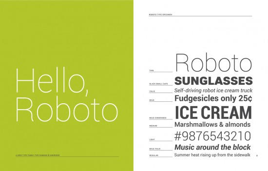
Matias Duarte On Roboto Font for Android 4.0 Ice Cream Sandwich
Matias Duarte took to his Google+ page today to give everyone a behind-the-scenes look at the developmental process behind one of Ice Cream Sandwich’s tiniest updates: the font. Those boys over at Google are calling it Roboto (don’t you dare call it san-serif Helvetica) and if you thought there couldn’t possibly been much thought behind the new typeface you were wrong. Soooo very wrong.
According to Mr. Duarte, the reason for the new change is simple — the old Droid font was made for lower res devices and wasn’t displaying correctly on the now offical 1280×800 screen resolution. They were looking for something new, modern and that would fit the new “magazine” style UI of Android 4.0. Apparently, the Roboto font isn’t just optimized for high definition screens but it also plays well with older Android devices sporting lower res screens, making it a perfect fit moving forward. In short, every part of the Robot typeface was planned in painstaking detail. And I haven’t even gotten into how they came up with it. If you’re interested in hearing more on Roboto (lots more), hit up Matias Duarte’s Google+ post. While I found it interesting, I’m sure even the most dedicated Android faithful may find it a snoozer.
