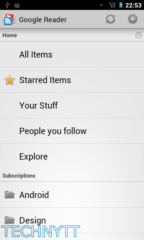
Leaked Images Show Revamped UI For Impending Google Reader Update?
Google recently revamped the UI of Google Reader (web version), giving it more of a Google+ feel and it looks like their official app may follow suit as well. Google made known their plans to update the Reader app in a blog post yesterday announcing the new design changes of their web version saying,”A new Android application will follow soon,” but exactly how soon wasn’t mentioned.
If you were curious on exactly what to expect, maybe these images we came across today will help you out. These were taken from inside Ice Cream Sandwich and aside from a few small UI elements, it doesn’t looks like much is changing.
Gone is the traditional “Google blue” replaced with the new “Google grey” color scheme. There is the possibility Google may have added some fancy new widgets options as well. We wont really know of any other changes until we can get our hands on the official updated app so until then, these pics will have to do. Anything you guys want to see from the updated Google Reader app for Android?
[TechNytt via Electronista]
