With today’s announcement from Samsung on the availability of the Galaxy S II in the US, you may have noticed Samsung’s (or the carrier’s) choice to design each device differently. With that, came some strong opinions from our readers on the version they felt was most aesthetically pleasing. We’ve all seen the handful of press shots making the rounds and hopefully you’ve watched our hands-on time with each device before making your final judgement.
Personally, I feel like the the AT&T version agrees with me more seeing how it’s almost a carbon copy of the international version sans the “iPhone-ish” home button. But now it’s time for you guys to make your voices heard in our reader poll. Carrier affiliations aside, which version of the Galaxy S II do you feel like “looks the best.”

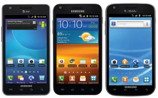

T-Mobile, it resembles the NS which has the best form factor on any phone IMO. Plus it has an LED indicator! Saw it while it was charging. Didn’t see one in either of the two so that’s a win in itself!
you have a link to the tmobile version with an led? i’ve only seen the sprint one have it so far
Yeah I assumed it was TMO’s, then looking at it again I realized it was Sprint’s. :( I sure hope TMO’s has it as well. Not having one would kinda suck…. Such a basic necessity.
the wp7 version of gs2 looks best
http://www.youtube.com/watch?v=ABO_LyD_SXs
thinnest phone in the world, thinner than the android versions which all have chins.
Yeah that looks damn good. Just sucks that it’s running WP7. I’d love to use WP7 but it doesn’t have the apps I like that Android has, and with all of this Google sync and cloud services I’ve basically signed my life over to Google from here on out. Haha.
which app does wp7 not have? lol
sign your life out of google bro, youll regret it cuz theyre an ad company
damn i was hoping you were right. then maybe there was hope for ATT having one. since we got gyped out of the extra screen space.
Nvm, I could be wrong :( I think that might have been Sprint’s version.
i like the tmobile version better
Me too. It’s shape looks like the Sensation.
Need some shots of the backs to make an informed decision #dat ass
Im stuck between the international and sprint version. But i voted the international one because its more universal :P But the sprint version is reallly nice
but will the intl vers work 4g/HSPA+ ? i travel a ton and would hate if it was only 2g while at home
Anyways I think the Nexus S looks better than all of them… I don’t do screens bigger than 4″ either as well. How about a Nexus S 2 with an Exynos upgrade :P
I second this request.
I don’t. xD
My 4.3 inch Evo is small enough to fit in my pocket.
However, I also won’t buy any device that has a screen that’s 4.5 inches.
Even if a device comes out that is the same size as the Evo or a bit smaller but has a 4.5″ screen? Why?
these people are dumb. They are making the display bigger not the device. droidx2 it is like 4/5 the whole the device but the screen its just 4.3.
The 4.5 inch phones are larger, not just the screen. Check out the infuse to see if the size is to your liking. Too large IMO.
Yeah I’m dumb, kiddo. Did I say I didn’t want a bigger phone? No. I said I don’t want a bigger screen than 4″. Problem?
Also, android involves extensive use of the top of the screen and on larger displays its harder to swipe down from the top when you’re only using one hand.
I’m going with the Sprint one. Minimal branding. Big ol’ screen. Actual 4G tech radio.
T-Mobiles is going to be WAY faster
I agree with you
Tmobiles is faster and is as much a 4g technology as wimax
the problem I had with T-Mo is i always found my phone (g2x) operating on 1x… practically unusable. I live in the heart of the 5th largest US city. Yes, I know each carrier has strong coverage areas and weak, but half way solid 3G should be second nature here.
yea but it was a lg issue not the network, lg really suck.
Agreed. Hardly any branding, although I love the Galaxy S2 logo on the back. And it has a notification LED. Although, LTE is the true 4G tech. And in my area, Sprint is actually the slowest 4G.
I Speedtested the EVO 4G, EVO 3D, and Photon against my Droid 3 on 3G. My D3 got 1.7-2 down and .8 up. The Sprint phones, which I made sure were all connected to WiMax, never got over 1.2 down. But when I speedtested the Sensation and G2X at T-Mo, they got 8-10 down consistently. And ATT phones get about the same speeds as Sprint’s. And VZ LTE phone get 15-20 down consistently. These were all tested on the same 2 servers.
LTE does not meet the minimum requirement of 100mbs downto be considered “true” 4G.
hmmm.uh ..ummm..lte is nowhere close to real 4g its as real as hspa plus..get facts straight..somewhat faster perhaps,,but no way close to real 4g.
I like the sprint galaxy s2 the best because the service is the best deal. I wish it had the iphone like home button though. The 4.5in screen makes up for it though.
Sprint wins! 1800mah battery, notification light, no carrier branding in the front!
I Think sprint did everything necessary to make their version the best. Of course the bigger screen is a hit or miss with some ( i love it) but the bigger battery and notification light makin this that much better. I’ll be right there September 16, time to say goodbye to my trusty HTC Hero, you’ve done good lol.
Notification light? I must have missed that part.
yea its there, if you watch the video you see it on as the phone charges in the upper right hand side
I like the squarer design of the AT&T one, but 4.3″, I would have liked to try 4.5″.
I love 4.5″ screen but it is slightly too long and it doesn’t have to be. Get rid of the logos at the top and bottom and that will free up about 1/4-1/2 inch of the length which will make a big difference in the pocket for those that fear 4.5″ screens. That is my only complaint about the Samsung Infuse 4G with 4.5″ screen.
Agreed, just give me the 4.3 version and I would be happy.
As a Sprint customer I have to say I’m disappointed in their version. I love the look of the international version, and consequently the AT&T version. I don’t need a 4.5″ screen and I don’t have 4G where I live so those do absolutely nothing for me. I like a minimalistic styling, but I can’t stand iOS. I really wanted that minimal look and feel with the GSII. Oh well, maybe Sprint will get it together one day and realize that not everyone wants or needs a 4.5″ screen. 4″ would do just fine.
Sprint has several options for Android phones sporting screen sizes from 3.2″ all the way to 4.3″ if that 4.52″ is too big for you. I think most Android users on Sprint have been waiting for this very screen for some time now, myself included.
…dont buy it.
just another sorry android phone..same ole shit in a different case! when all you android loving FOOLS run out and get this piece of trash,dont forget that samsung
is horrible when it comes to updating the o.s.! that means u will be stuck with what ever crappy o.s. it comes with! and if it comes with bugs, samsung will fix it when ever they feel like doing it!
Not if we root it…
I don’t know about the rest of these guys but I’m sick and tired of that crappy 2.3.4 vs of Android that these phones are shipping with. So are you a Palm guy or maybe an IOS guy? Either way, Android owns.
And yet you troll Android sites, looks like you’re the fool.
samsung has cyanogen
Samsung actually updates it’s phone pretty quickly. It’s all the US carriers that takes extra time to push out the updates to add their own branding. Outside the mighty US, this isn’t such a problem.
moron
..MILLIONS of people are still gon buy this phone…including me.Save your breath.
Geeeeze, some of you are idiots. Do you not see these phones are all the same size? Sprint has the 4.5inch screen and guess what? The phone is still the same size as all the others, it only enhanced your experience and yet you bitch on.
The phones are NOT the same size, the pictures are scaled.
I agree with Croak, and it caused me to edit my post, retracting a rant. At least the AT&T and Sprint versions are different in height by 4 mm which would have showed up had the photo not used different scaling on these phones. I think it would have made more sense to use the same scale and to include the international version for comparison.
According to Samsung’s website:
AT&T: 4.96” x 2.60” x .35” (126.0 x 66.0 x 8.89)
Sprint: 129.9 x 69.6 x 9.59 mm
I chose the Sprint version when I thought they were all similar, but knowing it is a bit bigger, I still pick it though I think the AT&T size is more optimized for my pockets (esp. the length 130 mm is a bit long ), I voted not only because it had the biggest screen, but it is also styled the best. The corners just aren’t round enough on the AT&T (my carrier) and on T-mobile, it seems too rounded.
But if I were designing the Nexus Prime (with hopefully at least a 4.5″ 1280×720 screen and perhaps up to 4.65), I would a) not be using the aspect ratio of the Galaxy S II I’d be using 16×9 – no extra pixels above that required for HD video and keep the width of the phone as trim as possible, and b) get as close to the top and bottom of the screen as possible – ditch the buttons and have the mic and speaker have grills on the sides (like the iphone mic for example).
The Sprint at 129.9 x 69.6 x 9.59 mm is a bit too big for me. I’m fine with even thicker phones (big battery, top of the line camera), but I’d keep my ideal phone down to 120 x 66 x 12-14 mm and then pack the biggest screen I possibly could. With 8.5 mm vertical and 4 mm horizontal, you can get a 4.65″ screen. If a near edge to edge is possible, a 4.9″ screen still fits and above that the DPI drops below 300 and loses a key marketing point (like it or not, Jobs defined the high resolution phone at 300 +).
There is slightly more than 1/8′ of an inch difference in height.. I calculate it at .157″ if I remember my conversion factor correctly. Don’t imagine there would have had to have been much scaling done.. but I suppose there might have been.. too much trouble to edit the pic and cut and paste and lay over images to see how much of that .157″ difference has been fudged, but I think if true dimensions were drawn in a cad program (again more than I want to do) and placed side by side it would still turn out not to be a “big deal” as has been made here.
Maybe I do have too much time on my hands after all.. here they are drawn in Qcad to the dims you listed.. now I am too lazy to radius the corners.. but at least you get some perspective..
The diagrams that you made look too long on my computer for some reason, I zoomed in to measure 9:4 on the taller one compared to 13:7 for the Sprint one, this is 21% off. Is this a rendering issue on my computer, the website, or do you have a typo in Qcad?
For me, the driver is always the phone length since most of my pants pockets have the same length and I like to leave my phone there when I’m sitting down. I know from experimenting that it starts to bug me over 125 mm and 120 mm is best. I could handle up to 72 mm in width, though enough people don’t like to open their hand that wide to hold the phone that I would never try to market a phone that wide and if you use a 16:9 screen, there is no reason to make it that wide anyway when you keep the height under 125.
I don’t know.. basicly it was drawn in Qcad, and then saved as a jpeg, and uploaded.. but at least on my monitor when I look at it on this site it renders as it did in Qcad.. The AT&T version comes off as a little thinner and shorter than Sprints, but as I said it’s not that much of a difference overall.
If I had to choose one, and it didn’t have to be my carrier I would choose the Sprint one. I really like it because of the lack of branding and the 4G, even if the 4G isn’t great. (I’m really not going to care about service coverage considering I’m not going to be getting one)
As someone said before it just stinks because even though it’s only 4 months old, in phone times that is old. There are going to be a lot better phones, and while this phone still is great looking, the US carriers are at fault for not getting this phone earlier.
I currently have an Inspire 4G and love it, but I’m kind of losing interest in it because it’s pretty far behind in terms of proc. speeds at what is now the standard 1 ghz speed and only one core. In addition because the 4G it uses is not the 4G AT&T plans to expand their coverage with. All in all it’s my fault for not waiting or spending some more money on a better phone, but what I’m really getting at is that the US carriers are all a little behind in terms of cell phone tech and need to get with the program.
Thats what I keep saying but most act like its no big deal. Sure this phone is still pretty awesome but its been 4 months and in the tech world thats too long to wait. Whats another month or two to get the more powerful Prime that also comes with ICS.
A friend of mine has the Inspire and its a lightning fast phone. I know it has only one core running at 1GHz but as long as the phone is fast it shouldn’t matter. Don’t bother yourself by thinking its not good enough.
It has the current gen Snapdragon (the upgraded version from the one in the Nexus and Evo)…you’re good.
FOR THE LOVE OF F*#%ING GOD IF I READ ONE MORE ARTICLE ABOUT THE DANNY GALAXY SII I’M GOING TO START STABBING FOLK.
Before you people flame me I realize today was their big press release. But do we really need 14 different articles on EVERY SINGLE tech blog in existence. Couldn’t we just consolidate the info, polls, opinions, other bull into one article.
Ok /rant
Then don’t read it
Sprint because of lack of carrier branding on the front.
this phone would be awesome running wp7, however, how long will we have to wait for that device? and it will probably only launch on at&t since the last samsung wp7 device only launched for them.
i do like sprint’s version. 4.5 inches may be too big on most phones, but it looks like it will fit perfectly with the galaxy s2. i just wish samsung would have put a b!!chen kick stand on the back… a screen of that size and beauty needs to be charished in all it’s glory!
the att version looks closest to the international version but I like tmo’s version the best. Sprints is a very close 2nd.
i like the tmobile form factor the best as well
The international one is definitely the best.
All these phones have big foreheads
Intwrnatioanl version. I’ve had mine for 4 months and have already recieved 2 updates. These US versions are slick, but likely to have more faults/bugs and take longer to fix them than the single international version.
I voted for the Hercules :)
As a personal protection device.. ATT Wins.. When thrown properly, it will cause much greater damage on your opponent.
yeah but you wouldn’t be so frustrated if you were on another carrier
The mic on the side may be a good idea however I’m willing to put money on it that apple has got that patented.
And people whine about all HTC phones looking alike. I am disappointed that the Sprint version is not shaped like an octopus.
k well if you take out the picture on the screen.. the tmobile version doesn’t look that bad. or swap em?
so the galaxy s 3 will have a 5″ screen?! when will they decide the screen is big enough.
…it wont be called GALAXY S3.It will be called the GALAXY NOTE.
The tmobile version wins. it looks nicer candy bar look
4.52…wow its kinda a old ass phone…but that sure is a nice size. Hopfully Verizon gets a phone this big…Bionic size is kinda boring to me now having owned a DX.
I voted for the International design but I think I may be rethinking on having a 4 button layout as apposed to a central home and 2 others.
So I’ll say the AT&T version is best except for the carrier branding top. It has the Galaxy S II logo on the back which is sure to look good to others who see it.
It keeps the phone the right size and the screen is big enough. I thought my Captivate 4″ screen was good sized, so why bigger than 4.3?
I think the T-Mobile one has the best shape to it but the 4.5 is too big so I’m stuck between the AT&T and T-Mobile ones.
Why do they have to change the layout of the 4 touch buttons on the bottom? I have a Nexus S (no branding in the front AT ALL btw and best designed Android phone EVER) and the back/arrow button is first followed by menu, home then search. Why switch it?
Anyways I think Sprint wins only cuz of the less branding and LED notification. T-Mobile second.
at&t because its what a android should look like