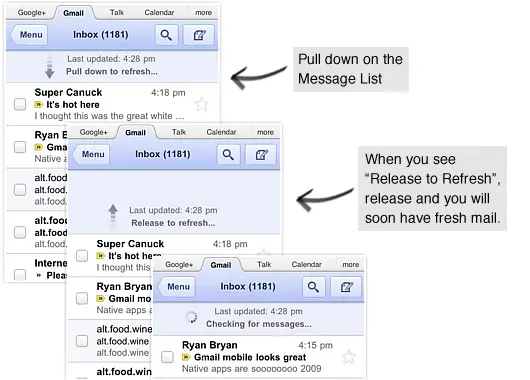
I know this may sound silly to report when the Gmail application comes preloaded on just about every Android device but not every Android user ONLY uses Android. For those of you with iPads or Playbooks, Google has recently spruced up the mobile version of Gmail on the web. The new interface looks a lot more similar to the Honeycomb version of Gmail feature window panes and email previews. One of the newer features is the addition of the “pull down to refresh” way of refreshing your inbox. Also added were sharper icons and new screen transitions when opening emails. Maybe these new features of the web and Honeycomb versions of Gmail will give us a preview of what to expect from a future update to the Gmail app on Android.
[Via Gmail Blog]


The same way the twitter app does it… nice cross over.
Yup! I’ve seen it in a few more apps too like….. Seesmic? I, personally, would rather push a refresh button though =p
Nice feature…I wish it was also on Android (although Friendcaster does it already) but it may provoke Apple into another lawsuit frenzy…LOL
They updated the iGoogle Gmail gadget (widget) not to long ago. Looks very similar to this.
Man, Google’s mobile pages looks so sexy. Unfortunately, they are the only things from Google that look sexy…