The HTC Status is America’s first phone with a dedicated Facebook button. While the service (allegedly) created by Mark Zuckerberg is without a doubt the most widely used social network in the world, the verdict on a device dedicated to exploiting its name, power and image is still out. AT&T hopes to capitalize on the iconic “f” logo, but is the phone good enough to pull people in?
Hardware
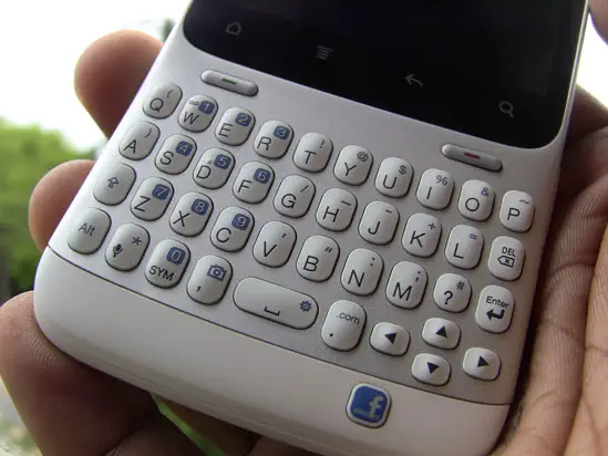
The HTC Status is a candy bar device with a portrait-oriented QWERTY keyboard and display. Below that keyboard is a Facebook button that gives you the ability to quickly post status messages or check-in to a location. This was HTC’s biggest selling point of the device when they first announced it (as the Chacha) back in February.
The keyboard is very attractive for those who are fans of the Blackberry-style orientation. More than it looks good and is familiar to that crowd, it feels great to type on. There is good track and feel here with a decent amount of tactile feedback. Keys are nice and “clicky” out of the box, but they might get a bit mushy over time.
Given the size of the keyboard coupled with the size of my hands, I thought the experience would be one of great pain. Fortunately, it wasn’t – I don’t know if it was due to the keyboard’s spacing or the device’s ergonomically designed body, but I had a much better time typing on this than I did any Blackberry or Palm device.
Moving past that, the device itself feels great in the hand. It’s light, but I wasn’t surprised by that. People will feel good holding it in their hands, too, as the build material and quality teeters on the line between this year’s string of HTC phones and last year’s. Not quite as much plastic as we were used to with HTC, but there isn’t a whole lot of metal on this thing either.
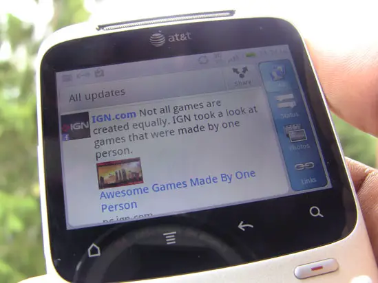
The display is landscape-oriented when holding the device upright, meaning all applications will default to their landscape views when launching them. The only time you’ll see an application or game in portrait mode is if that certain app or game requires portrait mode at all times. It’s a bit awkward to hold the phone sideways to use these apps, but that’s one of the caveats you have to deal with when going for a device like this.
This display itself is just as responsive and crisp as any new HTC phone. Things look crisp and clean compared to handsets with similarly-sized displays, too, as HTC chose not to skimp on the resolution. While you may have a bit tougher of a time reading text by nature, it’s still as good as it’s going to get in this form factor.
Inside is an 800MHz Qualcomm processor that’s similar to the chipset that powers the G2, Desire Z and other such phones. This processor is still more than capable of running HTC Sense smoothly. We didn’t expect much in the way of performance, but the Status is quite capable for the market it’s aimed at. With a bit of XDA love, you could potentially get a stable 1.2GHz overclock, but that depends on the development community.
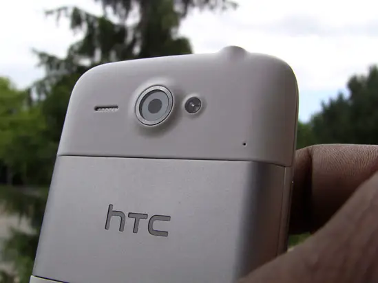
You don’t get much RAM or internal storage, but the former hasn’t posed a problem for me in my week of testing and the latter will depend on who’s using the device. Some folks may need that ability to install applications to the SD card. We’ve also got a 5 megapixel camera sensor on the back and a .3 sensor on the front.
The battery life on this thing is quite good. Without a ton of work for the processor to push graphics to the small display, you’ll last all day as long as you aren’t looking at the phone 24/7. I’ve gotten more than 20 hours at one point, which I’d say is above average compared to other smartphones. Feature phones may give you more juice but this, of course, is no feature phone (although it may look like one).
Software
Here we have Android 2.3 with HTC Sense. It’s a modified version of Sense 2.1 for messengers, the first we’ve heard of HTC using this term. This definitely does differ from what you typically know as Sense. The home screen has been modified, for instance, to get rid of the Phone button (due to the advent of a physical call send button). On the very first home screen you can only use three rows on the left and right most columns due to the space the personalize and apps button take up.
Some widgets have been customized to fit smaller displays and some applications’ navigation bar (like the one you see at the bottom of the HTC launcher and in many of their applications) are set to the right. It’s still Sense at the end of the day, just looks a bit different.
As I mentioned before, thanks to the above-average processor and the low amount of work it has to do to push graphics to the screen, the software runs quite smoothly. Hiccups ware few and far between and I could only get it to stutter when absolutely trying to do way too much. For everyday use, this thing will serve any light-heavy user well.
Facebook implementation leaves a lot to be desired. For a phone that has a Facebook button, I expected to be able to do a bit more than what the Status allowed me to do. I’d urge everyone to download the official application in the Android market if it weren’t for the fact that it can sometimes be hard to use with a display this size.
The button leads you to post a status message when pressed. You can also go straight to check-ins when holding it down. Also, the button will illuminate when viewing a webpage that will allow you to share the link of the page you’re on to Facebook. Likewise, photos and video can be shared when viewing them simply by pressing the “F” button.
I had hoped for added functionality – such as a pulsating light letting me know that I’ve received a comment or message. Naturally, I’d want to be able to jump right to those happenings as I press the button. Unfortunately, it doesn’t add much of anything to the experience unless you need the convenience of touching that button every 5 minutes.
Compared to recent updates to the main Facebook application, this implementation is downright crippled and not a joy to use at all. I appreciate HTC trying to do something a bit different. And it was smart for them to license the use of that Facebook button – it’s iconic and will turn enough heads at the point of sale.
But it’s such a rank experience from the main Android app that I’d urge users to struggle with using that on a very small screen or just visit the much-improved mobile web version of Facebook. On one positive note, the chat functionality has a dedicated widget and an icon in the apps try. Yippee.
Camera, Media, Odds, Ends
The camera on this thing is quite ordinary, relatively speaking. You won’t find the MyTouch 4G Slide’s virtually lag-free shutter. I would liken it to the quality of camera on the HTC DROID Incredible 2 and some of HTC’s other “S” phones. It’s serviceable for a phone of this type and will be pretty decent for uploading the odd mobile photo to Facebook here and there.
The front-facing camera is also decent, though we’re not sure if this was meant for video-calling on a device this small. With Facebook video-calling coming to Android sooner or later, it’s in good shape to receive that feature (in the main app, anyway). And maybe this is just wishful thinking, but I like to think that they included the front-facing camera so the campaign against bathroom mirror photos is scrubbed clean from this earth. They suck, people.
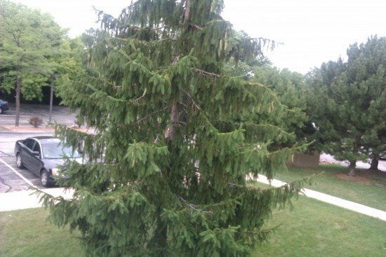
A few samples taken with the rear camera in several different situations:
It’s unfortunate that this thing doesn’t shoot HD video, but considering the nature of the device and the crowd it’s meant for, we can’t say we’re surprised. Video comes out looking OK, albeit a bit choppy. If you’re recording you may want to make sure your hand is steady as fast movements can make the video appear really choppy and you might also experience some screen tearing.
Photos are how I imagined them to be with the phone’s 5 megapixel camera – we’re on par with some of HTC’s latest phones, including the DROID Incredible 2, the HTC Thunderbolt and the HTC Sensation. As always, it’s going to be quite decent in daylight, but your mileage may vary in low-light situation. We’re very happy an LED flash is accompanying the camera in case you absolutely need it.
Gaming on the device won’t be ideal in most situations. It runs games well, but you’ll have to turn the device sideways half the time to play portrait-only titles. This looks odd and it feels clunky. Some games don’t scale down well, either, so your options are somewhat limited in the Android market. Likewise, watching films on the device will be a tad unpleasant. It’s OK, but if you need a bit of visual entertainment on a flight or during a boring stretch of time, you’d better take a tablet or a bigger PMP with you.
And all the other important things – call quality, radio performance, GPS, etc – work just fine. I would have preferred a bit more in-call volume, but that’s minor and was my only complaint in this area.
Overall
It’s a decent phone for social heads, Facebook or otherwise. The keyboard is ideal for heavy volumes of tweets, texts and status updates. With the Facebook button, we had hoped for better and deeper integration, but the only advantage the HTC Status has over any other phone in terms of “Facebooking” is that you can post a status message with one press of a button from within any application.
All of that aside, it’s still a phone worthy of a chance. HTC’s solid build quality, as always, doesn’t really fail. It’s actually surprising how solid the phone feels considering this is a huge departure from the norm for them. Due to the nature of the phone, portrait-only apps don’t really work too well on the Status, but that fault lies with the lack of development standards and we can’t really blame HTC for that.
As long as you go into this purchase knowing that this isn’t meant to be a multimedia-serving powerhouse (it certainly isn’t), you’ll be fine with the Status. It won’t overwhelm you, but it’s a great addition to a group of devices with this form-factor that’s lacking in devices from powerhouse manufacturers.








I’m not dogging your review, it’s great, but couldn’t we have summed it up with a single acronym:
The HTC Status. Wtf?
This looks like something teen aged girls would love.
I think the Orange Barcelona is a better phone than this: http://shop.orange.co.uk/mobile-phones/barcelona-from-orange
wtf? this was an android? I assumed it was something more basic with a big facebook button.
This would of been a good phone if they got rid of the stupid facebook button and made it prepaid.
The processor is a msm7227…not a snapdragon.
My source is the kernel source.
I don’t think I ever mentioned it was a Snapdragon.
It said it was similar to the procs in g2 etc,those are armv7, this on the other hand is armv6.
Can be seen as misleading.
My battery last only 11 hrs. It keeps deleting phone numbers. the screen will freeze up time to time. One time you tap on sreen to enlarge words then the next time you might grab and drag. AT&T just kept blaming it on fb or the numbers must be linked to someone or it just does that!!! Looking at changing phones!!