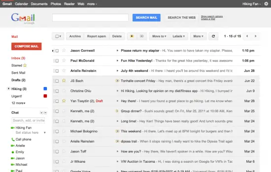
Gmail Gets A Whole New Look Thanks To Google+
Google is on fire lately! With the launch of the uber exclusive social network, Google+, we were introduced to something I wasn’t used to seeing from Google: polished UI.
Well, it looks like Google is running with the UI from Google+ and incorporating it into Gmail as well. The newer, more minimalistic, clean look wont officially be rolling out for a little while longer but you can get a sneak peak preview with Google making it available as a theme inside of Gmail’s settings. Google had this to say on their blog:
This is part of a Google-wide effort to bring you an experience that’s more focused, elastic, and effortless across all of our products.
Not only will Gmail be receiving a facelift but Google said we should see it in Google Calendar as well so look forward to that in the coming days. I honestly couldn’t stand the old cluttered look and as superficial as it sounds, hated opening my Gmail simply because of how painful it was to look at. Of course, all that has changed and I can now leave my Gmail tab open and get to tackling those 402 unread messages.
[Via GmailBlog]
