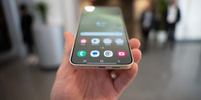
What do you get when you take an Android 2.3 base layer and stack a slick interface on top? The new look of Japan’s KDDI Infobar line of phones as they cross into the smartphone age. Yes, it does look a lot like Windows Phone 7, tiles and all, but that’s not going to stop us from drooling over this fully customizable interface.
[via Gizmodo]


nice! can a dev please hop on this as a launcher. would love to see this on my TB
+1 My thought exactly! That UI seems to marry WM7 and Android very well!
I’m very excited about the dev community getting a hold of this.
WP7 users just don’t understand the power of Android.
Android users don’t understand the usefulness of simplicity
simplicity=boring
Look I’m not trying to start a flame war. I currently own a Nexus S. I just wish people would keep comments relative to the topic at hand instead of attempting to bash another platform all the time. All the platforms have their strengths and weaknesses and people have their preferences. I feel that if people were so confident in their platform of choice they wouldn’t go around spreading negativity about another’s choice. They would let their platform speak for itself.
mr. commonsense seems to have found nothing witty by way of retort. nicely done.
Yeah!
Do you comment on Engadget? There was one guy who pretty much made me hate WP7 and I used to defend it all the time. Little by little I want to give it a chance again. The sales are doing quite poor since Android and Apple are so big now. I did the math a few math back when some stats were finally released and all 10 phones were barely selling more than the G1 did when it first came out.
I’ve commented on Engadget a few times before. I do like WP7 as a whole but right now it doesnt suit my needs. That doesnt mean that it cant be a capable platform for someone else though. Thats all I’m saying. I will be getting back into WP7 once the Mango update comes out and thats a promise.
What does that have to do with anything you retarded asshat? Android languished for quite a while until it took off.
Jesus, there are too many stupid bastards like you on the internet.
Please re-read my comment, you just contradicted yourself.
Also we aren’t students at your school so you don’t have to talk like a
complete idiot. If you are a WP7 user then now it makes since that you lack
any intelligence. You sir (in your own words) are the retarded asshat.
Amen brother
I understand perfectly you stupid twat. Android was my first phone, and the entire OS is a pile of sh*t.
– Ugly
– Difficult to use, with simple features buried under layers.
– Choppy and laggy, even on the most powerful hardware.
– Massive fragmentation.
– Godawful market
– Update nightmares
I can go on and on. So don’t assume a damn thing about people you don’t even know.
I haven’t seen one of those issues on Android since late 2009, try again. Yes I do know since I myself am very tech savvy and have used many different devices. I am not just talking about mobile phones.
Pro Tip: Next time you want to make a point don’t talk a like 13 year old.
Wait, what was I meant to be watching? I was just mesmerized by the scrawny bendy bones of the finger.
Very cool interface. Personally I think it’s kinda ugly but the overall idea and function is very nice.
Looks pretty functional to me. . . I’m sure MS will sue them soon enough though.
Well how else are they gonna make money?
Seriously, if WP7 had built on Android like this does, they’d be actually selling phones instead of trying to break even on a patent war.
It looks more suitable for an elaborate lock screen, although the more interactive elements wouldn’t work of course.
Personally I’d be willing to switch back to Windows Mobile if it weren’t so restrictive. They seem to hate free apps and don’t allow the side loading of apps. Really those two things will doom it more than anything else. It kills of the early adopters that don’t work for MS.
You are clueless and ignorant. There is sideloading of apps, though it’s not officially supported. There are also a ton of free apps, in practically every category. You also get a free trial with every app, including paid apps.
If you don’t have a clue, you shouldn’t comment.
“You also get a free trial with every app, including paid apps.”
I would certainly hope you can get free trials for paid apps as well because only getting trials of the free apps would suck…
Also I am quite sorry that you find android so hard to use, but my 6 year old niece was customizing my interface and learning how to flash roms the other day and my 3 year old has no problem navigating my home screens to get to games, flashlight apps, or calling his grandmother so I think the issue is you…
Why the hell are you looking at this blog? Your obviously a Winmo fanboy. I don’t care what phone you say you have. I don’t believe your using a Android device one bit by the looks of your comments. Go over to WMpoweruser or something. You WM fanboys get on my nerves more that ifanboys. Atleast they back a polished device instead of some ugly non customizable POS.
I like the feature shown right at beginning of video. If i want 3.5 inch phone then i can just shrink it or if i want 4.3 inch phone then i can just enlarge it.
From phone to tablet to wristwatch with just a pinch of your fingers!
Yuk. Nearly as ugly as SPB Mobile Shell for Android. Still better than WP7 though…
So lets get this thing over to the US ASAP
can’t be android..it’s not all juddery like.
Interesting concept but I prefer TAT’s concepts to this. Also I’m using Launcher 7 which is pretty nice if you like the simplicity of the WP7 home-screen interface.