Ever wanted a cool way to see how many people were searching in what different languages in each part of the world? Wanting to see something like that never crossed my mind, but when Google introduced Search Globe it made me appreciate unique infographics no matter what type of information they reveal. It’s a browser-based app coded in WebGL. You can spin the globe ala Google Earth and it’ll show you spikes of colors – these colors represent different languages. The more colors there are in one area the more people are searching.
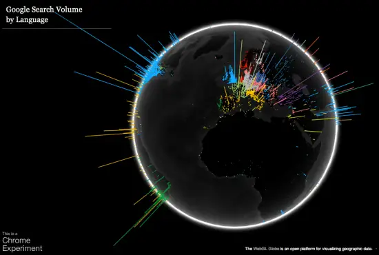
You can spin the globe by simply holding your mouse button and dragging it until you get to the region you want to see. Using the scroll wheel (or two finger swipes on MacBooks and Macs with a Magic Mouse) zooms in and out. Google’s even open sourced the project in case you want to see what they’ve done and apply some of it to your own projects. Cool stuff indeed. Check it out here. (Note: use Google Chrome if other browsers are giving you issues.) [Google via Pocket-Lint]








Maybe I am just stupid but I can’t find a color key. Anyone else?
my guess is that the colors are just to allow each country/nation to be seen individually.
You’d be wrong.
Well make an educated guess:
light blue – English
dark blue – Polish
green – French
dark green – Portuguese
grey – German
white – Finnish
orange – Spanish
yellow – Italian
purple – Turkish
….
figures.
I think organge is probably chinese, or there are a lot of spanish speaking people there. I think spanish is ymore of a mustard yellow color.
it doesn’t look like the US ever searches for anything….
That is not US, that’s Africa.
I’m surprised Spain looks empty