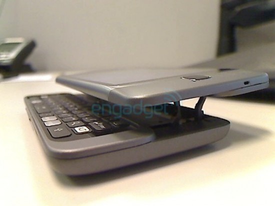
A Few Clearer T-Mobile G2 Images Showcase QWERTY Slider Mechanism

Most sliders stick to a pretty tried-and-true format, literally comprised of two halves that slide apart to reveal a QWERTY keyboard. The upcoming T-Mobile G2 accomplishes the same task, though the mechanism in place to divide the handset into its keyboard and screen is slightly different than what we are used to judging by a new round of slightly clearer leaked shots of the phone.
It appears that screen lifts away from the keyboard on a hinge and then slides flat to present the G2’s typing surface. The design decision is no doubt to facilitate a much thinner profile by shifting the component layout so that the larger internals can be stacked up in thicker parts of the casing which interlock like puzzle pieces to create as compact a design as possible.
A pretty neat design, but I get the sinking suspicion we could be hearing some complaints about weak hinges breaking after heavy use or more than one account of the phone’s two halves breaking apart. Maybe that is just the pessimist in me speaking. What do you guys think about the slider that is actually more like a stacker?
[via Engadget]