It feels like it wasn’t too long ago that the Google Play Store added those fancy colored status bars. It wasn’t that big a deal, just something that was introduced in KitKat. Today, Googler Kirill Grouchnikov is revealing some new changes making their way onto Google Play starting today, but it’s only for users running Lollipop.
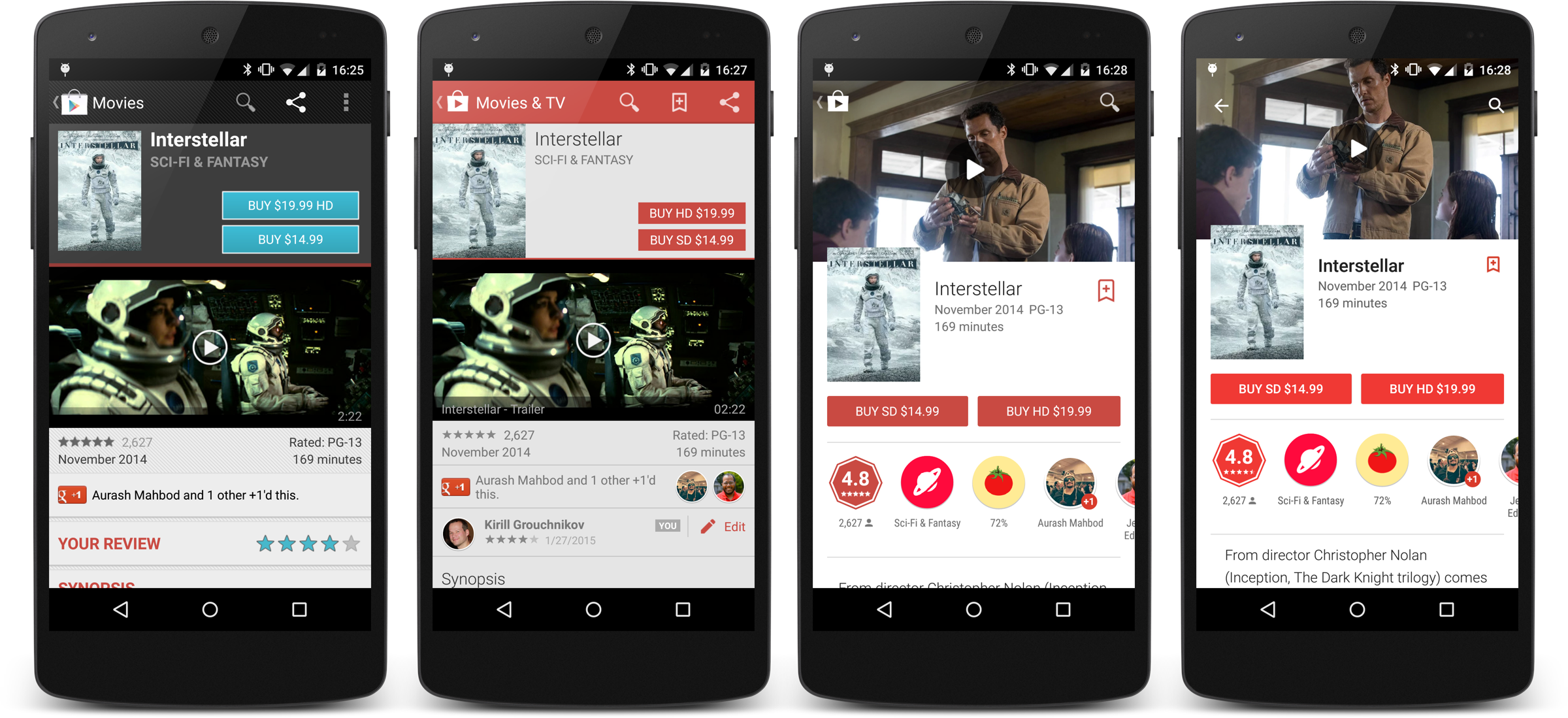
Evolution of the Google Play Store’s listings page
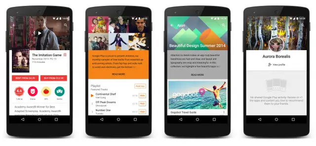
Once again, it’s not a big change, just a little something Android fans will get a kick out of. The Play Store now features transparent status bar when viewing listings, going full-on immersive in the latest update (Google Play 5.4). With the hero images for listings slowly inching higher up on your phone’s display, more content can be displayed below without scrolling. And that’s pretty neat.
For those that don’t feel like waiting for the updated Play Store to hit their device, you can download it from us below.
Download: Google Play Store 5.4.10
[Google+]





Still waiting for Pull Down to Refresh in My Apps.
Yeah – more than a couple time a day I force a refresh to see if updates are waiting.
(Swipe left and go to Store home, swipe left again and go back to My apps).
On my g3 I just check after my daily battery swap, the restart forces a check, plus seems to help with bugs when apps update without me having opened them since their last update.
Where’s that download link Chris?
It’s there now, sorry.
Thanks lol
Waiting on apk
Updated post with download link.
better, now they need to get rid of the black on the nav bar, it needlessly wastes around a half inch or so.
I’ve really loved the changes they’ve made from the beginning although I do sometimes miss the old magazine style they had for a while.
Speaking of the Play Store, if one has a suggestion for content to offer, how would one even go about it? Twitter? The only email they seem to provide is for purchase issues and such.
You can still send it via that email address, it will get forwarded to the correct department.
I can never see that upper left back button anymore, especially with the music app. Once again Google shows they don’t give a damn about usability.
Managed to switch my Play Store region using these steps https://thevpn.guru/change-google-play-store-region-country-vpn-help