Talk about the HTC One M9 at AndroidForums.com!
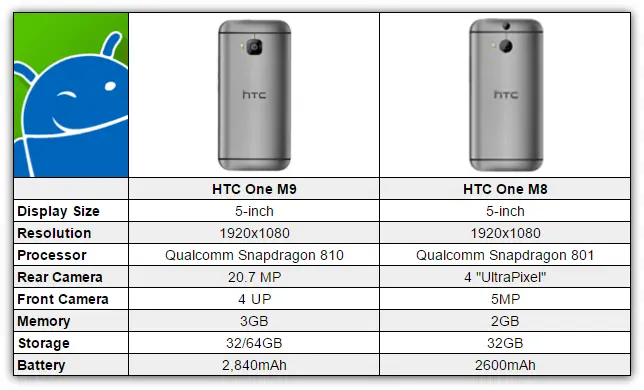
After all the leaks, rumors, and drama we can finally put the “official” stamp on the HTC One M9. There has been a lot of talk about the design of the M9. We shared the first leaked images of the M9, but there were some rumblings about that design being fake. Turns out we were right the first time. The M9 looks a lot like the M8 on the surface, but underneath they are very different.
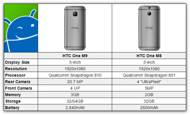
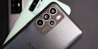
The biggest visual change can be seen on the back. The M9 has a square camera cut-out and there is no duo-camera set-up. HTC is of course raving about the performance of the M9 camera, but we’ll have to test that for ourselves. The M9 keeps the same 5-inch 1080p display from the M8, but that is where the similarities end.
The M9 is powered by the Qualcomm Snapdragon 810. The M9 should be buttery smooth and snappy. Another big improvement comes with the enlarged 2,840 mAh battery. More battery is always a good thing, especially when they can keep the size of the device the same.
The story of the M9 is going to be about how the design is “uninspired” or “lazy.” Let’s not forget that Apple and Samsung have been known to recycle designs for a couple of generations. People loved the design of the M8. Why try to reinvent the wheel every year. What do you think about the HTC One M9? Is it worth the upgrade?


Basically htc one m8 S, only incremental upgrades, they can’t pull it off they’re not apple
still looking better than samsung
That’s an idiotic statement, as an outsider who mainly sticks with Motorola, Samsung has a ton of hype going for them this year with a lot of new features not just upgrades.
And how does that translates into looks….FOH
“Still looking better than Samsung”, that statement makes it look like you are stating that HTC is looking better than Samsung at this point, not a specific phone. Use more context when making comments if you want to be specific.
How? The S6 is highly likely to be #1 in every category ranging from display quality, battery life to processor performance.
I dont know about processor performance/battery life. Of course we’ll have to wait for reviews but in the past the exynos was a little better at performing than snapdragon, but a little less efficient as well… and if the gs6 is going with a 2k display then i would think battery life might take a small hit.
And as I said look s…. You mentioned nothing about looks…. Design… That’s what I specifically said. And funny u say that because htc dominates Samsung in terms of rating for the last 2 yrs. FOH
Yep, but boring design.. Thought the edge would have less bezel and wrap a bit more.. Aw well.. Neither get my vote this time.
I’m not sure. That rumored Galaxy Edge looks pretty good, but I’m sure TouchWiz will bring it down like it always does with Galaxy devices in general.
I feel the same….but like you, we prolly not about to pay the price they gonna ask for
you mean the same thing every manufacturer does… upgrade the processor and camera and up the battery
This is not even Samsung lazy
Apple, Samsung, and HTC are all lazy. I hate when people use the “They do it too” excuse.
I don’t think they are lazy I think the consumers are spoiled. None of these phone designs need a major overhaul they look just fine. Were so spoilrd that we want drastic change just 12 months later. I personally wish phones would last 18-24 months before we saw the new version of it.
They do, just look at Apple.. Now htc and Sammy.. By the looks of it your good for 3 years now atleast.. Personally I love seeing yearly design change.. Doesn’t mean I will run out and buy it.. Its good for progression.. Lived when the g3 dropped with near no bezel or top or bottom borders.. That’s still a slicker looking design than either Sammy or htc latest offerings.. Lazy ass designs agreed!!
Se because they dont want to or choose not to make their phone the way YOU want it means they’re lazy…. My friend who only likes Galaxy devices (Note and S series) just told me today that he loves the physical home button even if that means keeping a larger bezel. My iPhone friends (mother, brother, friend) love the design of the iphone and dont want to necessarily see it change. So yeah it’d be nice to see them change but not soo soon and they arent lazy becasue you dont like it
Your right.. They aren’t lazy because I don’t like it.. They are lazy because they had a year to innovate and did a poor ass job dude.. What do you mean “not change so soon”. How is this soon? Htc been running same design since m7..Samsumg pretty much since s3 really, albeit more premium improvements. Has nothing to do with me not liking it.. Its just laziness because of the time line involved.. It doesn’t take a year to move a power button and ad a new chip.. Jesus they don’t even have the camera software ready a fricken year in.. Wtf these guys doin for 365..
You must have missed my previous point where I said I dont mind a design staying around for a few years. And jesus christ what more do yall want in terms of design minus the bezel. Less bezel is better to almost everyone but what else do you want. The phones beautiful both of them
Well Ya like u said.. Less bezel and increase the screen size within the body of the phone.. Get rid of that bar and bring the screen into the top and bottom borders more with less border.. I realize this has been said already tho by a previous poster.. Maybe change the angles a bit on the corners.. Give the phone a bit of a curve to the body.. Change up the back.. Give the back some sort of groove for better grip.. Just think outside the box a bit more and be progressive within a year.. Stray away from these iPhone looking type clones.. I mean look at the renders guys do online.. It never fails to bewilder me how these no names pull off these awesome pre release renders and then the the phone is released only to be a let down design wise.. Not saying they are ugly ass phones.. Just be nice to see more progression
What a let down in the design department.. I was really hoping for something special.
I love my m8 but I was hoping for more . I guess why HTC isn’t as big as Samsung . And probably never will be . Such a let down . And no mention of a HTC m9 plus ?????
Why is this a let down? So the device looks the same on the surface. They seem to have addressed the issues with the M8.
Still a let down… Black bar and bottom borders the same.. Bezels the same.. Could have increased screen size while shrinking bezels, even if only a bit to make it somthing… Sorta like lg from the g2 to g3..There has to be progression in aesthetics for today’s consumers.. Unless of course your Apple.. Ha
Depending on what Samsung unveils with the S6, the M7 I’m using now might be my last HTC. If you’re an M8 owner, I can’t imagine a reason to upgrade! What a snooze…
I like the way you included the back of the two phones : D makes sense.
Good improvements to take on other soon to be released flagship smartphones.
I wonder where the One M9 Plus is though, I’d be very interested in that if it exists.
Good question, I was waiting on the Prime announcement.
the m9 is thicker than the m8
0.0.2mm to be exact, and that is nothing!
I’m ok with it…I really wanted to the evileaks design to be true though. The things I’m truly disappointed in and really thing it was a big mistake is the lack of OIS on the camera. I also don’t see how they made the device thicker and bigger with the same screen size. With the same screen size it should have been at minimum the exact same size..but should have been smaller.
Looks like its going to be another tough year for htc.
Yeah, they should replace Peter Chou ! Guess I’ll be keeping my M8 a bit longer.
Was waiting for the m9 to be like the evleaks design, but now I can purchase the m8 with a clear head. M9 is not worth my money. And I love how they tried to stress the gold on the side.. Yeah it looks like sh*t.
Agreed that two toned gold crap on the side is ugly
Hey! Com on now.. It took them a year to stress that god damn gold on the side! Let’s be fair here! That’s a solid 365 worth of design here fella! SHEEEESH! . Gold borders OMG HTC PLEASE TAKE MY MONEY! haha
I will be buying the gun metal gray version. For sure.
It is horrible looking who wants two tone anything. I guess in Taiwan that’s a big thing . And what was the big announcement? The vr glasses that probably won’t be available to consumers this year. They will be making another announcement this filling for chapter 13
Its alright there wasn’t much to upgrade significantly so I like it.
Where’s the venom that has been thrown at Samsung and others for not making significant changes? Boring, and probably suffering from the same problems as the M7 and M8. But oh, it’s beautiful LOL Yea, like dung flung at a wall is perceived to be art.
I’ll toss the venom at Samsung and I own a note 3..They sucked! Plain and simple.. Both of them sucked, period.. Its all on lg and Sony now! They can run with this if done right.. Was considering going to htc after my note 3..That is if the evleak was true.. But now, NAAA
I hate to say it but my eyes are on Samsung now. I’m untreated to see the s6 edge. Hopefully LG gives us something worth a look too.
So I can’t say that the design has me in awe, it’s a solid device now… Fixed a lot of what’s wrong. But as an M8 owner I can’t help but wait to see what other manufacturers are going to bring out now.
On the same boat here
Uninspired and lazy? Please. If the phone does the job and is excellent, design is secondary. I don’t buy a smartphone just for looks, it’s not a doily on a chair, I need the thing to PERFORM and look good.
No, Design and Performance are hand and hand, they are equally important.
OK fine, it’s a great design, why change it? :D
They’re not equally important; functionality above looks always, otherwise you’re buying an overpriced piece of junk.
it should be called the m8 pro not m9
M8.1 lol
Tbh my only issue was try camera and I’m hearing it still Sucks
and where are you “hearing” this?
CNET, hands on review
that was ONE review. Lets wait and hear other reviews as non of us have had a hands on.
From Android authority and their video showcasing the m8 vs m9.
Don’t be a smart ass lol.
I’m not being a smart ass, but we all know, that reviews are not the “end all be all”. Correct?
Let see it in action, is the camera REALLY bad??
Overall graininess and poor low-light? HTC already said they’re releasing a software update to fix that
How can they release an update for software that wasn’t final when tested? I don’t get it. O.o
I done think I have that much faith in them to believe it’ll be fixed enough that it’s what most are hoping for.
Problem is the M7 set the bar so high ..the iPhone pretty much copied n pasted it’s design two years later ..it was an inevitable fall ….one I don’t think they can bounce back from
I’m curious about the Galaxy edge and toned down touchwiz
I don’t understand the “let down” comments. Those who are let down, why EXACTLY are you let down and what would you have preferred to have?
Is changing the design of a device needed every year/every other year/every three years to be relevant or innovative?
Get rid of the black bar and stretch the screen to a realistic size within that giant frame. Those speakers do not excuse the size. There.
I’ll give you that. However, outside of that how is the design of the device a “let down”?
That isn’t enough? It’s as tall as my nexus 6 with a full inch smaller display.
LOL OK OK OK LOL
It is a outdated.design not a.bad design just outdated. But to announce.something bid was going to be released then to just bring out last year’s design it a bit lazy . And how bad is.it.that a render of the device is better better looking and what everyone wanted. That would have been something big. Oh and this is sent from my HTC one m8.
Make it 6″
no…as the device has only been around for 3 year. I wouldn’t count the EVO 4G LTE or the various ONE+ devices.
It needed to be different. This is the M8.5
Yes it is actually.. Its all about progression.. Its why we are android fans and not apple.. Well part of the reason anyway. Personally, get rid of the huge borders.. Increase screen size while shrinking bezels.. Atleast somthing..Change the top and bottom angles a bit.. Innovate, atleast make that year you just had count for something…
My problem is that HTC could have and should have released this phone as last year’s M8. I mean really the only notable difference is the camera, which should have changed last year when people complained about the M7’s ultra-pixel.
HTC and others say “why fix the design if it ain’t broke.” Well the design is broke HTC that is what we have been saying this entire past year with the black bar and non-symmetrical speakers. Oh and let’s not forget that this year it is even more broke with the protruding camera.
“More battery is always a good thing, especially when they can keep the size of the device the same.”
But it’s not, it’s thicker. And the m8 design was terrible, repeating it is idiotic. A phone as tall as a nexus 6 with a full inch smaller display? All I have to say is, black bar.
what is it like living under a bridge?
Person insults. The last refuge of the intellectual coward.
Are you serious? The M8 is still more beautiful than anything else available as I type this. I don’t mind this, especially if they do go more extreme next year. I haven’t tired of the design yet. Add the improved specs and I’ll definitely be satisfied for the next year.
You people are never satisfied, the design is a great build and literally HTC made changes based on trends and customer feedback. If thoss specs are good to you then what more do you want? I like it and I’ve been hard core Samsung supporter. I’m sick of larger phones just cause, and bloat from TW. S6 may be a good phone but is going to be full of features that average users don’t take advantage of and have limited usefulness.
I know people are mad about the the lack of a complete redesign. It’s unfortunate for HTC that there was a fake design floating around that many people had fallen in love with. I’m happy with the M9 though. Evolutionary design or not, it still looks good and more importantly the hardware and new Sense features are great.
yawwwn. For the first time i have to say HTC blew it big time.
I like my m8 so the design is fine, the improvement in speed and camera may be interesting.
My problem is that HTC could have and should have released this phone as last year’s M8. I mean really the only notable difference is the camera, which should have changed last year when people complained about the M7’s ultra-pixel.
HTC and others say “why fix the design if it ain’t broke.” Well the design is broke HTC that is what we have been saying this entire past year with the black bar and non-symmetrical speakers. Oh and let’s not forget that this year it is even more broke with the protruding camera.
Hoping whatever issues people are experiencing with the camera can be remedied via software fixes before they hit the market. I’ve suffered long enough with a substandard camera on my otherwise awesome M7. Who makes the camera in the M9?
I wish they could have found a way to redesign the phone without the bezel with the logo, and making a small bump on the screen size wouldn’t have been the worst thing. Other than that, I think it was a good move to keep it largely the same. The M8 received nearly universal praise for the design, so why fix what isn’t broken? They upgraded the most important specs, including coming to their senses on the camera, so not much to complain about, here.
I want a bezeless tetrahedron..
um battery life for the 810 cant be that great with a sub-3k mAh battery, can it? and how would you consider this a “big improvement”? its a slight bump. Good thing its a beautiful phone and will probably be my next device unless LG wow’s me with the G4. =)