We’ve been curating hand-picked Android wallpapers for awhile now (see past editions here). Contrary to what some might think, not every awesome piece of high-res art or pictures will make a good fit on your Android’s homescreen. While this largely depends on personal tastes, generally, having a wallpaper that’s considered “too busy” can make it difficult to easily locate icons on your homescreen. This can be especially painful when you locate that perfect wallpaper or want to use a snapshot of a loved one, only to find it conflicts with your theme’s color pallet, or is simply too bright or (again) busy.
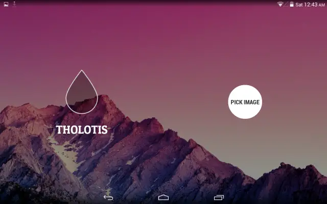
Tholotis is a wallpaper app who’s name comes from the Greek word for “blurriness” and looks to fix this first world problem by allowing users to not only defocus or blur backgrounds (making them appear less busy), but also tint/dim background images as well. The app utilizes the same open-source design resources as Muzei and features a clean and minimal interface that’s easy to navigate.
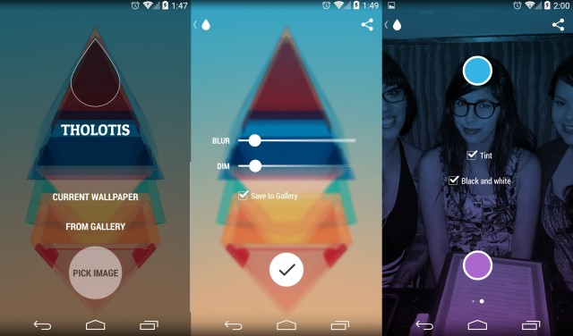
Although free to download, there is an in-purchase (located by swiping left on the main screen) that unlocks the ability to color tint images as well (see right screenshot above). While this may not sound too appealing, we were surprised to find how wonderfully well this works with photos taken using your phone. Tholotis is definitely one of those must-have Android apps for anyone who enjoys customizing their homescreens to perfection. Download link provided below.








Muzei does blurring already for me, that is all I need. I love Muzei…all the add-ons and the features for such a simple app…just wonderful!
Came here to say the same thing. I don’t even like the blur tbh. I look for images the exact right size so they don’t need to be doctored.
I prefer the blur tbh, for the reason given in this article. The blur and the auto-rotate between selected images is what I use now on Muzei…whenever I come across a cool new wallpaper I jsut add it to the rotation :D
Not gonna lie Chris, this is pretty good. While the wallpaper I have has great colours and had a flat look, adding just a little blur actually blended well with the icon pack I’m using on Nova (Aurora UI for those interested)
Pic Say Pro does too, but I’ll check this out.
This is also nice. Blurone:
https://play.google.com/store/apps/details?id=com.nexdev.blurone
It’s a good idea as I currently use Photoshop to do this and an integrated app would be a simpler approach. For me it would need gradients to be a full alternative though, usually I don’t want to darken the whole wallpaper but just the parts of it that make it hard to read the clock and other text.