One look at the most recently announced smartwatches from LG, Samsung, and Motorola tells you the chunky, geeky smartwatches we’ve come to know and hate seem to be a thing of the past. Each company got a bit antsy by announcing their latest smart watch products well ahead of IFA Berlin. Consumers will soon have a stylish selection of smartwatches the likes of which we’ve never seen before, but which one takes the cake?
LG G Watch R
On LG’s side, they officially confirmed the circular LG G Watch R (find a hearty LG G Watch R image gallery here) that seems to be a direct answer to Motorola’s attention-grabbing Moto 360.
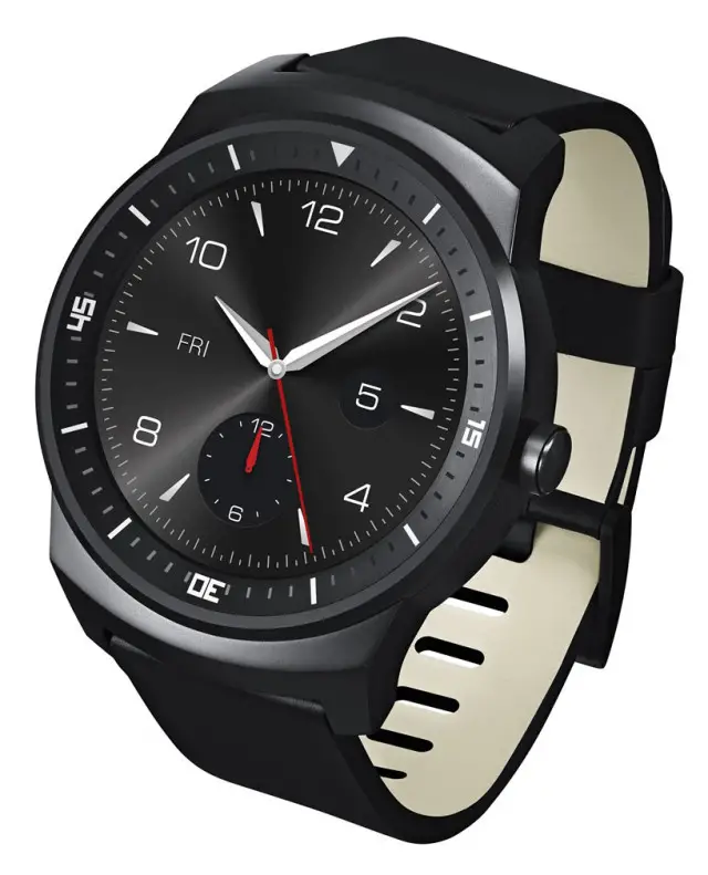
The LG G Watch R is upping the ante just a tad in terms of sheer performance with its 1.2GHz Snapdragon 400 chipset. Other key specs include:
- 1.3-inch P-OLED Display (320 x 320)
- 4GB Storage
- 512MB RAM
- 410mAh Battery
- IP67 Certification
For more, check out the full LG G Watch R Specs.
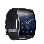
Samsung Gear S
Samsung decided to go with a more traditional form factor with the Samsung Gear S, though it stands out by having a curved display (don’t see that too often in a smart watch) and its own dedicated 3G radios.
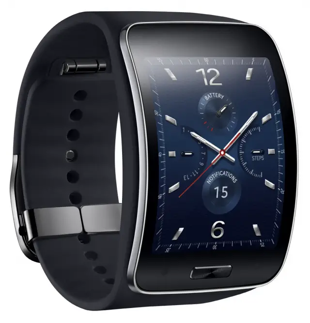
Some important notes on the Gear S:
- It runs Tizen OS, not Android
- It also comes in White
- 2-inch Super AMOLED display at 480 x 360
Could Samsung’s decision on the white band be in anticipation of Apple making a similar move?
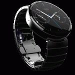
Moto 360
This is the one that started the whole “Round Smartwatch” Android Wear craze, yet it’s the only of the three whose specs we still don’t know.
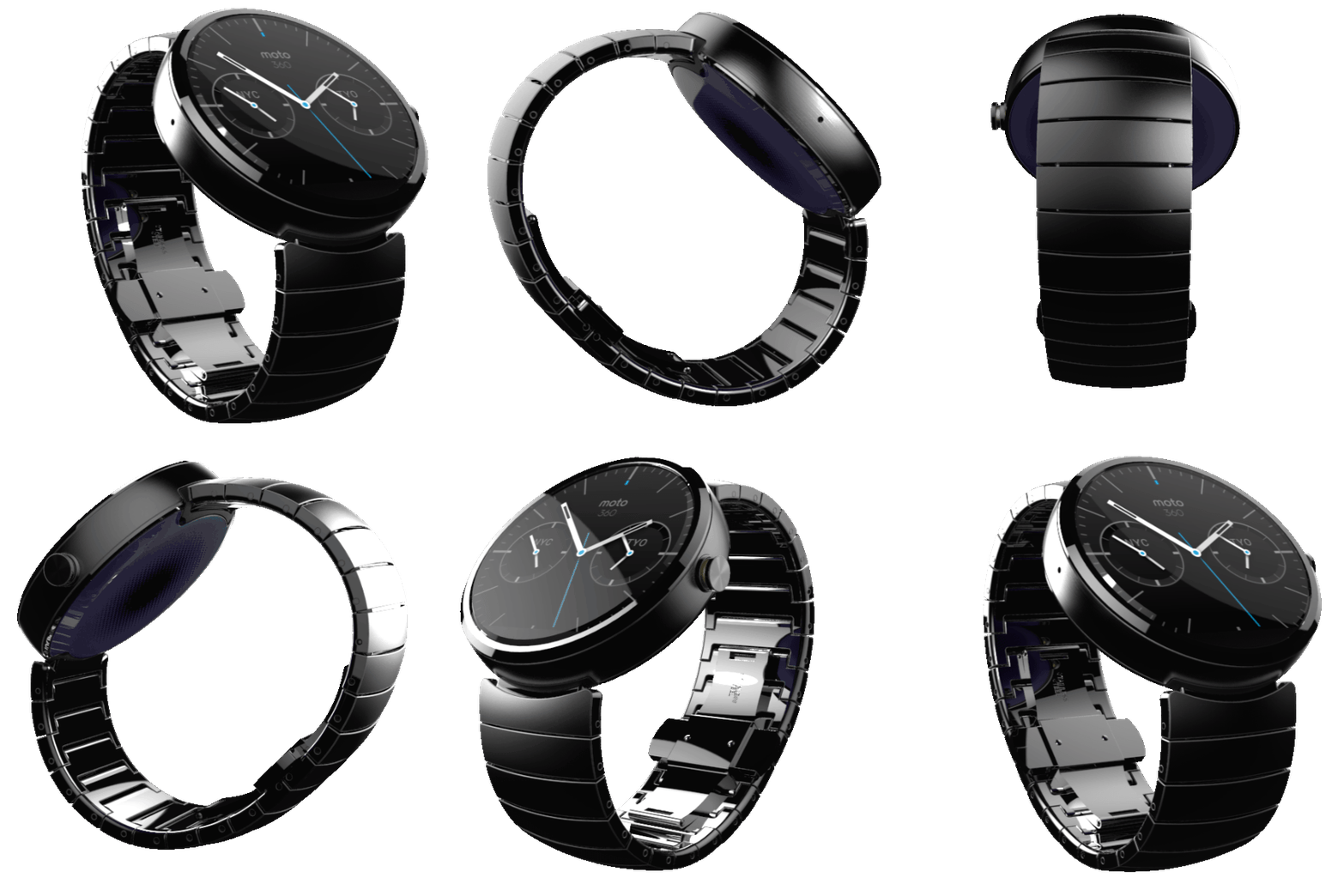
When it was first unveiled, it seemed there wasn’t a single thing on the planet like it. Now, just days ahead of its launch, it’s got some sizeable competition.
Which one looks best?
With that, IFA just effectively became a big fatal 4-way brawl (if you’re counting the ASUS ZenWatch that was officially announced but has yet to be shown in full glory). Each of these devices has reasons for folks to be excited, but we’re curious to hear what you think about their design in particular. LG and Motorola’s options certainly are eye-popping, though the Gear S doesn’t look too bad either. Which of the 3 do you link looks best?
[polldaddy poll=8272551]
Because smartwatches are also fashion accessories, a greater proportion of the purchase decision will be put on their design, but let’s not overlook their functionality. Jumping into the silicon, the devices all stack up fairly well against each other, though there are enough differences to note when you go to make your purchase decision this fall.
Don’t judge a watch by its face
The LG G Watch R is upping the ante just a tad in terms of sheer performance with its 1.2GHz Snapdragon 400 chipset. The Gear S’s bigger display and higher resolution could be a winning factor for some, though the G Watch R’s display should look just as crisp at its small size and round form factor. The Moto 360 boasts a slightly bigger display than the G Watch R at 1.5 inches, though the resolution is slightly lower at 320 x 290.
Which to choose, which to choose?
The design will undoubtedly play a huge role in your decision, but let’s be honest- there are more factors that come into play.
So that brings us to the ultimate question: which smart watch will end up getting your money? Let us know in the comments below! Don’t forget to circle back next week starting September 3rd as we’ll be getting up close and personal with many of these options ourselves.

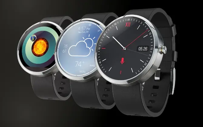



The new LG Round closes the gap significantly compared to the earlier watches but the Moto 360 still looks miles ahead of everything else in my opinion.
Agreed
I really wish that the Moto 360 didn’t have the black bar on the bottom, cutting off a part of the watch face…
The bar holds the ambient light sensor (and other tech). The 360 at this time is the only one that has that.
I read elsewhere that for it to get an accurate reading, it has to reside on the same plain as the screen. If it were on the side, you would get a different light reading than the watchface. The only other alternative would be to add bezel and/or lugs all around to house the sensor.
Kill the black bar, and it would definitely be the first Android smart watch I buy.
They both look pretty cool, but I’m not a watch guy, so I wont be buying either.
I still like the 360 because it’s a more casual look and there is less bezel.
Without knowing all the data on the 360 I would have to go with the R. But I will wait and see what comes out for both first.
Moto 360 of course. Not only does it look the best, but as for the G Watch R (which we have yet to see an ACTUAL picture of, and it running Android Wear) those renders are HORRENDOUS. They don’t even look “somewhat” real.
Maybe because renders aren’t exactly real. Just as the moto 360 isn’t exactly 360 :)
Except it is. Last I checked, the watch face of the Moto 360 is a circle. Last I checked, the Moto 360 is rightfully named as such for its circular watch face.
No, it’s not a face because there’s nothing on it (would you say that someone has a face if there’s 2 eyes and a nose on the head but the mouth is missing?). A normal circular watch face would have its tick marks all around the face. Moto cuts them off from around 5 to 7.
beyond dumb
If you’ve already placed money down for the 360, any opposing view will sound dumb. I’m not even interested in a smartwatch but I have to hand it to LG for being first with a true 360 watch.
The only watch LG has presented is a super ugly, bland, plastic, rectangle black slab with corrosion issues.
I think the Watch R looks like a cheap plastic watch. If its cheaper than the 360 then I’ll consider it, but the 360 looks like more of a traditional dress watch that you’d find rather than a “Shark” surfer’s watch like the Watch R.
As far as the Samsung goes?
Huh? What are you thinking Samsung? NOBODY WANTS TIZEN.
I like the LG watch, probably because of the exact reason you stated, I loved Shark watches when I was younger (wow, total flashback, I haven’t thought about those in about 10-15 years lol).
The G watch R has a stainless steel body.
Interesting.
To my eyes the LG watch looks more classy than the Moto.
Obviously judging based on computer renders leaves a lot up in the air. The same “shape” can be made to look much more in vogue depending on the material/finish and band.
Six months ago I lost my job and after that I was fortunate enough to stumble upon a great website which literally saved me. I started working for them online and in a short time after I’ve started averaging 15k a month… The best thing was that cause I am not that computer savvy all I needed was some basic typing skills and internet access to start… This is where to start>WagePress.com
Moto 360 FTW!!
None! I can get the time on my S4 just fine.
360. Really, how much tech will an Android Wear device actually require to do it’s job? Probably not much.
Plastic vs metal…similar to phones, it comes to preference. My phone i want to be durable (of course i use a case) but a watch, i want it to stand out, pop, and make people comment on it. The 360 looks to do just that.
Yes, people will comment about the black bar on the bottom that covers up the ticks from 5 to 7.
The Moto 360 looks nice and fancy whereas the LG R just have the natural feel of a watch I would wear every day. I like both and I think price will also influence my final decision.
360 easily….i like classy watches more then sports watches…so ill go with the 360 over the lg g watch r(lol @ that name)
To me, its too early to purchase a smart watch.. Technology is still in its infancy.
Not sure how many people saw the LG press release: “encased in a strong, durable stainless steel frame”, “an Ingress Protection Rating of IP67, the LG G Watch R is designed to run for up to 30 minutes in one meter of water” and “1.3-inch full circle P-OLED display that produces stunning image clarity even under bright sunlight and superb clarity when viewed from any angle”. This new LG watch might be a stronger competitor to the Moto 360 than people thought…
Depending on functionality (camera & I/R BLASTER) as on the SAMSUNG GEAR 2 &
if the carriers come up with a discounted smartwatch plan,akin to adding a 2nd line, I’m all-in for the SAMSUNG GEAR S .
I want to get one of these, but I am not sure I can rationalize going for something that is going to weigh that much on my wrist. I’ve grown accustomed to the irrationally lightweight wristwatch. When I see stainless steel as one of the perks of the design, I completely lose interest.
I’ve been rocking aluminum swatches for the past 8 years, and I don’t need some super tough material. Heavier doesn’t mean better.
I dig the G Watch mostly because it looks like a traditional watch. I don’t need my tech to “make a statement about my individuality.”
And you would REALLY pay $300 for something that looks like a traditional watch like THAT?
Entirely too premature to say if I would find sufficient value in any of these non-released marketing exercises.
That said, I certainly wouldn’t pay a premium for a watch that tries to “make a statement.”
That watch is not my cup of tea, and smart or not, I have to find a watch I wear to be attractive and fit my personal style. This LG watch does not. Having said that, smart or not, I would never pay more than $30-$50 for a watch that looks like that.
Glad I asked?
No idea what they means
I actually think the LG watch will be a non-show. They did the same thing with LG Fitness Band Tracker….a load of hype but then nothing!
Moto 360
It looks a ton classier, which is important to me.
It has more health features so I can use it when running. Built-in heart rate monitor is a killer feature if true.
Heart rate monitors w/ bluetooth are $50 alone, so that saves money for me.
But none of the watches advertise the weight. For all we know the 360 could weigh like a brick.
Agreed on the HRM. That’s the biggest sales point for me as well. Anything that needs a secondary sensor for HRM is just not getting my money.
there’s a difference between HRM that requires you to be still vs one you can take while exercising
Before you name that the feature that gets you to buy, let’s wait and see if it actually works. The Basis B1 fitness band has built in HRM, but it doesn’t work very well during anything other than just light exercise.
True, but those devices use Optical HRM technology.
Basically they shine a lite at your skin and as the blood flows it causes more and less light to be absorbed. The camera monitors the rate of the fluctuation and calculates the pulse. The problem is, wiggle of a loose watch can be confused with blood flow.
Assuming the HRM for the Moto 360 is on the back of the watch, it looks as if it uses some other technology (probably EKG):
http://www.droid-life.com/wp-content/uploads/2014/06/Moto-360-10.jpg
TI has a paper on doing EKG with their processors (interestingly, the Moto 360 is using a TI chip, IIRC):
http://www.ti.com/lit/an/slaa486a/slaa486a.pdf
EKG is a much more accurate, if not harder, method.
I’m pretty sure the 360 does use an Optical HRM. There are images of the covering tape removed from the back showing this. I’ll see if i can find it.
Even in a smartwatch a heart rate monitor is still unnecessary and the vast majority of people (those who aren’t exercise nuts or suffer from a serious medical condition) will agree.
In other news Disney files lawsuit against Motorola for patent infringement! Defense asks judge to throw case on grounds that their design resembles a small wall clock.
In other news Apple sues Motorola because they just have to sue something. It’s what they do.
I love the actual watch face and curved display on the Sammy… but lol Tizen and I’m not a huge fan of the band and clasp. It’s ugly. 360 or bust.
Lg has a divit to me it would get annoying to swipe to different screens. Its not flat like the moto 360. Moto 360 for the win for now.
moto 360 of course but they lose a few points for not having a full circle screen, you would think they could have moved that to the edge of the watch rather than on the screen.
LG G Watch R of course but they lose a few points for having a slightly larger bezel
If there’s one thing I can say about Motorola, it’s that they make amazing accessories to accompany their devices. To this day, they still have had the best car dock I’ve ever had the pleasure of using, which is huge in Los Angeles, since majority of us spend more time in our cars than our homes or offices. I’m actually very intrigued to see what the new bluetooth will be, as well, and how that will work in conjunction with the moto 360 and Android phones.
what everyone is failing to realize is that the lg g watch r has a huge bezel surrounding the display. the moto 360’s bezel is only the little black bar at the bottom. if anyone is complaining about the moto 360’s bezel they should be ten times more displeased with the lg g watch’s bezel
Especially since said bezel has numbers and hashes on it. Like custom faces? Not any that don’t work with that look.
…and that imprinted dial positions on the freaking bezel, which was completely stupid. What about all of the nontraditional watch faces. They make the bezel a far worse waste of space than the black bar on the 360 in my opinion.
People complaining about about the black bar on the 360 need to understand that it contains the ambient light sensor. It can be inferred that the GWAR (G Watch R) doesn’t have one otherwise LG would’ve used it to prove it’s watch can be better than Motorola’s.
I’m sure they’re aware of the bars functionality, that doesn’t change the fact that they don’t like that it takes up what would otherwise be screen space. I’m one of those people who doesn’t care for it, simply because it throws off the aesthetic qualities of having a round screen in the first place…that and I don’t use automatic brightness settings on my phone, so I wouldn’t need it on my watch.
…and while I’m with you in thinking that it’s an ambient light sensor, I’ve heard other people say that it could be a display driver.
It’s both. I posted this further down.
“I read elsewhere that for it to get an accurate reading, it has to reside on the same plain as the screen. If it were on the side, you would get a different light reading than the watchface. The only other alternative would be to add bezel and/or lugs all around to house the sensor.”
Only it doesn’t. With black bar in tow, the Moto 360 STILL has the most screen space of all of these Android Wear watches. As for you knot using auto brightness on your phone, a watch is a completely different thing. Your phone is not strapped to your wrist at all times, and constantly lighting up, while there.
LG has plenty of other specs but for a watch, the most important selling point is that first and foremost it looks like a watch. Otherwise, you don’t get anyone into the door.
How many people are you getting through the door to spend $300 on something that looks like a $30-$50 watch from Walmart?
Who knows…last night my father found someone wearing a Samsung Gear…
A Samsung Gear looks NOTHING like a $30 Walmart watch. The G Watch R DOES.
Are you familiar with the band GWAR? I don’t listen to their music but your acronym reminded me of their crazy costumes I’ve seen on TV, haha.
I think the LG one looks the best. It’s not too large, not too small and I love the sporty look to it. As always Samsung’s is ugly. Motorolas looks good too. I think it comes down to price
Definitely the Moto 360. That said smartwatches are pointless I’ll stick with my Victorinox Swiss Army Infantry. Not buying another device when I only need an Android phone.
What’s that? A Bluetooth Swiss Army Knife?
LG is the only true 360 watch. Too bad Moto took the name first without actually delivering. I’m not a moto hater and I don’t have anything to do with LG products but every time I see the Moto, I just have to call it the “Moto close but not quite 360.”
Looking at that large but stylish bezel on the GWR I wonder if the Bezel might be hiding something like what we see on the 360. I guess we’ll have to wait for an iFixit teardown to know for sure.
I’d bet the G Watch R is SQUARE with a circle slapped on top! LOL.
Well you enjoy your LG G Watch R Upside Down 30, and I’ll enjoy my sexy, sweet Moto close but not quite 360.
Lots of watches have an upside down 30, such as this $10,000 Louis Vuitton http://hypebeast.com/2012/10/louis-vuitton-tambour-diving-ii-chronograph
No one said anything about other watches. And even mentioning Louis Vuitton or even $10,000 alone in the same sentence as this fake poorly computer generated copycat atrocity is BEYOND FUNNY! Hahahahaha!
still going with the 360. Samsung’s non-changeable band means it’s almost certainly not going to fit my wrist, and I don’t need a 3G radio on my wrist, just a window into my phone (note 3). I hate that look of the LG offering, that stupid “casio” looking border around the periphery….why not just do that on-screen? Plus, if there is anything Moto has always done right, it’s hardware, and with a watch which requires a little more durability and build quality, that’s the track record which matters.
Whichever is smaller since I have small wrists. It seems like the LG is smaller but it also has more bezel so we’ll see once there are some actual videos comparing them both.
The 360 was not bad at first, but now that I’ve seen the Gear S and LG G watch, the 360 doesn’t look so great anymore.
The Gear S is actually quite sexy, while the LG G watch looks like a real man’s watch.
The 360 kind of looks like a poor man’s hipster watch.
I’d say the LG G watch, Gear S(exy), and Gear Fit are the most beautiful ones so far.
Hah, funny how our definition of sexy differs. The Gear S is probably one of the ugliest things I’ve seen in a long while. Oddly rectangular shape, that stock watch face is atrocious as well. 8% of people really want a mini phone-lookalike strapped to their wrist?
Hell yeah it’s sexy. It’s the best of what’s available, along with the LG G watch and the Gear Fit.
LOL. The Gear R looks like a $50 Timex or Casio from Walmart. And you think that looks rich and sexy?
Sorry LG, but the dial positions imprinted on the bezel were an iditiotic decision. They are not only redundant to some watch faces, they are a completely pointless distraction with an watch faces that are nontraditional such as speedometer, digital, or multiple gauge layouts, etc.
Yeah…I agree that’s a dumb decision that had nothing to do with any tech limitation
Wait, what?!? I never even looked that closely; I just assumed that was part of the rendering for the display. Wow, that really is pretty bad…
It’s not pointless. It’s decorative bezel to hide the functional bezel.
Right, keep telling yourself that. Until you load a watch face that doesn’t have a circular dial or dial at all.
Dude, I’m on your side! LOL. That’s what I hate sometimes about typing…it’s hard to detect the sarcasm. My point was, the “point,” of that atrocious bezel is to camouflage the even uglier bezel that is beneath it.
I thought so, but wasn’t 100% sure. Certainly couldn’t let you have the last word if you weren’t!
The bezel on the LG would seem to offer more protection for the screen…but I am hard on watches.
I think most ppl just vote for the 60 because of the hype but the R looks the best hands down.
I don’t care at all about any hype. I voted for the 360 because it’s the only one in the bunch that has a nice metal band instead of a cheap swatch-looking rubber/plastic one. As far as body design goes, I think they’re both good looking and for me it’s a wash right there. The sample display face on the R does look best, but choosing it for that is like picking a TV based on the movie that’s playing on the showroom model…
The band is easily replaceable to your liking, not the actual watch itself. Besides, the “cheap” plastic points are really getting old. Not everything needs to be metal ppl. Some of the best things out there are made out of plastic so don’t fall for the plastic = cheap nonsense. Plastic has nothing but advantages here.
Is it really replaceable? I haven’t read anything that suggests it uses any kind of standard strap, so we might be stuck with only what they offer. I stopped wearing watches with plastic straps when i got into high school; I’m not about to start again now.
Even if it was replaceable with a beautiful strap though, that just left the R and the 360 tied in looks for me. But then further down the page somebody brought something up that I hadn’t even noticed: Some of the dial marks on the R are part of the actual bezel and not part of the on-screen display. That’s just a really weird and ugly design decision IMO… It only looks good if you use a display face that looks good with those. Otherwise it just looks out of place or ruins a more minimalist watch face design
I assume it is replaceable, I don’t see why it wouldn’t when the competition offers the ability to replace the band.
Good point about the dial mark, but I think that until we actually see the devices for real we can’t know.
Yeah, hopefully even if that is the current design they can revise that before they ship… I’d much rather have the choice of 2 watches that are about equal in looks than have just the one option.
Watchlovers love their watch faces and love to change the straps often. If the strap is easier to replace then that is a win. That is Watch Selling 101. Of course companies are known to have brain farts time and again…
I voted for the 360. And I voted for it because it looks better than the other two.
Ouch
http://i.imgur.com/1T4NsGx.png
I’ll “feel the gap” over the thick dail marked bezel. Now if LG loses the dail marks and shrinks that bezel some I would be more interested.
I would have been all over the Lg R if it had just 4 clear shiny zirconium stones or swarovski crystals on the 12, 3, 6, and 9 positions….if LG would have added just a tiny refined touch of bling bling… Hands down the decision would be tighter between the 360 and LG R.
Moto could have added some slight bling around the metal band of the 360….i dont know i just like the bling…worse comes to worse, i could always bring it to a custom jeweler to notch in some holes and some diamonds, or some swarovski’s
You’re reminding me of the Conan Gold iPhone 5s skit. :p
Correct me if i am wrong but arent the pictures of the R renderings and not the actual watch. Ill make my decision when i see a hands on.
I’ll wait till someone creates an round Android wear device that is shock, true water resistance 100M-300M. Maybe Casio ;)
You’ll be waiting for a while as it needs to be a resistive touch screen in order to be used in water, otherwise what’s the point of so much water resistance. Look at the Tissot SeaTouch as an example semi smart diving watch. Also they’re marketing to the masses that think IP67 is enough for all basic needs.
I’m hoping for sapphire crystal, but I’m not holding my breath.
I don’t want to use it in the water O.o I want to be able to swim and not worry about my $300 watch leaking, or having to remove it anytime I want to swim or bike riding and worry with the possibility of wrecking.
I have had them all Gear,Neo 2, LG G watch, Pebble Steel (not all but a few).
Pebble Steel is what I liked best but I just would like the Android wear OS.
Honestly what’s the point of watches nowadays when we have classy looking phones with the time on them?