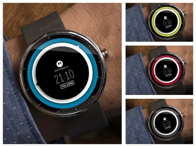
The Moto 360 smartwatch with Android Wear is one of the most highly anticipated devices of 2014. Motorola and Google simultaneously blew our minds when this attractive device was announced. We’ve seen many smartwatches in the past with Android, but there is something very special about the Moto 360: it’s round. This simple design feature has captured the imagination of techies everywhere.
This is best displayed on Motorola’s Moto 360 Design Face-Off contest page. Thousands of watch faces have been entered in this contest. Motorola will soon be choosing a winner, but until then we have scoured the entries and chosen some personal favorites. Enjoy!
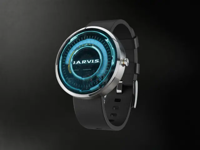
Jarvis
This design was created to make it seem like the watch is powered by JARVIS, Tony Stark’s AI computer assistant. You may not have an Iron Man suit at your disposal, but a Moto 360 with JARVIS is close enough. Fun fact: JARVIS stands for “Just A Rather Very Intelligent System.”
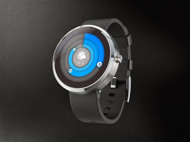
Circle-based Clock
In this design the hours, minutes, and seconds are displayed with circles that grow to represent the time. On the outside of the rings is the day of the week and the date. At the center of the face is the current weather conditions and temperature. It’s a very attractive and information-rich design.
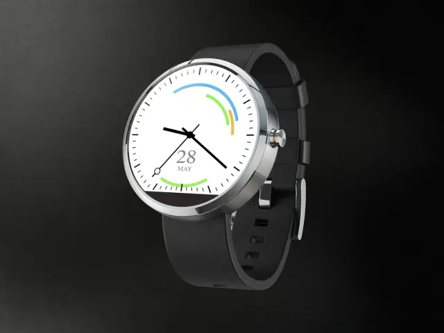
Calendar Clock
At first this seems like a very simple and plain watch, but there is more than that. The colored lines represent events on your calendar. You can visually see how close your are to an upcoming event, or see if you are currently at an event. This is very handy for anyone with a loaded calendar.
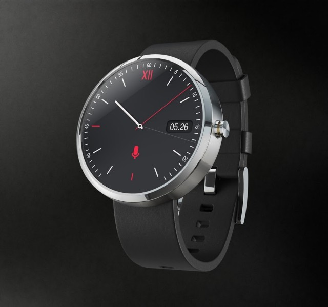
Moto Simple
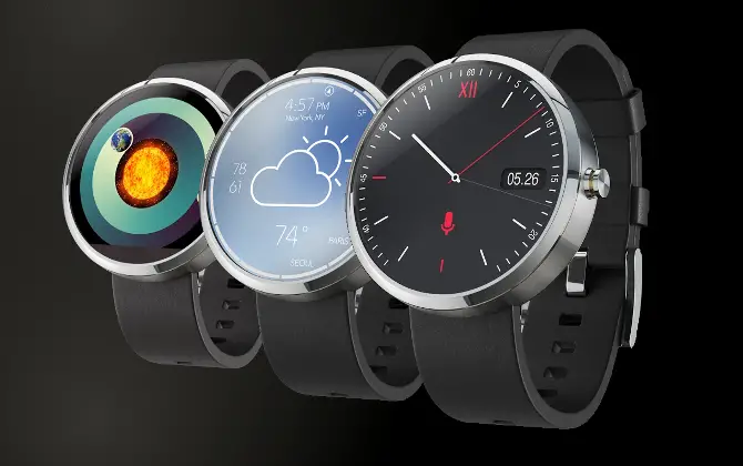
Simplicity is sometimes an overlooked feature. This clock face has tons of it. Simple clock hands show what time it is, and a realistic-looking cutout displays the date. There is also a handy shortcut to perform a voice command.
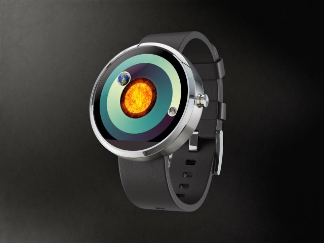
COSMOS Clock
Are you a COSMOS fan? This is the watch face for you. At the center is our bright sun, with the Earth and Moon revolving around it to display the hours and minutes. There are no numbers to show the time, making this watch a bit abstract, but it is visually stunning nonetheless.
Fitbit Concept
This design is a concept for an Android Wear Fitbit app. With your Fitbit on your wrist or in your pocket you will easily be able to pull up this app and check your progress. This is super handy since most Fitbit devices don’t have displays. The 360 could be the perfect companion to a Fitbit.
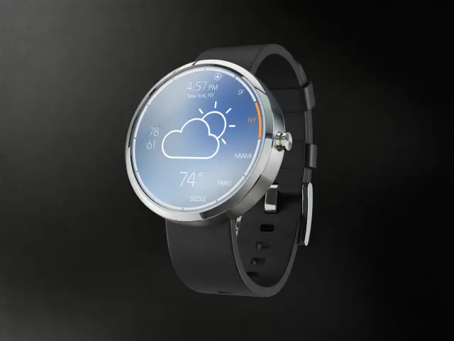
Simple Weather Clock
One of the most common reasons for pulling your phone out of your pocket is to check the weather. Moto 360 will make this even easier, especially with this clock face. At the center is a big icon for the current conditions and the temperature underneath. Even the high and low can be found on the left side. On the right side you can switch locations to browse the weather, and up top is of course the time.
Minimal & Elegant
This watch face is called “Minimal & Elegant,” and that is exactly how we would describe it. Instead of the usual clock face you always see, this one uses a revolving row of numbers for the hour and minutes. It also displays the date underneath. We would love to have this on our watch.
Translucent Discs
Another take on the classic watch is this face that uses discs. The discs don’t really help you tell the time (that is done with the hands), but they subtle move and create a cool effect. We like the Tron-like design of this watch. It’s futuristic while using the classic time-keeping mechanism.
Classic Mickey
Everyone has seen the classic Mickey Mouse watch at some time or another. This guy has been around for a long time. Mickey’s arms act as the hour and minute hand which make it very fun. We would love to see a hyper-realistic Mickey Mouse watch face like this. Nostalgia is a powerful drug.
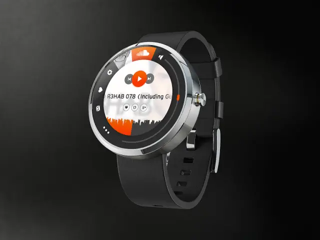
Soundcloud Concept
Here we have another app concept for Android Wear. This time it’s for the music service Soundcloud. There is a lot going on in this concept. Along the right side is a volume slider, across the bottom is the progress of the track, along the left side is shortcuts, and in the middle there is play and pause. This would be an awesome remote for Soundcloud.
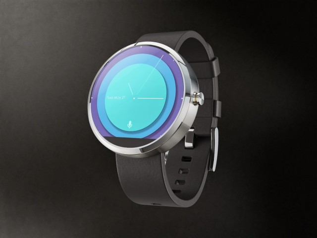
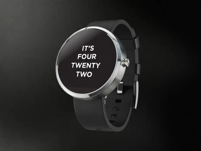
Simple Text
“Hey, what time is it?”
IT’S FOUR TWENTY TWO
“Okay, cool.”
It doesn’t get much simpler than that.
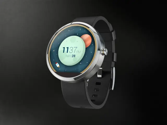
Space & Time
Space: the final frontier for watch faces. The second design on our list with a space them is a little more cartoonish, but that is why we love it. This design uses clean vector graphics to show the moon, a planet, and a cute little space ship. It also shows the time, which is critically important.
Modern Retro
“Modern Retro” may sound like oxymoron, but there is nothing moronic about this watch. It shows the time with stacked discs that have small arrows to point at the hours and minutes. If that is too difficult you can just check the digital time on the center of the screen, as well as date. Very snazzy looking.
Motogotchi
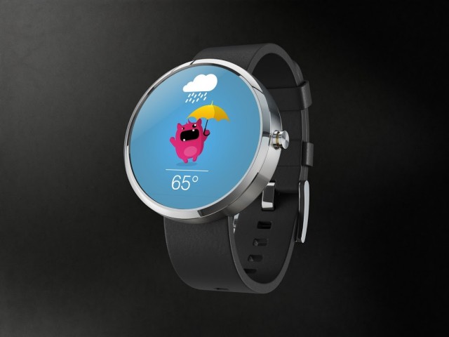
A cute little creature on your watch at all times sounds pretty cool. But what if that creature could also interact with the weather conditions? That is exactly the proposed idea for this watch face, which has been accurately named “Motogotchi.” Hopefully this one is less addictive.
Lambdλ Watchfaces
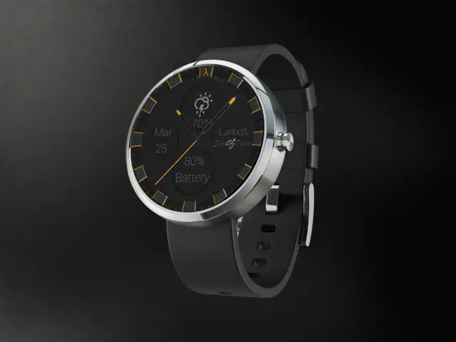
This watch is cool because it looks like something a diver would wear. Instead of specialized read-outs for depth and oxygen we have the weather, date, and battery information. You can use this watch face to feel like a marine biologist without getting your hands wet (the 360 will also appreciate that).
Chin Invert
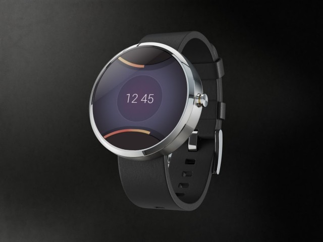
You may have noticed a “chin” on the bottom of some of these designs. That is something that will be in the final design of the Moto 360. In most designs it looks out-of-place, but in this one it was used in the design. The designer put it at the top of the display to make every symmetrical. It’s a very nice balanced look.
***
Now it’s your turn! All of the submissions can be seen here. It’s amazing how many different designs have been submitted. We can’t wait to see some of these in real life. What are your favorites from the list? Do you like the watch faces that we chose? Let us know in the comments if you plan on getting a Moto 360.











I. Can’t. Wait.
Damn skippy ;)
For some reason this is exactly the words I was looking for.
this list is missing tons of better ones.
Of course it is. There are over a thousand entries. This is just 17.
I think it’s a matter of taste. I’m with you that there are tons of others I liked more and I noticed most of them were very complex looking… seems like Joe just prefers simple?
I’m sure they will look great on the sideplate that is Moto 360. http://wp.me/pSjiW-AU7 Just try get your hand in your pocket waring that!
I have an Invicta that is bigger.. mine has huge knobs that will dig in my wrist but once you wear it for a week it’s not bad getting used to it and avoiding disconfort.
Thats good news, I have a G shock thats pretty big buy that looks like it will hang over your wrist big time.
What’s the eta of the release of said watch!!!???
I would hedge my bets at Google I/O 2014 ;) for official release news more than likely a week or 2 after to keep the hype going.
Really cool stuff.
All Awesome!
I’ll wait for Googles and HTCs versions. If I wanted something to look like a regular watch, id buy a regular watch.
I was hoping this would be out by my birthday this month, but at this point, I’ll be surprised if I have one by xmas.
What is the expected price
$$$
More than a dollar, less than a million dollars.
Just say you don’t know
I guarantee that my prediction will prove to be technically right. And as we all know, that’s the best kind of right.
is the totally round face in or out! I want it to be totally round and not that bottom part seen in some pics, ROUND, COMPLETELY, PLEASE!
Its not going to be completely round… Maybe wait for the Moto One (if they go with the xbox name scheme)
Woah I’m just sold on the 360.
It’s all about the Xbox 1 now buddy.
It’s so misleading for them to show as uncropped, full screen like that.
I seriously lost all interest once that Black Bar of Death™ showed up.
For the simple text clock, I hope you could swipe up to have it reverse the reading direction. Then if someone asks for the time you just swipe up and let them read it.
But seriously, this watch continues to draw my interest even as I try to tell myself I won’t ever wear a watch again.
you prick
For you to be right, it should also give the option to two finger swipe so they can read the new screen, “Time for you to buy a watch.”
now with visuals (sorry for the aweful photoshop)
Sorry for the aweful (i’m in awe of how bad this is) shop…
great comment!
Sorry for the aweful (i’m in awe of how bad this is) pshop…
Soz for the aweful (i’m in awe of how bad this is) fotoshopz
That would be really fun to do to people… Muahahaha
I’ll use whatever face saves me the most battery.
I’m sure it would never fly legally, but something modded to look like the HYT H1 or H2 would be super awesome.
A weather radar would be great for a watch face. Show the time, today’s high/low temps, touch it once for an hourly forecast, a second time for 7-day forecast, and double tap for app drawer. Bam….. Profit
The black bar chin of doom makes me extremely sad. I think I will let some other early adopters be the guinea pigs for this and wait for a fixed version 2 with no chin.
Seriously. The Moto 360 is the first smart watch that has me even somewhat interested, but that ugly cut-off just makes it look unfinished. Was there really some insurmountable technical problem that prevented them from making the entire display round?
I’m hoping there will be an option to change the faces even after they pick a default. That would be great for trying new looks whenever the mood strikes.
I am soooo ready to buy this.
Ian B
Love the simple weather one. And I have ALWAYS been a fan of the simple text watch face. Can I please place my pre order, already?
Can’t wait for this…
Wow this post got me hyped again! Are they real or concepts? … Can they make it happen?
That Jarvis is nice!.. I will try to put this on my Galaxy Gear until it comes out.
What’s the screen burn like on smart watches? My GNex has a pale band in landscape mode where the bottom buttons are in portrait mode. Wouldn’t want the hour numbers burnt in after a couple of years.
My gnex had the same problem but I’ve been using a gs3 for over a year without trouble. So I would say its been fixed.
I really love the look of the Jarvis one. The Calendar Clock is also great as it’s simple and yet the calendar appointment times are really functional and useful. As for the Moto Simple, I love this for it’s minimalistic look. It looks like a normal watch with the addition for the microphone icon which makes it really powerful. The thing I really love about all of this is that I can see them just being themes that could just be changed very easily. Better yet, may be an app that can switch the themes based on different conditions. So give me a different theme when I’m home vs at work vs anywhere else. I’m so fired up about this. the Moto X+1 with the Moto 360 could be my next smartphone and my first smartwatch.
Somebody needs to turn this into a watch face ASAP:
someone needs to turn your face into a watch
And your watch into a face
Liking these designs. Moto Simple and Space & Time both caught my eye as something I would run (if I ever got a smartwatch).
As I think about this more I fear that I am being taken in by media hype that may never be realized. All these designs are fantastic and show what the watch could be. However, there is no guarantee that even a significant fraction of these designs will ever be turned into functional watch faces. Crafting an idealized image (even a moving gif) is a lot easier than providing the functionality envisioned.
Even if Motorola isn’t able to turn these designs into functional watch faces, I’m sure some developer will write an app that allows people to do so.
They all look awesome. I just have this feeling that the moto360 is going to be too thick. I’m going to wait and see.
Has Moto ever explained why this device has the Black Bar of Death? I was sold until I realized that it was going to include a design “feature” that makes it look like part of the screen has just stopped working.
Too fat for my taste. I’m already fat enough. =T
as a mechanical watch type of person (and a computer engineer) i’m oddly fascinated by the moto 360. i want one but i’m not sure i’d be willing to ditch my nice Bulova mechanical watch for it, but surely if i were in the market for a watch i’d strongly consider the 360.
I’d be very disappointed if the Cosmos one didn’t accurately show the phases of the moon, the day/night terminator on the earth and a current image of the sun where you could see sunspot/flare activity instead of static images…