We honestly weren’t sure we could suffer through another flagship iteration using LG’s stale old user interface. What was good during the age of Ice Cream Sandwich isn’t sitting so well with us anymore, especially after seeing what rival OEMs like HTC and Samsung are bringing to the table. The good news? It looks like LG has finally gotten the hint, and for upcoming LG G3, will be giving their UI a much needed facelift.
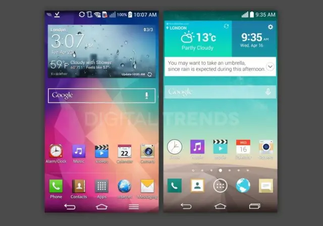
Old vs new
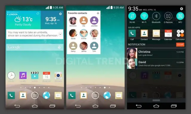
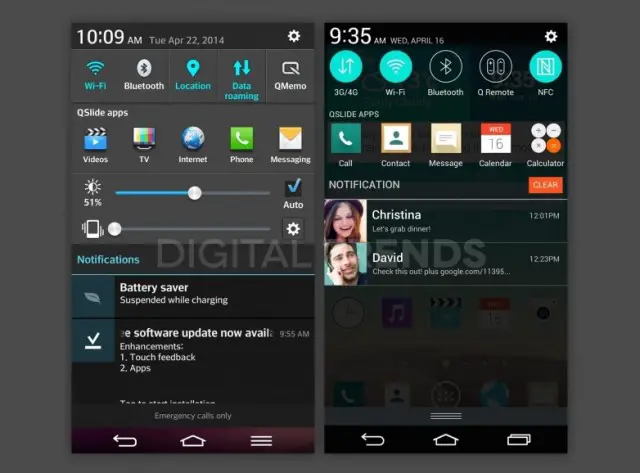
The folks at Digital Trends have nabbed some screenshots taken from the upcoming LG G3, confirming once again not only a 1440×2560 resolution display, but a departure from LG’s previous skeuomorphic design. Instead, we find a design much more in tune with what we’re seeing in iOS 7 (round, bright colored settings icons), and a much more flat, minimal icon set. We have to admit, it looks leaps and bounds better than before.
Old vs new
Apparently, a refreshed UI isn’t the only trick LG has up their sleeves for the G3, with a new “Concierge” supposedly in the works as well (because voice controlled personal assistants are all the rage these days). You can see a brief glimpse of their concierge in action in the weather widget, where concierge is recommending the user bring an umbrella. According to sources, other contextual based information will be displayed here, similar to Google Now.
No word on when — or even if — LG will get around to updating their older devices to this new UI. Typically, LG drags their feet when it comes to software updates on older devices, so don’t go holding your breath. We’ll keep you updated.




I like it, it’s leaps and bounds better than my G2’s UI… Even if LG doesn’t update their UI on other phones, I’m sure a dev on XDA will hook us up. .
They should update the G2 when the new KitKat patch is sent out… LOL just a dream
Looks like they use the google now launcher… see in the top picture on the right, it has the page indicators? The one on the far left is a G, same thing that the google now launcher does
Huh? The Google Now launcher doesn’t have a G on the far left. They’re all circles (looking at it right now).
I guess it doesn’t have it now. I just checked on my phone. I know it used to have it though… except maybe not a G
Never had a “G” dude… But their Launcher being more in line with the Google Experience Launcher is a nice touch
Never said it had a G… I only said it is similar to what the google now launcher does
Ewwwwwww,don’t F***up a good thing LG,the notification bar/pull-down doesn’t need all that noise from the clownish-sized icons……
square icons? BLAHHHHHHHHHHH
Yeah, especially with the circle ones thrown in… It’s a bit inconsistent. Other than that it looks nice though.
That’s the name of the game. Observe HTC+Samsung->copy->improve-> release after two months. That’s the recipe for the perfect smartphone. It ain’t copying if it’s better.
P.S. The home-screen shot is non-legit, as it’s clearly taken with the Google Now Launcher. However, the pull-down menu is legit-looking and looks amazing.
Why would you think the home screen shot isn’t legit? That weather and clock widget looks quite similar to LG Isai’s. And icons are the same as in notifications.
I think it’s similar to the Google Now launcher, but it’s not the same thing. There’s a tiny “G” on the far left home screen indicator. If I had to guess, that’s where LG’s new concierge will be.
The tiny G! Good observation!
Way better than the previous UI on LG devices… its more refined, cleaner, somewhat flatter and lighter looking…. I can definitely dig it. But PLEASEEEE include some type of blinkfeed/google now homescreen… I’d actually cop this over the M8.
If you look close, you’ll see a tiny “G” on the far left home screen indicator. I’m guessing that’s where LG’s new concierge/BlinkFeed/MyMagazines app will be.
Yea I saw that, I’m hope it is… Something along of the lines of BlinkFeed as opposed to Google Now would be dreamy, but I’d take either really.
is it just me or does that color scheme look a little to pastel-y? reminds me of ios for some reason
It’s just you. Stop trolling and get a life.
Why is he a troll? Because he dared to mention iOS? I hate douches like you who can’t even have a sensible discussion without bringing attitude along.
Says Master Doucé
Especially with a profile picture like he has. Screams 14 year old all over it.
Yeah…pretty ugly color scheme. Not as bad as ios though.
looks good. still going to get replaced by nova
Nova ftw!
This looks waaay nicer than before!
Looks like TouchiOS7
Or iWiz?
LG was doing well until the CEO made this announcement: “iWizzed on my phone.”
Has anyone heard when they are going to update the Tmobile Gflex?
Had the G2 and while the hardware was nice, the camera lag and terrible pictures made me hate it. Funny thing was, I was never able to find anyone else complaining about it so I had no idea how to fix it.
Am I the only one to have had the issue? If not, how could that be an acceptable flaw?
Can confirm: camera sucks. But it hasn’t been laggy for me. Captures shots pretty darn quick.
I think he means the “viewfinder” is laggy. As in it isn’t smooth when you move the camera around.
Both really. The camera seemed to take forever to focus and take a pic, often just resulting in a blurry pic regardless. The stutter in the ‘viewfinder’ made me constantly think I was doing something wrong. It came to a point where I just stopped using the camera at all.
I find the camera speed and quality to be pretty important to me. I’m not a ‘photographer’ and am certainly not trying to be. I have small kids though and need the ability to catch my 3 year old doing 3 year old stuff. I had to get rid of the phone so he didn’t think we didn’t like him at this age as he is reviewing old pics later in life.
M8 easily has one of the fastest and most reliable shutter speeds available. my GF had a similar problem the OP spoke of with the S5 she got on contract, for such a “terrific” camera it took blury pics all the time, shutter speed with the flash on was terrible. She today finally got an M8, couldnt be happier with camera performance
I have the GS4 and the camera works pretty well. Hard to believe they went backwards, but maybe it’s just that I have had Samsung phones for a bit and have gotten used to their shortcomings.
I think you’re right tho, I don’t believe the S4 had any real problems with its camera. So it might by the software/view finder on the S5. A possible software update may take care of that. But its hard having to wait or depend on a software upgrade fixing that when it should be working good out the box.
if you turn auto flash off its pretty quick none the less.
Can confirm: Camera is fine. See, opinions eh . . . wonderful as they are, they are not ‘confirmation’ of anything.
g2 bad camera??lolol what??
If you’re willing to root your G2 (very quick and easy), there’s a mod by xdabebb on Xda that installs like an app (or flashes in recovery if you prefer) and is night and day better than the stock camera. He’s reduced LG’s post aggressive processing and even added new features. It’s well worth the install.
Nice article, bro.
Hey look! Apple made a flat UI. Let’s do that!
Coke and Pepsi were copying each other before phones had colour screens, let alone touch screens, haha.
Virtual buttons.
YUCK.
Can you hold this L for me?
i feel the same way about hardware buttons
Same here lol.
I feel the same way about physical keyboards. Fyi, install the root app Pimp my Rom. You can hide virtual buttons by using the app. If you don’t like hardware keys don’t buy a device with them.
I dont buy them lol. I was tempted to get the gs5 in spite of the home button, but i didnt pull the trigger. i can hide virtual buttons in my dirty unicorn rom just by hitting expand in the pulldown, but thanks for the tip anyway.
Actually it’s pretty easy (if you’re rooted, as most commenters here seem to be) to enable softkeys and disable hardkeys. A lot of phones (especially samsungs) dissappear completely when they’re disabled.
Virtual buttons grow on you. Especially since immersive modes. Some of my favorite games are implementing them, so they’re not a hassle.
I can play Super Hexagon with all my screen. So they’re not that big of a deal, heck it’s not deal at all.
Immersive mode works about as well as a bag of rocks does for a headache. The notification bar and buttons don’t disappear worth sh&*.
I usually hate LG’s UI but this is gorgeous. Apart from the touchwiz like quick toggles though.
Still the hideous square icons? Why? And for the record I am sick of the unified “flat/card” UI give me my drop shadows and skeumorphism back lol
No. skeumorphism needs to go extinct once and for all.
Toggles belong on the toggle screen. My notification area needs to be clear for all my notifications.
But how about they hand over that weather widget? I like how it’s telling you to “take an umbrella”.
Would love to see this ui update come to my gpad, but I won’t hold my breath.
This looks gorgeous and clean! What held me back from buying a GFlex was the UI, but if the follow-up has this, I will STRONGLY consider it :)