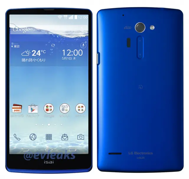
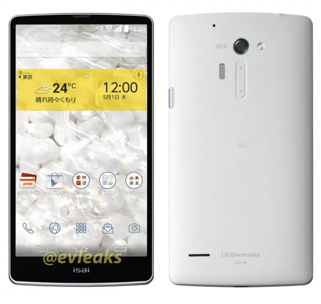
In the wee hours of last night, @evleaks dropped a nice little leak for us to drool over. What you’re looking at is what Mr. Leaks claims to be the upcoming LG Isai FL, a phone that is sure to make the bezel-hating crowd scream in glee. But not so fast — this model is only for Japanese carrier “au” by KDDI.
While it’s rare to see a Japanese smartphone make its way to other parts of the globe, it’s entirely possible we’re simply looking at the Japanese variant of the rumored LG G3. You’ll notice what appears to be LG’s trademark rear button placement which is found on the LG G2 and the LG G2 Mini (and the LG G Flex), and given last year’s Isai (L22) was the G2, it’s likely the above pictured L24 is the G3. Really, we can only speculate at this point.
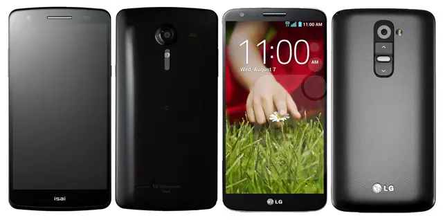
Last year’s Isai (left) compared with the LG G2 (right)
Given the LG G2 already had some of the smallest bezels on the market, LG really only has themselves to 1-up. With a rumored 2K display and Snapdragon 801 processor — would the Isai design make a worthy upgrade to last year’s LG G2?
[Google+ | via BGR | Image credit: DroidSans]







I really love the front, however, the buttons seem too flush and hard to find by touch alone.
Where’s the front facing camera and the rest of the sensors?
Bottom ala Xperia ZL? Never even paid attention to the fact they weren’t there. Then again, it’s just a render at this point…
Hey Chris remember how we were talking about this on that other thread ?? It’s looking real good man lol
Considering this is just a testing japanese variant and the final will be much better- Looking really good so far!
Finally they came up with standard Android soft buttons layout and physical Power button. Now I can recommend LG phone!
Lg is seriously making some good looking phones.
Shut up and take my money!
Like the N5, that is a seriously slick and classy looking phone. GIVE IT TO ME!!!!
With this design…I’m okay with whatever specs they want to offer…. but still keep em high end please
Isai that looks promising.
Dat bezel though
the side bezel is ugly but i highly doubt they’d make the LG G3’s bezel bigger than it’s predecessor. In my opinion, they’re probably gonna pull a samsung/apple and release the same looking product, with a small slight modification to the look and re-release it as a ‘breakthrough’ in technology.
Their isn’t much else they can do. The slimmer the bezels the more alike they look.
Those buttons are WAY too tiny!
If this is the G3, a Korean/US variant could look a little different.
It had better, because there is no way I’d be able to hit those every time I tried.
I hope so. I think it’s safe to say these “leaks” get leaked out on purpose so that the manufacturer can maybe fix last minute alterations. I mean they gotta have some guy they hire to find out what we the people want right? So let the criticism flow so they can address the matter. Plus it’s like free advertisement for them to keep people interested instead of clueless and settling for something else =D
Virtual buttons. Pass.
funny, cuz im the opposite
Hey sexy, you gonna be my N6?
But then where would the fat phone provider logo go? Nothing like a giant verizon logo to cover my entire phone.. -__-
Verizon is going to make their logo transparent and plaster it right in the middle of the screen. When the screen is off in a dark room, the logo will glow in the dark and spot on the ceiling like the Bat-signal.
Or put it on the home button… the ONSCREEN home button. Muahahaha
that was funny lol. i could see it. oh and theyd put a logo above the flash on the back too, so when u take pictures, u see a shadow outline of the verizon logo.
SADLY it would have to go on the back. Don’t worry though, it’d still be bigger than the LG logo :P
Verizon needs to be given a giant kick in the ‘nads for their obsessive brand marketing on devices.
Any idea when the G3 will be officially announced?
Current rumors point to a June announcement. LG wants to release this bad boy before everyone upgrades to a GS5/One M8/Xperia Z2.
My Jump on T-Mobile isn’t until July 18 anyway.
SPIN IT UPSIDE DOWN. The smaller bezel should be on the bottom so the nav buttons can balance out the bezel (bigger side). That’s how they do it on the Moto X, and it looks perfect.
thank u this +10000000000
Come to daddy
I could care less about the front camera. How about the build a mirroring system to where they can get light from the front of the phone through a tiny slit (telescope) and sit the speakers on the back. I’d take a thicker phone with minimal bezel and curved glass like the n4
Bezels are too big