
We know that you Phandroids love apps and app updates, so we’ve been working hard to bring you just that. After many months of blood, sweat, and tears we’re proud to announce a major update to our Phandroid News app. With our app you can stay up to date with Android news, search our site for your favorite topics, find out what’s going on with the Mobile Roar Podcast, and leave insightful comments.
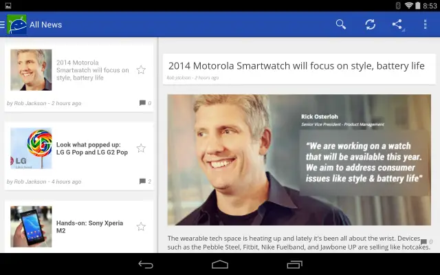
Version 2.0 of Android News by Phandroid brought a lot of graphical changes as well as plenty of under the hood code additions. We know that Android fans have become accustomed to a thing or two regarding Android design guidelines, so our latest update adds some much needed #HOLOYOLO over our previous iteration.
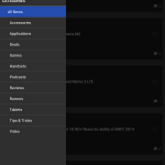
- We added a slideout navigation menu that displays all of our site categories to help you find the Android news you’re looking for.
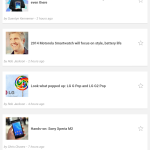
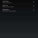
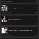
- We’ve also implemented a nifty Cards UI, mimicking what you’ll find in Google’s arsenal of apps.
- Like a dark theme? You can now swap between light and dark themes from settings.
- You can now swipe down from the top to refresh the displayed articles or comments.
- Speaking of comments, you can easily log into our Disqus comment system with your Disqus credentials, Google+, Facebook, or Twitter.
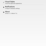
- You can customize your notifications to stay up to date with Phandroid, choose vibration settings, toggle notification light, or sound alerts.
- Don’t have the greatest eyesight for reading on a mobile device? Why not increase your font size under our visual options?
- Find an article you like or want to comment on later? Just star it for easy access.
- Widgets. Android news on your homescreen. Need I say more?
Head on over to the Google Play Store and download the Phandroid News app. It works great on both phones and tablets.
Don’t forget to drop by the comments below and let the man, the myth, the legend (our app developer) Steve Albright know what you think. We appreciate your support and hope you love the updates: we’re trying our best to earn your 5-Star Review! Your feedback helps us continue to improve so we look forward to your comments!






The new app is beautiful! Definitely loving this update =) Great work guys!^^
Glad to hear it!
About bleeping time. Excited!
***EDIT***
Excited, but already forced closed in about 30 seconds on my stock Nexus 5 :(
Hmmmm… if it happens again, shoot steve and I an e-mail at firstnames at phandroid dot com and we’ll get it ironed out. Sorry for the irritation and thanks for your support/feedback!
Nexus 5 is my main test phone so I am surprised. Like Rob said.. just get a hold of us if it keeps happening and I am sure we can figure out what’s happening.
No auto cache clear option & no option to turn off ads. I’ll pass for now……
An ad-free paid version is in the works. Stay tuned.
Cool. I know everyone has bills to pay, glad an option will be available. Win/Win.
We’ve heard a lot of feedback regarding the ads and we’re still collecting feedback. In reality, the time and resources investment for development was huge and we felt the ads were tastefully integrated. We’ll definitely offer an ad-free version in some form or another but have some things to consider in that regard.
I’ll chat with Steve about the cache but I can tell you this: we tried to make the app settings as simple as possible while considering the user’s needs in our defaults. Given the growing size of device storage we didn’t consider this app’s defaults to be much of a burden. That being said, maybe we’ll have some “Advanced Settings” that allow people who want more fine tuned options to tinker a bit.
Thanks for your feedback!
Glad to hear the staff is in tune w/the audience/membership.
As I stated in response to Derek, a Premium/PRO version is a welcome option.
I realize maintaining a site isn’t funded by UNICEF & have no problem w/some sort of alternate means of collecting revenue.
BTW, totally dig the dark theme, NICE TOUCH!
As long as the ads don’t hang the app waiting for location or internet connection I’m fine with it.
Great app guys, loving the dark theme and adjustable font.
Love it but it would be better to make the dark theme real black, IMO.
Always looking for feedback like this. I will do some experimenting. Any apps out on the Play Store that you just love their dark theme?
I just redownloaded the app after uninstalling it months ago. Really nice job with the new design and I’m digging the dark theme.
Just a small request, would it possible to jump straight to the comments from the news feed without having to click into the news? Otherwise everything else looks good!
It’s a thought and would be helpful for folks who already commented that want to continue following them.
Not sure if it’d be best for the collective whole, though. I think we’d get a lot of people jumping directly to the comments posting assumptions based on the title without reading the actual article. Or possibly people trying to open the article who accidentally click on the comment bubble.
But it’s a pretty good suggestion… we’ll chat about it. Any clarification on the above will help. Thanks!
Loving the update but are pictures now viewable in the comments?
This on my list todo… I will try to get this done in one of the coming updates.
Glad to hear it. New app looks amazing man.
The app looks great. No complaints ;)
Overall a pretty good job. I am personally not a fan of the card look since it greatly reduces information density, but I understand the design choice given the evolving modern UI direction for touch devices. It’s just too much white space that could be better put to use IMHO.
However, I gratefully give bonus points for the ability to disable the card styling in favor of the format that better suits the high DPI of my phone display. 5 stars gentlemen.
I did notice one bug. Leaving comments is a bit difficult with a “one line height” worth of space, especially when trying to review a post before submitting, so part way into this I rotated from portrait to landscape. This kicked me out of the comment section and back to the main article, losing the text I had started to input. (Nexus 5).
That tidbit aside, Keep up the great work!
Thanks for the feedback! That’s actually a bug I’ve noticed before and forgot to report to Steve… probably because I was leaving a 2000 word encyclopedia post and quit the interwebz for the day due to frustration.
Why would it only show one line of text when typing multiple lines? it’s more intuitive to show all lines you’ve typed and it works fine in the old app.
Excellent job guys. I’ll still be primarily using gReader as it tracks all my reading but I’ll definitely be going to yours when I have a few articles in line. Would there be any way to link up our gReader (Feedly) account in order to see the same new/read/starred info? Otherwise it is great.
Thank goodness you have the option of removing the cards, I’m a fan of the list as it uses the most real estate.
Edit-
Noticed you can’t open polls from within article. Also can’t ‘open article in browser’ through the article, you have to go back to the main list. Finally it’d be good to open videos within the app instead of heading to YouTube.
So far so good, very clean, takes a bit to load an article but that’s probably due to images which look superb in app.
5/5
Glad you like the app and the options. Some people have been rating us 1-star for simple changes that they could adjust in the options!
Can you explain a bit on your gReader/Feedly idea and share how you would see that working in the perfect world?
Well since Google Reader left I’ve been using a Feedly account for all my site reading. It tracks my unread/read/starred items (u/r/s). I use the gReader app as it utilizes my Feedly account but in a cleaner UI.
I read or view every single article you guys post, so instead of having different u/r/s I’d love everything synchronized through Feedly, or any account that you guys could implement. Example, how can I move my starred items if I change phones?
I understand if it’s not possible because you’d more than likely 1. have to use Feedly servers/feed instead of your own, OR 2. simply because Feedly aggregates all news and not just a single source it’s not feasible.
Nonetheless I’m sticking to your app as dark theme is so simple but so great for me.
Opening the article in browser is essential.
Fantastic update guys and I’m glad you’ll be implementing a donate option :)
5/5 even with ads.
Nice update. But I’m wondering why you are not catching links and allow opening them in the app. E.g. I like to browse all my news on twitter, but would love to have the links open in the app instead of the browser. It really shouldn’t be that difficult to implement.
Please get on board on Google Currents / Google Play News stand. Although the app is good, it is a pain going through multiple apps for each blog we follow.
You can follow the Phandroid feed on both apps no problem.
good update!
Feels great
Too many ads , and the apk doesnt run on the iPhone , uninstalled
Still pending for Apple approval. Any month now…
You guys forgot the make bacon feature. 1 star. Just kidding :) it’s awesome.
I love it! Dark theme, large fonts are the best! Bye bye Feedly!
Can comment editing be implemented?
GJ Steve. The two-pane layout for tablets was long-overdue.
Still, I’m sticking with Feedly + Chrome for most of my news, because I got tired of having a dozen apps installed for each of my favorite sites (AP, Verge, Engadget, NYT, etc etc) often with lesser functionality than web.
Exactly. I too just use a browser. I can’t see having an app for every site/forum I visit.
New version sucks.
Was waiting for this update like forever… Love it! Great jobs his