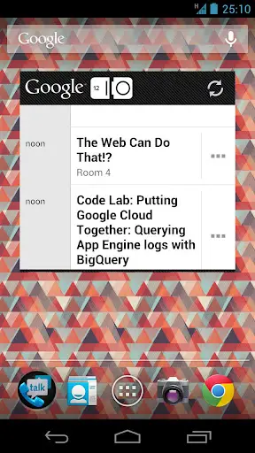
We pretty much know next to nothing regarding the next version of Android 4.1 (tentative version number) Jelly Bean. There’s been murmurings and rumors on what could possibly change in terms of features, but when it comes to a change in the Ice Cream Sandwich UI, we expected little to no change at all. Well, in today’s update for the Google I/O companion app, we may have gotten a little clue on at least one design change in Jelly Bean, starting with the Google search bar.
A slight deviation from the Holo (read: Tron) UI introduced in ICS, the Google search bar is not solid and transparent, while still maintaining a flat, minimal look. Are we looking too much into this? Have we already caught the Google I/O fever? Yes, and yes. If you guys have any idea what we’re looking at, feel free to shout out.





Is Google Cloud something new? I wonder what that might be from the screenshot appointment at noon? Could it be games and apps syncing data across devices? One week from now seems too long!
I found google’s business cloud platform that is probably what the widget is referring to. Just a guess though
Yeah, those are the sessions. We’ve fully analyzed those for any clues but nothing. Google Cloud is just a session on cloud apps and whatnot.
Their clock is broken. When is it ever 25:10
In Mountain View. They work overtime. Literally O_o
Must be some secret!
Google i/o
Android presentation
List of Jelly Bean features:
-Desktop mode for when connected through HDMI with BT mouse and keyboard
-Majel Voice operated Android assistant (control your phone with only your voice, no need to pull it out of your pocket when you want to lsiten to some music, enable wifi, send a message or call someone with a headset on)
-Guest profiles
-Introduces new time format, in which days have 42 hours as it was always meant to be
-3d textured Maps
“Android announces official strategic partnership with canonical and brings ubuntu for android to every Jelly Bean device!”
This would make me cream my pants.
would love it!
Would it make you Ice Cream your pants…or possibly Krispy Kreme your pants? Eh…eh?
Yep. said all the haters wanna be me.
I like the guest profile feature if it true.
It’s not broken, the clock and the icons are easter egg clues
25th of October, maybe?
why would an American company not use the American dating system?
Because 10:25 is a real time and wouldn’t seem like a clue.
25(OCT) = 21(DEC)
10/25 on Nexus & by 12/21 on all new devices
octal = decimal :-)
Google went back to G-d and asked for more time… so he gave them a broken clock :)
Global Dynamics? Yeah, I could see them running Google. ;-)
http://eureka.wikia.com/wiki/Global_Dynamics
Maybe Jelly Bean or Nexus-4 comes out 10/25? Who knows.
Maybe Oct 25th is a tentative release date? Or… when Skynet goes online at Google! XD
makes sense!!
Inception.
In Soviet Russia the clock watches you
More Google Voice/+ integration calling it now.
Yes plz!
Wish I was goin to IO. Can’t wait to see what they say about Android.
I’m super hyped. I’ll take lots of video so everyone can feel like they were really there :D
don’t take video’s, take some of the loot with ya!
Nothing says “I’ve been at google i/o 2012” better than a stolen Google-staff nameplate. If possible grab me some of those Project Glass glasses :D
Last year I took one of their pillows. No lie O_o
http://youtu.be/i-8cst_tZuE
I’ll re-iterate myself. Project glasses or something else that you are not supposed to take with you and has this written on it: “Google i/o 2012″…..otherwise it could be any pillow…..
But try to aim for the glasses…..seriously….or get the word out that they need to send me a pair :D
You should also send me all the free stuff you get! I need a tablet ;)
The time of the digital clock is 25:10…..OMG~~
25:10 backwards is October 25th. The day they’re going to launch the next NEXUS!!! :O
no. not backwards. In all the world it is October 25th. Just in America backwards
For a second there, I thought you said America wasn’t the only country in the world…
Don’t you mean only in America it is October 25th while the rest of the world it is the 25th of October?
;)
Maybe it won’t be announced/ released in America first? A London launch like the Galaxy S3 for the next Nexus?
Who announces release dates (to the day) four months in the future?
Could be 10:25, European-style.
Not really, in Europe hours come before minutes… so 25:10 is probably a date. 25th of October.
In everywhere, hours come before minutes.. I would assume
hahahahahahaha.
You’re silly
The voice search button is different. I would think it means improved voice search but it could just be nothing and I’m looking too much as well.
let’s hope Majel makes an appearance. But I doubt the new icon has much to do with it…..let’s hope I’m wrong.
Does anyone know what the icon is the folder behind Google Talk?
That would be Google Voice.
No wonder I didn;t recognize it…..Google better announce that google voice will be released in Europe too!
damn straight
I’m moderately disappointed by the fact that they’re leaving the phone and camera icons the same, they’re just not to my liking. Then again, this is Android, so I’ll probably just download the minimalist pack that was so popular around here a month or so ago.
You mean Mitch S’ Flat Icons? They’re no available in the Android Market. Work great with Nova or Apex launchers :D
https://play.google.com/store/apps/details?id=mitchs.co.go.flaticons
Really? Icons are really one of the last changes in a new software build. Way to be disappointed in either an alpha jb or skinned ics… yawn.
i actually prefer the phone and camera icon over most others i’ve seen
What Android needs is a mechanism to change the icons for application “shortcuts”. You can already do this with 3rd party apps (e.g. LauncherPro)
Yeah it’d be nice to have this stock, but I use another launcher anyways, so no biggie.
It’s obvious Chrome is the browser for Android now, bottom right.
Mine looks the same…. Just install chrome and drag the icon down and wowla, it looks like the screen shot
chrome is a stock feautire on 4.0 ics
no its not, its only available on 4.0 you still have to download it though
Anyone notice there is only Google Chrome and no android browser… Maybe Jelly Bean will have chrome as the stock browser?
It’s possible. Although, the stock ICS browser could just be in the app drawer =p
Doubt it…why would Google take away great options…I for one, still prefer ics stock browser.
I also don’t think a lot of companies will be happy with android incorporating Google apps in its stock version. (Normally, they need a license to include google maps, youtube etc..)
Also, don;t think it would be a wise choice…..people would complain that Google is using its mobile OS dominance to sell their browser (I know apple does the same, but apple sucks!)
Android Jelly Bean… sharper edges, starker colors, more minimalist design. Soon it will be in monochrome blockiness. This is an improvement?
Picture messages through google voice would be nice.
MMS implementation is carrier-specific unfortunately.
They DO support Sprint picture messages.
http://googlevoiceblog.blogspot.com/2011/10/first-steps-towards-mms-support.html
I think that’s only if you’re integrated completely. I prefer having two separate numbers…. yes for no apparent reason whatsoever.
Well, I’m on Verizon, so I’m SOL.
Also, Google Voice doesn’t support the full SMS stack (e.g. SMS Transit / SMS Gateway). These functions are often used by web services that provide texts, but they prevent you from subscribing with your gVoice number (e.g. Amazon text notifcation).
http://webapps.stackexchange.com/questions/9497/which-carrier-should-i-use-for-google-voice
I’m not familiar with SMS Transit or Gateway tbh, but I’ve rarely had any issues with GV and I text from my browser quite a bit. Hopefully with Jelly Bean they go all out with it though.
It’s an issue for receiving texts, not sending.
It’s an issue for receiving texts, not sending them
Ah gotcha.
Jelly Bean should just further polish Ice Cream Sandwich… ICS is almost perfect imo. They should work on performance, battery life, and UI consistency. A massive improvement to voice commands (Siri style), and easier connectivity to other Google devices would be nice.
On a side note, it’s really sad that I’m still running Gingerbread (other than playing with CM9 ICS beta builds) and here I am looking at the Android OS releasing 2 years later. F you Google, that’s the #1 thing wrong with this system.
that’s not Google’s fault. It’s yours, if you want perfect updates either go Nexus or go Apple (Sony appear to have a very good recent record too btw)
Yeah you gotta do your homework on that front. Either get a Nexus or root and rom or be patient. I do feel your pain though, but that seems to be facts of life for now.
That’s like Hobbit time an’ shit…
Does the unequal size of the icons in the dock bug anyone else?
What’s unequal about it? The icon on the far left is a folder. The rest are pretty equal, I mean, sure they don’t have some fancy rounded square back drop to make them all symmetrical, but who would want that?
I see what you did there ;)
Anyone also notice that the Chrome Browser is in the dock (Rather then the stock ICS browser)? I wonder if Chrome will become the default JB+ browser?
Chrome is also in my dock. You can do that today.
It’s also highly unlikely anyone would ship a device with a folder in the dock.
Nothing to see here.
You must understand that this screenshot will have been worked on for quite a while, deciding what to put in it, what not.
If something is in that screenshot that now isn’t stock, there’s meaning to it
I’m with you there. This is supposed to be hinting at things for us, and having Chrome stock would be pretty nice, though as someone above said, it’s nice to have choice.
I knew I’d spotted that wallpaper somewhere –
https://plus.google.com/u/0/113735310430199015092/posts/1RjC5yNNhFC
So I asked him the question……………..
Seeing this screenshot a lot today. No one is commenting on the combined Dialer and Talk icons. Is there a new super app coming that combines these into one (I hope)?
That looks like a folder to me. Too bad, cause combining them would be cool.
I was going to comment on those being in the same folder. Hopefully some sort of integration with google talk, google voice and regular dialing/phone calls. Carriers will probably keep us from doing VOIP at least in the states though. They suck here.
it might be something related to : OTT/VoIP + normal calling(carrier). one stop for all your calling (voice/video, local/internaitonal) options
Yeah, it’s a folder. SMS is also hiding in the back there.
Hopefully they open source Google Music so we can do pinning/offline playback in other apps.
That microphone icon is the same icon for voice search that comes up on any google desktop search, so there should be an upgrade to voice actions hopefully majel.
The menu dots the Google I/o widget show them being horizontal.not like the crrent vertical one
Am I the only one seeing a stereogram there?
Maybe the search bar was a Mod?
Didn’t Star Trek have 26-hour days kinda like on this screenshot?
*cough* Majel *cough*