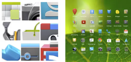
There’s no denying that in terms of overall looks, Google hit one out of the park when they introduced a complete UI overhaul that was Ice Cream Sandwich. After countless years (it was only about 3) design was finally a focus and thanks to Matias Duarte ‘n friends, Android 4.0 not only brought a UI worth bragging about — but one that no longer necessitated the need for 3rd party skins to make Android beautiful. The term Google likes to use for this all new UX (user experience) is “Holo,” and apparently it’s up for a 2012 User Experience award tonight, at the Parsons School of Design.
To help celebrate, Google has thrown together a reel of their most famous commercials and somewhere around the 2:00 mark, you can see the initial inspiration for Holo, and where it eventually ended up — on our glorious Galaxy Nexus’s. Of course, we think the Android User Experience Design team should win first place, and we’ll keep you posted with the results. Check out Google’s video below.
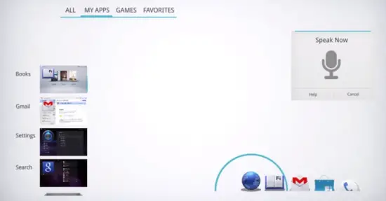
Anyone else get tinglies when they saw the animations for the concept Ice Cream Sandwich launcher? Eeeeee… It’s a shame more developers haven’t taken Google’s advice when designing their apps for Android, but keep in mind this isn’t Microsoft (they impose strict Metro UI guidelines for devs when creating apps for their market place). Seeing how there are so few apps designed to Holo standards, a new site has been created to showcase them called HoloEverywhere.com. Feel free to have a look see.
Update: It looks like they won Gold Prize for best platform experience. Way to go, guys! [Google+: Matias Duarte]
Via Droid-Life | AndroidCommunity






As a developer, I’m happy to see Holo being appreciated more. It’s a simple yet amazing look.
I think the phandroid app is an excellent example of using Holo correctly.
I’ve seen some of my classmates try to design apps using Holo but they just don’t look right.
ive never seen the commercial of the girls doing Bohemian Rhapsody before! it’s awesome lol!
also congrats Google!
They have a few different ones showcasing the group chat feature of Google+ like that. I think my favorite is the beatbox one.
It looks like they were going to go with “Fi” for the renaming of the market before they settled on play. Its both on the books and market icon. See 2:30
I’m just gonna throw it out there: I think it’s awful. Switching from clearly titled menus to descriptionless icons, often confusing ones at that. I still cannot stand vanilla Android. It’s got all the style of TRON. Meh. Launches/custom UIs are a must for me, which has left my tablet experience (Transformer, Transformer Prime, Touchpad; all rooted and rom’d) somewhat disappointing
I agree on the nameless icons – I hate guesswork when I need something done quickly, and what-if-it-does-something-i-didn’t-want-it-to type of feeling. I hate action bar, and blueish on black color scheme.
1. Long hold nameless icon
2. Success?
Super annoying. I’ve been using ICS for months now and still forget what little icon does what in the action bar. And I’m a power user. Imagine your average Joe?
I think the worst is when I am trying to copy something. Long press and then the action bar pops up. Which one is freaking COPY!!!! I think my success rate is about 50%.
I was not aware of this. THIS should have been in a tutorial. not how to open apps.
I was thinking Thunderdome. WE DON”T NEED ANOTHER HEROOOOOOOOO!
I had looked forward to ICS with bated breath–especially after Google’s hiring of Duarte. When I finally saw it I was unimpressed. (Great description, TRON.) I can’t comment on how it works or any feature improvements. After seeing it I decided it was not attractive enough for me to get a new phone just for that. As a tech geek and designer (different type of design) I have come across appliances with prettier UIs that will have more style longevity. Thankfully, there are manufacturers and developers who get the design a little better.
“And the winner is….. Drum roll please……. iOS!!! Because its company paid to have it win!”
Yea no doubt that ICS should win the UX Award, or at least come pretty close to the ultra-straight forward iOS.
BUT, the only way to actually get this gorgeous GUI is to buy a giant Galaxy Nexus which is only offered on Verizon or for insane $400 on other carriers direct from Google.
WTF is wrong with you Google. Sell the 4th-gen Jelly Bean Nexus on ALL carriers like Apple does with the iPhone!!!!!!!!!!!!!!!!!! Also, make a smaller 4.0″ version a normal person would want to use.
Define normal. My mom is normal and just picked the razr maxx with a 4.3″ screen. She’s not a techie at all but preferred it over the 3.7″ screen on her droid2.
ALSO, my gf has a sprint gs2 with a 4.5″ display and desperately wants the Note with a 5.3″ screen. She’s no techie either. Both my mom and her are 5’3″ so they have small hands. Both are well within the range of “normal” in my mind
Are you sure your gf can handle 5.3…. ;)
Handled mine without any complaints ^_~
ZING!
Give it to her twice?
I think we may be closer than we realize to seeing a google device, They have been flashing the googlegoggles as I call them for some time now and we are kidding ourselves if we think they don’t have a smooth dreamy device floating around the google halls…
Holo > Metro
Glad the Android team got a hold of Matias Duarte (still mad at HP for their handling of webOS though), he certainly has an eye for ui.
Kudo’s to Android’s UI team.
anyone else lose it when andy put his hands up…
LOL
Is funny that the site is iPhone themed… More sad than funny really it looks like crap.
ICS would be great…if anyone actually had it. Two Verizon devices, both with empty promises.
That’s why you buy devices that you know even if the manufacturer fails to deliver the devs will. People used to knock on Samsung, but look at all of the Galaxy S2 variants. A lot of them have ICS now. There isn’t ONE Motorola device that has ICS pushed to it yet. That is just sad. Even HTC has devices with ICS on them in peoples hands now.
Even HTC???? I guess connecting to a pc and downloading firmware manually works better than a seamless OTA push, like HTC did since god knows when… Also, I believe they were faster to push ICS to their numerous devices, even that crappy Sensation XL…