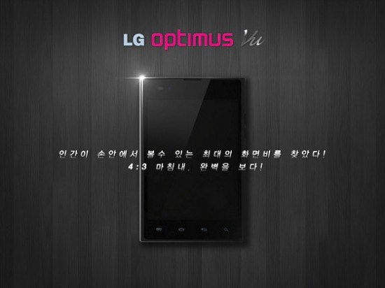
What’s old is new again. At least that’s what LG would have you believe after teasing the upcoming LG Optimus Vu, a brand new 5-inch device with a 4:3 aspect ratio. The Optimus Vu breaks away from the now standard 16:9 mold of tall and skinny devices, instead offering a smartphone that looks something like a tiny iPad at first glance.
Details on the device are scarce with nothing but a brief video showing off some of the device’s curves. I’m sure we’ll see more at MWC later this month but in the meantime, what do you guys think? Is there any appeal in a 4:3, 5-inch Android device? Personally, I’ve found 16:9 devices to be almost completely useless in landscape mode so this device has me intrigued. But then again, maybe I’m being overly optimistic?


Perhaps this is a bit off topic but in any case I have been
surfing about your blog and it looks really neat. impassioned about your
writing. I am creating a new blog and hard-pressed to make it appear great and
supply excellent articles. I have discovered a lot on your site and I look
forward to additional updates and will be back.
[Link Moderated]
Impassioned? Really? Gosh… *blushes*
terrible idea for a phone
Looks very interesting. As long as it fits in one hand easily I might get it.
This and the Galaxy Note are amazing form factors. I would like to see a stylus excluded though. And, I’m really unsure why all post-Galaxy Nexus phones are including buttons, instead of just planning for ICS. Like it or not ICS is the future, so do it now.
I agree on the form factors. Keep them coming! I’d rather have my screen used for content and not buttons though. Capacitive all the way.
I like the buttons, especially the hard search button. It was one of the reasons I chose the RAZR over the GNexus. Hard buttons are optional for ICS – you can have them or not.
Optional or not, they are completely unnecessary. There is a dedicated voice search box/voice activated search button on every homescreen. I have never even pressed the search button on any of my phones. I’d rather have more real estate for the display than buttons. And if there are buttons taking up a part of the bezel, they should be PHYSICAL buttons.
“Dedicated” capacitive buttons have no place since ICS holds a place on the screen for buttons no matter what application is on the screen.If you want a dedicated search button, put in a request for Google to add it next to the Back/Home/Task Switch buttons.
I have the Galaxy Nexus and prefer the software nav buttons, but the search bar on every screen doesn’t cut it. When I am in the browser or another app, I want to be able to hit the search button to search within those apps. Since I am not on any of the homescreens, the search bar doesn’t do me any good. Thank God for ROMs that add the search key back.
For me the 16:9 ratio is perfect since I use my tablet for watching movies and reading and just browsing the web. In all but browsing the web the 16:9 is better since most movies and videos are 16:9
I like bigger screen sizes and wider screens so I’m all about this.
Come on OEMs make more 5+ inch phones. Im really happy with my gs2 but bigger screen is always welcomed by me
4:3? What year is this? 1970?
16:9 all day every day.
Different is always good.
For handhelds to be pocketable, the screen width is limited to a max of approximately 3 inches. The normal 16:9 aspect ratio for pocket size devices would provide more screen realestate than the VU’s 12:9 (4:3) size but for larger non pocketable tablet sizes, a 12:9 size could be better. For pocket size devices (width limited devices) I would like 16:9 size devices to be lengthened to a 21:9 size (cinematic) for more screen area. Could a 12:9 size be considered a purse size as opposed to a pocket size and a new market?