Motorola unleashed their teaser site for the phone they’re set to announce tomorrow – the Motorola DROID RAZR – and left us with nothing but our wits to figure out what it’s all about. Aside from a quick teaser video, random images and an input field to submit a code, there wasn’t much… but there is.
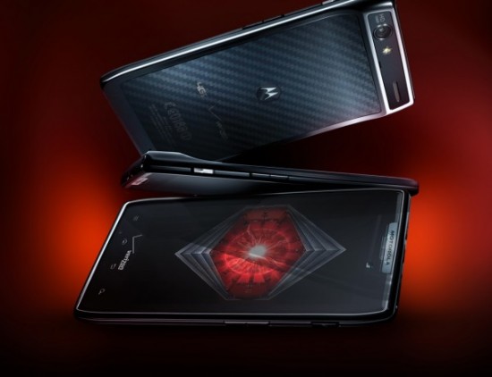
Our friends at Droid-Life somehow uncovered a clear-as-day image of the device showing its kevlar backing, among other things. We get a look at the new DROID eye, its HD 1080p camera with flash and the Verizon 4G LTE logo on the back for mind-blowing data speeds.
We sure can’t wait for tomorrow as we’ll be at the event covering at live. Keep your eyes on Phandroid tomorrow morning and afternoon (and evening if you want to hear more about the Nexus Prime and Ice Cream Sandwich as we’re in Hong Kong as well!)






Reverese Samsung design with bump on top part, interesting..
This has been Moto’s design since the Droid X. If anything, Samsung’s design is a reverse of moto’s.
ok my bad :)
No worries :), hope I didn’t sound like a fanboy lol. I like both this and the galaxy nexus cosmetically. (carbon fiber is sick!) It’s going to come down to what’s under the hood and if Moto can find it in their hearts to unlock this beast. They said they would consider unlocking bootloaders toward the end of 2011. We’re here! I hope those weren’t empty words.
As a nexus s user, i find the bump at the bottom to be a nice feature when holding the phone, and I dont have much experience of motos thats why I was a bit samsung biased haha
Yeah, when I saw the leaked pics of the Galaxy Nexus, I assumed the bump was at the top just because that’s how the X’s are. Are there any other phones with it at the bottom. I’m not sure I would like it as much. Seems to make more sense when holding it in portrait to have the bump at the top.
I agree, I feel like the bump at the bottom would be weird on the Nexus, but probably just because I have no experience with it.
The original Galaxy S had the bump at the bottom, and it’s ergonomically sound. The bump at the top makes the phone top heavy which is a little unwieldy.
This might be the phone to get if they bring out thr razr out on other carriers
Looks like the other Xs, kind of boring.
So a Droid X with capacitive buttons and a different back cover
Its a Droid X with swagger though; Kevlar backing, 4G LTE, and a way sexier screen.
That was my thought exactly. Thin with a bump. The back cover looks cool; the front screen looks cool. I don’t like Motorola Android devices. My next phone will be Samsung or HTC.
DP
This is not the droid you’re looking for.
Actually this could be the droid I am looking for. Even with a locked bootloader Moto still manages to put out some quality phones. I think a lot will have to depend on the display.
Will there ever be a Droid article where someone doesn’t say this?
Looks like a Droid X to me… It would have to have some killer specs
It does have style. There something 1960’s James Bondish about it. Very masculine design.
Design-wise I actually like it. Yeah it looks like the X and the Bionic, but it looks wickedly thin.
Why call this a raza? It’s nonthing like the original one. I mean wtf
Brand recognition
Droid X with upgrades and 4G? I’m good with that!
Tomorrow is going to be a great day for phandroids. :)
Isn’t that what the Bionic was?
the backing looks like someone put a sticker on it that didn’t fit. The whole backing should be that carbon fiber.
Ugly IMO. I don’t like the style at all. I like the round sleek look of samsung/htc over the droids anyday. And how is that even look like a razr?????? I loved that phone!
I think im good with the bionic
looks stupid. i’d take the vigor over this
look, a droid x
yawn!!!!!!!!!!!
That ain’t how your Momma make her money though.
I really wish Moto would drop the humped phone backs.
If you go to the reveal.motorola.com website with chrome and use the inspect element tool… it shows the page as being named “spyder”… I would place my money on that being the actual name after seeing that. I posted a screenshot on my G+ https://plus.google.com/u/0/107806185575296542941
If you care what your phone LOOKS like, buy an apple. Seriously. My Droid X has been great. I really don’t give a rats ass what it looks like as long as it performs.
I’m a bit over the design concept. Having owned an X and a Bionic, it has lost the power to seduce me. Now the Nexus… hmmm. I like the cut of that one’s jib.
Of course, it’s not just about the aesthetic, though that’s definitely a part of it. Specs matter as well, and software. I’ve always lusted after a developer reference phone, though I didn’t care for the look of the two prior ones. Nexus seems to have it all, including the most important attribute: it’s on Verizon.
BTW, the teaser site link is broken in the article.
Ah, but there is a big difference. Dual core CPU and a Samsung AMOLED+ display!