Another app is getting some Material Design love. This time it’s the popular list-making and productivity app Wunderlist. The team has been hard at work the last few months building Wunderlist from the ground-up for Android Lollipop. Not only does it have a fresh coat of Material paint, but they’ve also added some really nice new features.
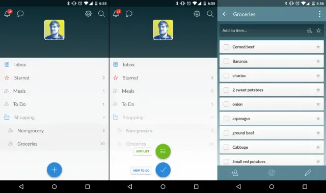
First and foremost is the new design. We’ve got colored status bars, floating buttons. meaningful animation, and a much more clean and refined look. It’s not a drastic re-design, but it’s just enough to make it feel at home in Android Lollipop.
Wunderlist has also added a few new handy features. First is the ability to put lists into folders. As you can see in the screenshots above I have two lists inside a “Shopping” folder. They’ve also made it much easier to add things from anywhere. You can create a new list or to-do with the floating (+) button, but also use the new widgets, or your voice with Google Now. All of these features are free for everyone.
If you’re looking for a great list-making app with sync across tons of devices and support for collaboration you can’t go wrong with Wunderlist. Download it for free from the Play Store today.





So are you guys seriously going to make a “story” about every app that gets a Material makeover?
Yes, and no one can stop us! MUAHAHAHAHA
Maybe not, but he could!
Wow, that is going to be tantamount to about 1.4 million stories. I look forward to the next one and the remaining 1.39 million.
It’s material for them to write about….. See what I did there?
Wait, what?
Google Keep needs material design.
No dark theme?