LG G Watch R Specs officially announced!
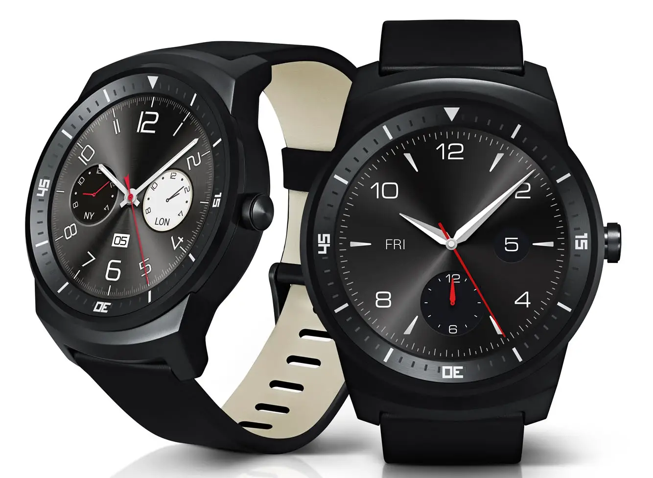
We’ve just learned what’s inside LG’s latest smartwatch as the LG G Watch R Specs have been officially announced. Now we learn about the outside as LG has just issued a number of stunning pictures of the LG G Watch R:
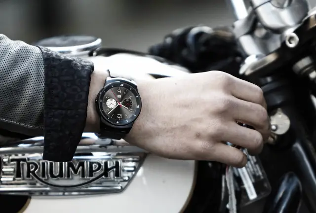

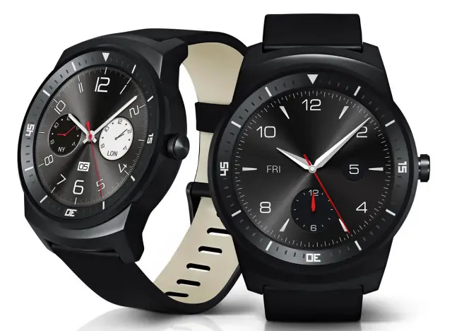
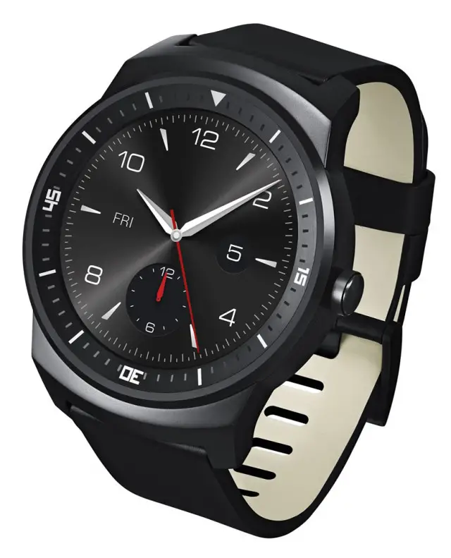
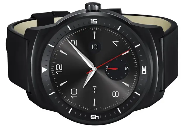
There’s a whole lot we could say… but we’ll let you be the judge in the comments!


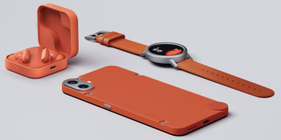
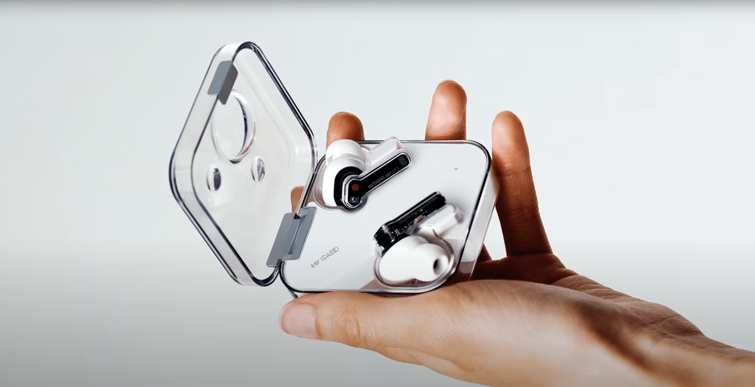

LG stepping in to steal the thunder. That’s what Motorola gets for dragging their feet!
I personally thing the Moto 360 looks better than the LG G Watch R. Plus the G Watch R won’t be released until Q4 and the Moto 360 should be released this upcoming month so they should still be fine.
It will all come down to the 360’s specs. If they are less than LG’s R, I can see a lot of people skipping the 360 in favor of LG. Not to mention the full circle watch face, which is already a slight advantage over the 360.
and price point and face options… if they are both truly “stock” and not altered in any way and the same price then its purely specs (battery life being a spec)
Losing customers before you even have a product on the market takes a special skill, Motorola are the boss!
I hope they ditch the dial bezel and go with either a more end to end screen or something neutral. Every watch face you see will have to be somewhat tailored to match that bezel and that will detract from the beauty that these watches are capable of displaying.
Do we know for sure that the dial isn’t part of the screen?
Yeah, I actually thing that the whole thing is a screen. It just the skin/watch face that make it look like a bezel.
I wish it were so, but in this pic:
http://phandroid.s3.amazonaws.com/wp-content/uploads/2014/08/lg-g-watch-r-71-640×432.jpg
You can see the bezel is different color tone to the rest of the face, and the shading / highlights are in line with the light source (top left).
Yeah… Too bad. Look like it will be hard to swipe or somewhat limited.
But just imagine if the bezel lit up to indicate you’d missed a notification, or an alarm, etc…
I kind of like the dial as a bezel… but time will tell. (Truly no pun intended)
The other interesting thing about this pic is the blatant display of the Triumph logo. May LG will have a special Triumph edition, as well as a standard version. You can’t show someone else’s logo without some sort of agreement.
Yeah, I was wondering about that logo myself – it Triumph logo is so prominent it could be an advert for them!
Apparently Triumph has watches, so maybe they designed it http://shop.triumphmotorcycles.com/apparel/personal-accessories/watches
Apparently Triumph has watches, so maybe they designed it http://shop.triumphmotorcycles.com/apparel/personal-accessories/watches
that image of the sphere is exactly the same mockup image as the bigger one that is side by side, which looks made in 10 minutes in photoshop
yeah, what if I am using some sort of time system that isn’t predicated on a 60 minute hour…?
I realize these are marketing renders, but this is the first “smartwatch” that I wouldn’t feel the need to constantly qualify with “smart-” at the beginning.
This thing just looks like a nice looking watch.
I hope LG can pull it off.
The Moto 360 had a more luxury oriented look while this is sportier looking. They both look attractive. I’m very impressed with what LG is doing here.
I agree, but I think that is part because of the face being used on these images. That could definitely point to LG intending this to be more sporty, but it think it is still going to be stylish, just not have the same emphasis that moto put on style.
Take my money…(throws money at screen)
*picks it up and runs*
*takes money* …… thankssssss
Can we stop the teasing and just release the damn thing. My money is awaiting.
Damn… Tough decision. I might have to hold off on buying the moto 360, to fit in the best buy 30 day elite return period.
I want the 360, it deffo looks far better than the LG one. But fair play to LG, if it looks this good it’s worth a second look. Especially without that stupid looking bar on the 360 which detracts from its round face and, to me at least, makes it far less desirable. I think the price and features would possibly make a swing to the LG for me. Losing that bar on the 360 would be a big step in there favour.
Looks quite nice… now makes me feel bad that I bought a G. LOL
Just sell it as soon as you can on swappa.
Looks like vaporware for now…
The date this watch may launch in probably 10/08/2014. Call me captain obvious.
Clocks/Watches are often shown with time as 10:08 to 10:12 to show range of hands without covering up numbers.
Based on the renders, the date would be Friday, the 5th; which would correspond this year to Sept 5 or December 5, which is more likely since it is being said it will be Q4 item in time for the holidays….
I appreciate that Jeff I didn’t know that… that’s why I usually just read the comments instead of making one.
If I’m not mistaken, the watch does show Friday Dec. 5 as the date. I was hoping not to have to wait that long. SadPanda
September 5 is also a Friday… Which is the day that IFA begins so that is the official announcement. No clue what release date is
Agreed, however if you look at the renders closer, there is one dial that simply shows the numbers 12 and 6,which I suspect are the months of the year. The hand points to 12…being December.
Of course, everything at this point is speculation, and in a few days we’ll know far more. I’m sold on this watch over the 360 if it looks like the images. I find the 360 to be too thick…
This looks like some type of G-Shock smartwatch. I feel like the 360 is a bit more elgant looking as opposed to this sporty look.
So, does it change screen to notify you? All I have seen is the same screen…