It’s only been a day since we saw LG unveil their latest flagship — the LG G3 — during their London launch event. Well, it looks like that’s not all they were showing, as some crafty folks from the German tech site AppDated managed to also get their hands on the upcoming LG G Watch, rumored to be shown off during this year’s Google I/O.
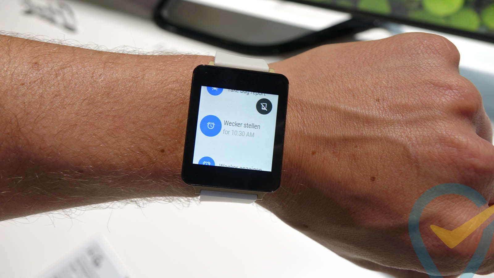
The smartwatch, which can be seen in their hands-on video, is still running a very early version of Android Wear (Google’s new Android software built specifically for wearables). It’s so early in fact, that an actual clock face wasn’t loaded on the device, but we do get to see how the OS behaves to some extent. Swiping from the top of the display showed some basic system information like the battery level, while a an ever present Google Now button hovered over some basic options.
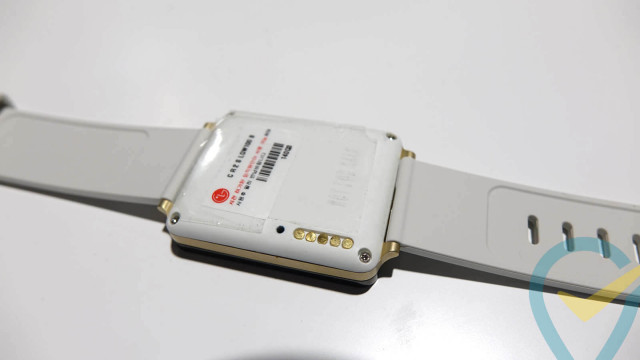
Really it’s not much and while we’re not entirely sure how we feel about the 3-tone white/gold/black combo, we think the black version is better suited for our tastes.
[AppDated]






why isn’t the video on this article? O:
Annnnnnnnd… it’s back. Sorry about that.
It’s private though :(
I’d originally ruled this out, but, looks like the watchband is easily replaceable with any 22mm band available.
Might have to give this a look after all.
Moving your wrist turns on the display. Nice.
That seems like it could be good or bad depending on how smart it is re: movement. I wouldn’t want it turning on with every little wrist movement.
Certain wrist moving activities would require the watch being removed O.o
I see no video… Why?
While I’m sure the final product will be better. The square form factor just looks like its from the stone age when compared with the round Moto360.
Add to that the size! Either the wearer has a narrow wrist or the unit is oversized as a timepiece. The bezel seems enormous especially when compared to the circular design of the Moto 360 with barely a bezel around it.
We need some really unique use cases for the smart watch craze to really catch on. Let’s hope for some out of the box UI ideas….
it seems to lag looking at the vid. Looks like we’re back to 2009 Android all over again.
Interesting. The 360 made it look old, press images made it look cool, and now this makes it look clunky.
It’ll come down to price and features for me. Look is passable in my decision somewhat.
I agree completely. I was all set to get this white LG G Watch (in addition to the Moto 360), after seeing the press images. However, this just looks bad.
I used to think smart watches were a dumb ides but since they ate strict about cell phone usage at my job, Ive found a loophole just one problem, no apps
When is HTC gonna show their smartwatch ? Im waiting on that one more than any of these. When Motorolla starts calling their products by more adult names and actually make something worth a damn, i might look at them again. Nothing good outside of the Droid series. LG well, its LG, enuf said.