As we get nearer and nearer to the launch of Android 14 and the Pixel 8 series, Google has finally unveiled new changes to its visual Android branding, which represents a new step for the company and its signature mobile device platform. More specifically, the Android logo comes with a slight 3D re-design, while the text-based logo itself is now spelled with a capital “A” at the beginning.
While Android’s branding has changed a few times over the past decade, this is the first time that Google will be featuring a more fleshed-out version of its signature mascot. As per Google’s official announcement:
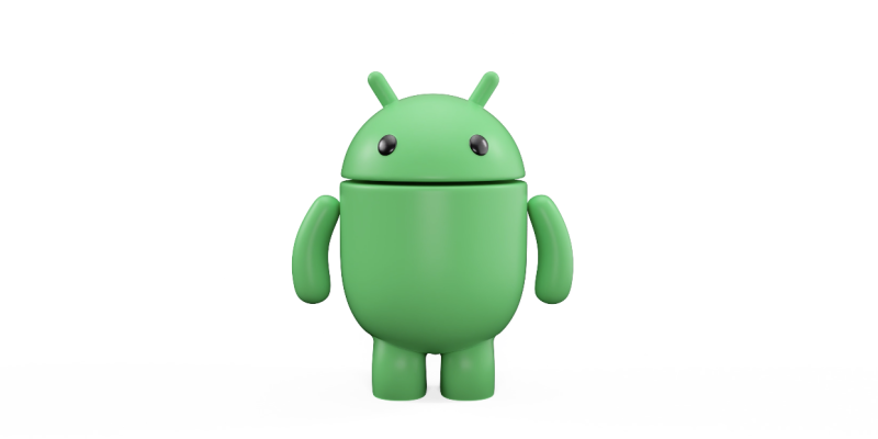
The bugdroid — the face and most identifiable element of the Android robot — now appears with more dimension, and a lot more character. As a visual signifier of our brand, we wanted the bugdroid to appear as dynamic as Android itself. We’ve also updated the robot’s full-body appearance to ensure it can easily transition between digital and real-life environments, making it a versatile and reliable companion across channels, platforms and contexts.
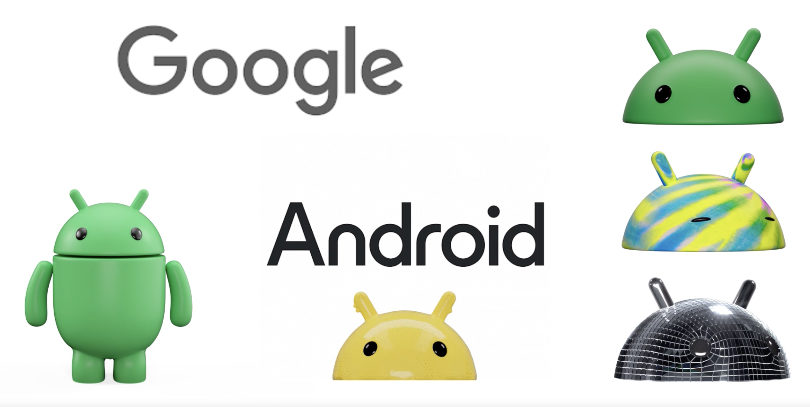
As mentioned earlier, Google has also switched up the first letter of its written logo to a capital A. While it might be a very minor change in terms of overall visuals, Google says that it adds more weight to its appearance when placed next to the Android logo. According to the company:
While we’ve added more curves and personality unique to Android, the new Android stylization more closely mirrors Google’s logo and creates balance between the two. We hope these small but significant updates to the Android typeface will better communicate the relationship between Android devices and the Google apps and services people already know.
What do you think about Google’s new visual identity? Are you a big fan, or do your prefer the classic look? Let us know in the comments below!
Source: Google




Comments