Finding the perfect smartphone used to be a simple task, as long as you had a limitless budget or didn’t mind signing your life away to a service provider for the next 2-3 years. The high-end of the market has always had great options and though phone reviewers like me might nit-pick about the slight differences in camera quality between the top contenders or split hairs in regards to performance or displays, most people would be more than happy with any flagship smartphone since the last time they upgraded was 2-3 years ago.
But a funny thing has happened in the past few years. Those bleeding edge specs that you paid top-dollar for in 2019 have now trickled down to the mid-range segment, giving you a lot more options than you’ve had in the past.
Of course, Samsung, Oppo, and Xiaomi all have a broad selection of mid-range smartphones to choose from, but if you’re looking for a device that is eager to stand out in a sea of devices that all look the same, the Nothing Phone 1 may be exactly what you’re looking for.
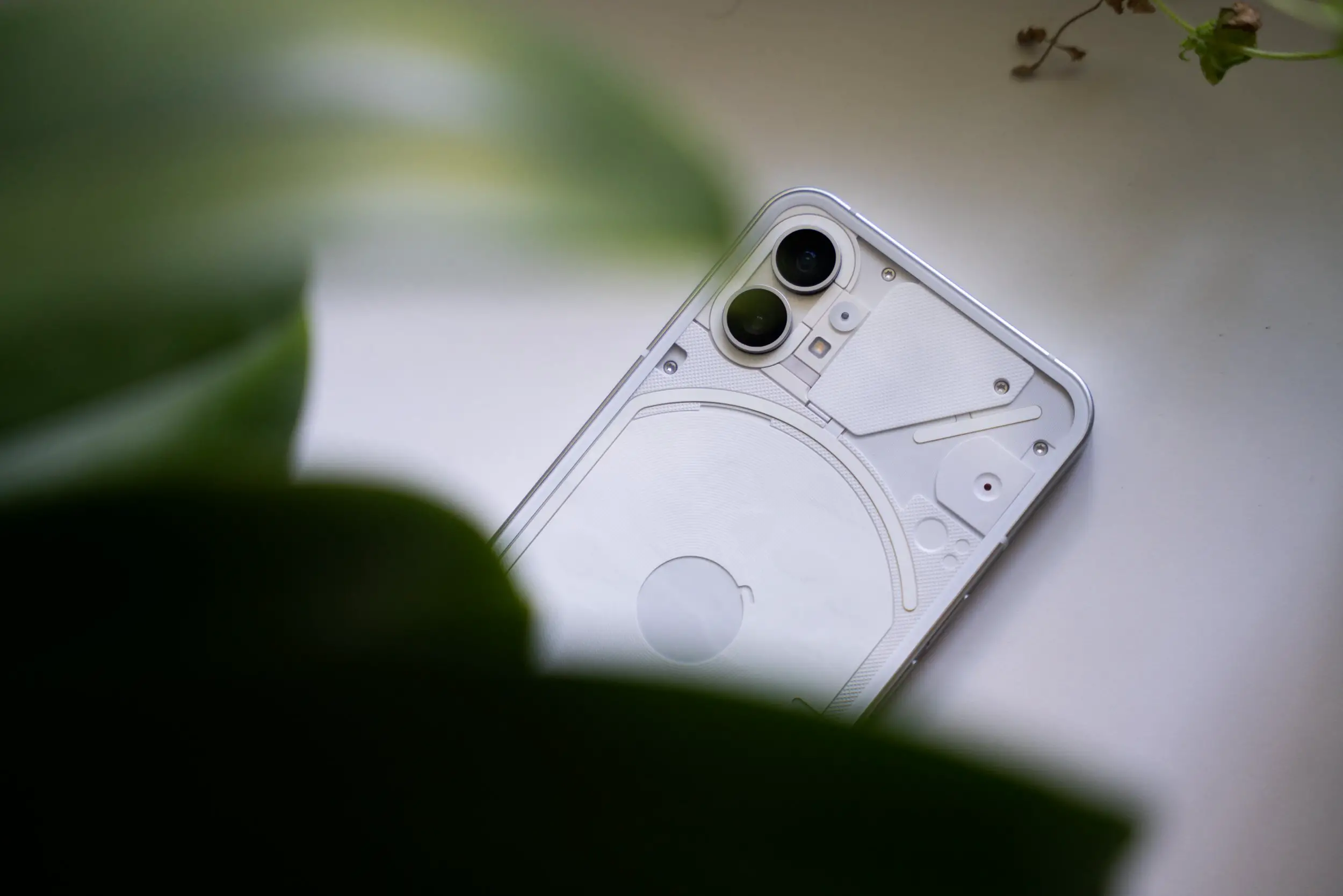
While this is the first smartphone from Nothing, there’s certainly a lot of hype that we need to cut through. For those who don’t know, the company’s founder and CEO, Carl Pei, was also the co-founder of OnePlus. Depending on what your stance is on the history of OnePlus, this could either be a good thing or a bad thing. It’s definitely helped Nothing garner quite a bit of attention with the launch of its earbuds last year and the new smartphone if nothing else.
But strip away all the hype and the marketing and the Nothing Phone 1 has no issues standing on its own. In fact, it’s easily one of the best mid-range smartphones I’ve used in years. For me, the formula for a good smartphone has always been to simply deliver a good device at the right price point. The Nothing Phone 1 does exactly that, with a bit of flare.
Eye-catching Design

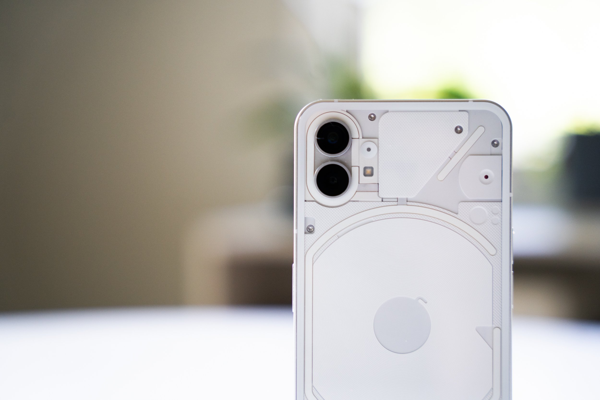
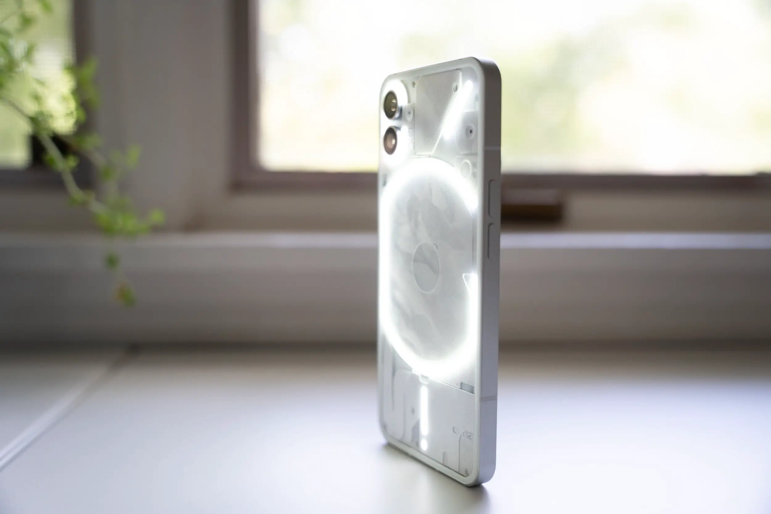
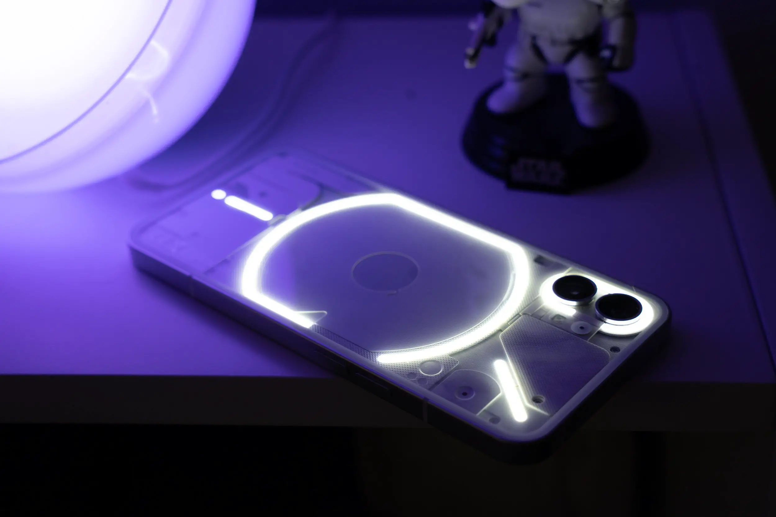
From the front, the front, and sides, the Nothing Phone 1 looks like any other smartphone, featuring a metal frame, volume buttons on the left edge, and the power button on the right side. But flip it over and things get quite a bit more interesting. The back of the phone sports a transparent glass panel that shows off some of the phone’s internals and what Nothing is calling the Glyph Interface which is a unique pattern made up of 900 LED lights that are used for notifications and a bit more.
Just jump into the Glyph Interface section within the phone’s settings and you can choose from a selection of notification sounds that are perfectly matched with the lights on the back of the phone. The notification sounds are sci-fi-retro and completely unique when compared to the notification sounds we’ve all heard a million times on Samsung and Apple devices. While it’s not officially available yet, there’s also a little hack that allows the Glyph Interface to light up in sync with any music you play from the phone.
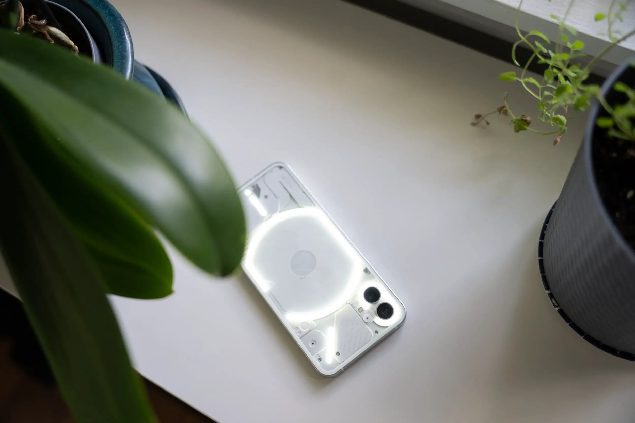
For me, the most useful feature is the ability to turn on the LED lights when taking photos or recording video in low light. I’ve always hated the look you get when you turn on the basic LED flash on smartphones, but the Glyph LEDs are bright enough to light us a subject that’s 2-3 feet away, acting more like a gentle fill light than a harsh flash.
On its own, the Glyph Interface isn’t compelling enough to be the main selling point of the Phone 1, but it’s definitely a head-turner, which isn’t something we typically get in a mid-range smartphone.
Specifications
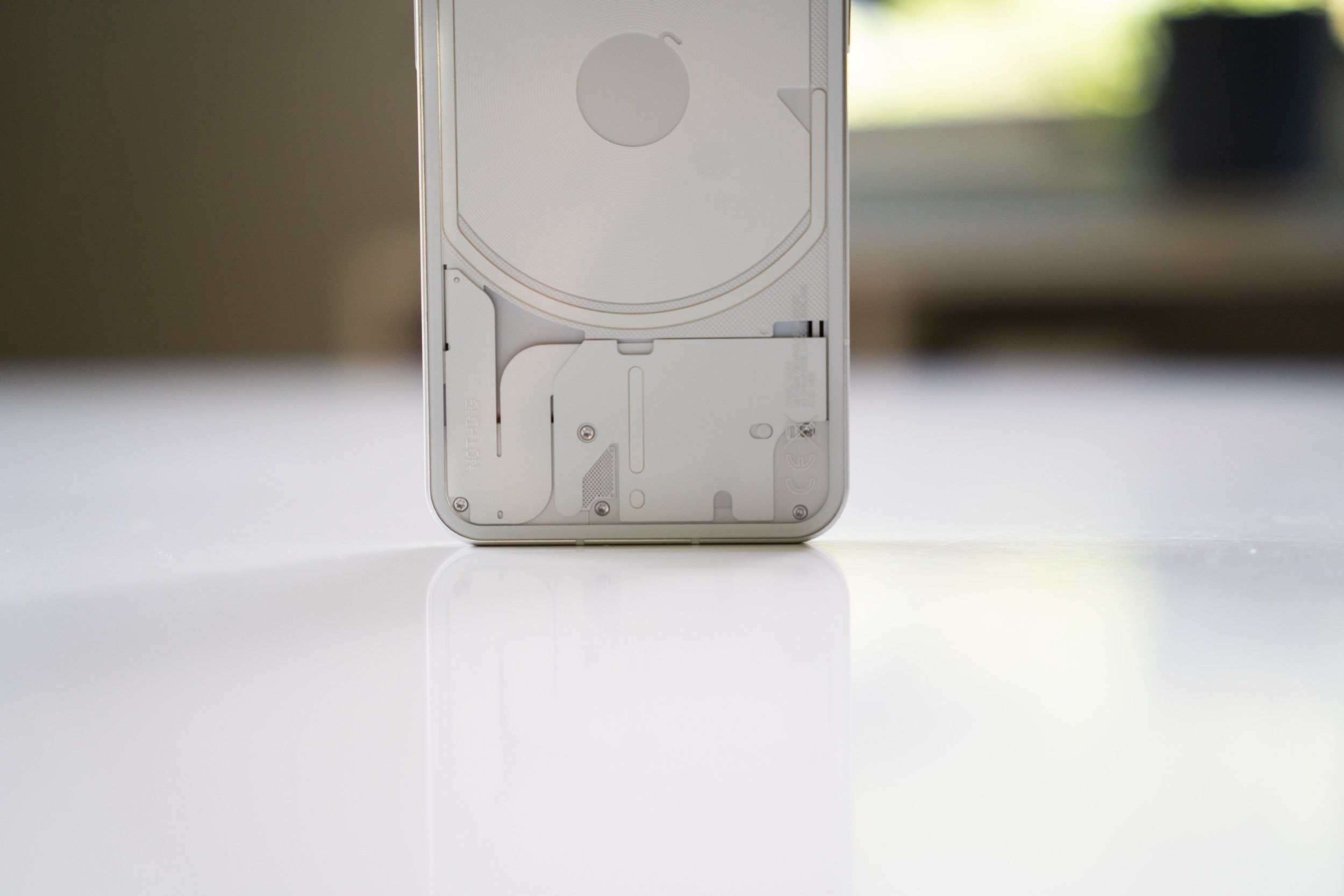
If you throw the Glyph interface and the transparent glass-backed design out the window, you’re still left with a mid-range smartphone that can go head-to-head with the best the competition has to offer within the category. To put everything into context, the base model of the Nothing Phone 1 is priced at €469, featuring 8GB of RAM and 128GB of storage. Powering the phone is Qualcomm’s Snapdragon 778G+, which was developed specifically for this device since the standard 778G doesn’t support wireless charging, a feature the Phone 1 prominently displays through the back panel.
Other specs include a 6.55-inch OLED display with a 120Hz refresh rate, a 4,500 mAh battery with 33W fast charging, stereo speakers, two 50MP sensors for its main and ultrawide cameras on the back and a 16MP selfie camera up front.
While that spec list is pretty impressive, Nothing did cut a few corners to make sure it could fit it all in for that €469 sticker price. The Nothing Phone 1 is missing a 3.5mm headphone jack and doesn’t come with a charging brick in the box. Typically, these are two items that I wouldn’t waste my breath mentioning if I was reviewing a flagship smartphone. Apple, Samsung, Google, and other big players ditched those features a while back on their flagship devices, but it’s hard to find a mid-range phone that has ditched one, let alone two of them.
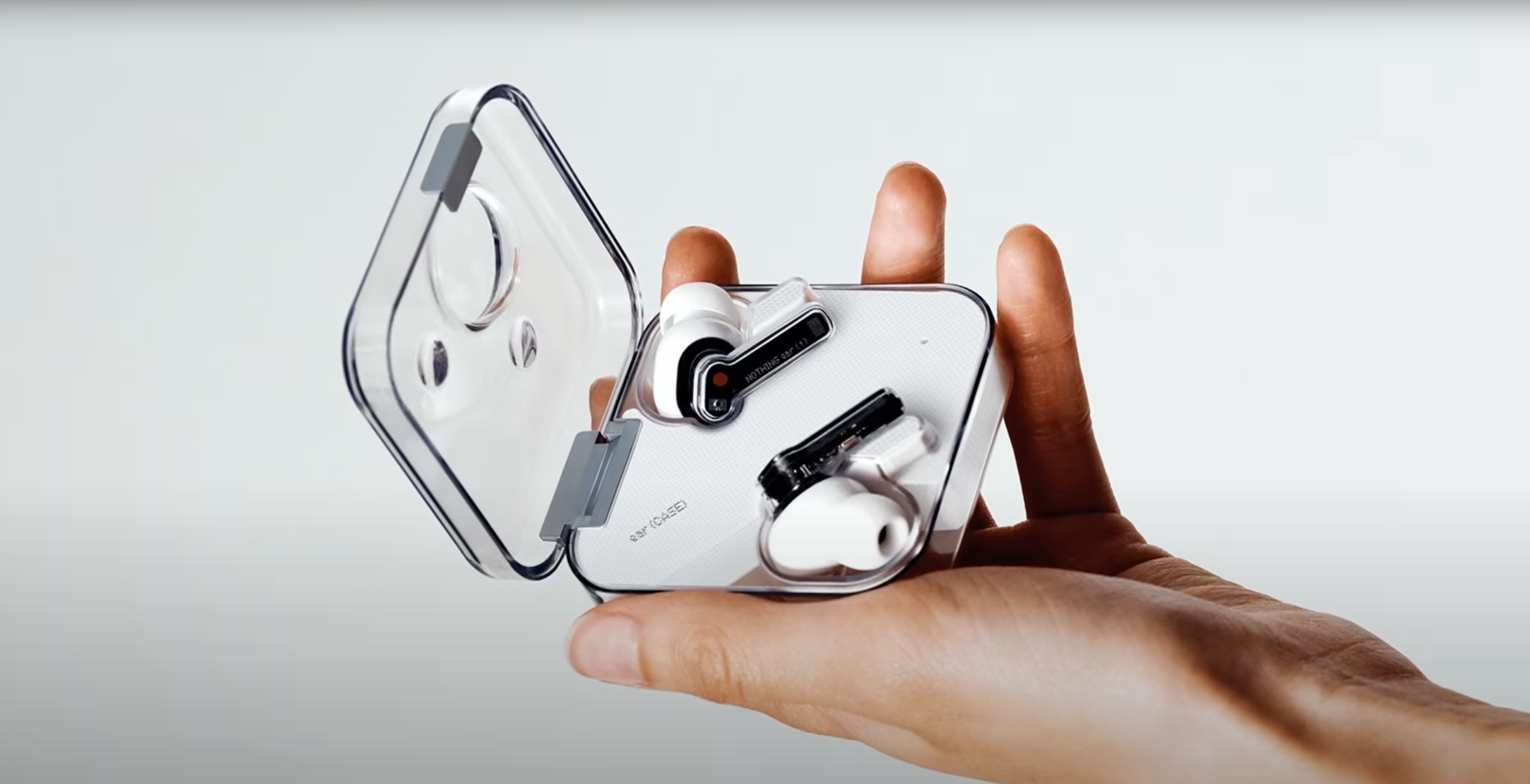
Personally, I’m fine with the charging brick omission since I don’t know a single person who doesn’t have a drawer full of them already and I honestly couldn’t tell you when I used a 3.5mm headphone jack last on a smartphone. I’ve been using the Nothing Ear 1 earbuds since they came out and I have to admit that Nothing’s phone and earbuds are a perfect match.
Display
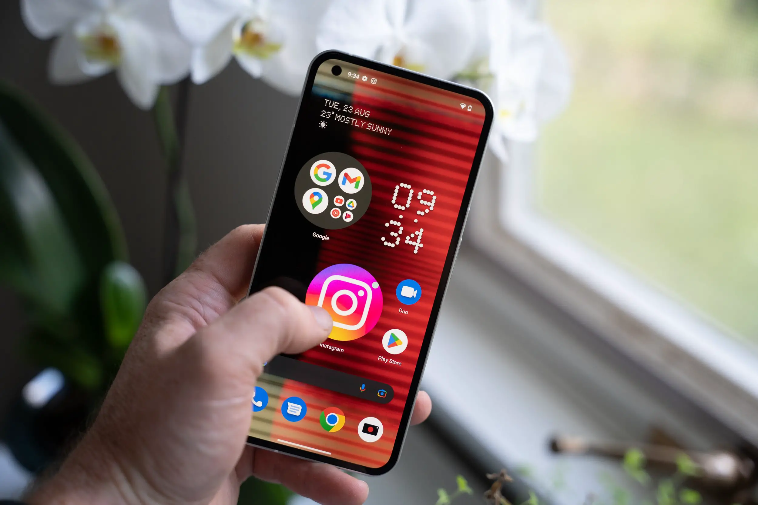
Finding a good display on a mid-range device isn’t as hard as it was a year ago, but the 6.55-inch, FHD+ flexible OLED panel used on the Phone 1 definitely punches above its weight. Not only does it sport an adaptive 120Hz refresh rate, but it also features 240 Hz touch sampling, 10-bit color depth and HDR10+ support.
It’s easily the best display I’ve used on a mid-range smartphone.
That being said, it isn’t perfect and has received a bit more press than Nothing may have originally expected. The first issue that showed up for some owners was a slight green tint on the display (something that’s not too uncommon with OLED panels), but the second one could have been avoided altogether.
Nothing advertised the display offered 1200 nits of peak brightness but later walked back that claim when initial reviews found that the panel wasn’t able to achieve the claimed number. The panel is technically capable of reaching 1200 Nits, but Nothing has limited it to just 700 Nits. That’s still bright enough to be used comfortably in direct sunlight, but it’s a far cry from what Samsung delivers on its devices.
Despite all that, the display still delivers great viewing angles and an incredible visual experience when scrolling through your social media feeds, playing games or simply watching your favorite shows on Netflix or videos on YouTube.
Performance
Mid-range smartphones aren’t ideal for gaming, but they’re definitely usable if you can’t spend more on a high-end device. The 778G+ delivers decent gaming performance, as long as you’re willing to settle for medium settings on PUBG Mobile and Genshin Impact. If you’re simply worried about day-to-day and want a smooth experience when using the phone, I honestly have no complaints here.
The UI is smooth, apps launch quickly and multi-tasking on the 8GB model is exactly what you’d expect it to be. Of course, you can always pay more and get 12GB of RAM if you’re someone who wants more than a dozen apps to be open in the background at once. It may be overkill for the average user, but there are those who simply want as much RAM as money can buy.
Software

The software experience on the Nothing Phone 1 is one of my favorite features of the device. While brands like Samsung and Xiaomi take a heavy-handed approach when it comes to customizing Android, Nothing is following in Google’s footsteps by delivering a stripped-down version of the operating system with just a few customizations sprinkled on top.
Out of the box, the Nothing Phone 1 is running on Android 12. The main design element you’ll see throughout the UI is the use of Nothing’s signature dot matrix font. On the homescreen, it’s used in the weather and clock widgets, but you’ll also find it in the section headers in the Settings Menu.
The UI customizations on the homescreen include the option to super-size app icons and folders. Simply long-press any folder or icon that’s placed on the homescreen and tap the Enlarge button. This will blow the app or folder up to four times its original size, allowing you to tap the first three apps in a folder without needing to open the folder first. I’m still not sure why you would need an app icon that takes up nearly half of your home screen, but it definitely gets people’s attention when they see your screen for the first time. The large icons are also replicated in the quick toggles section of the notification share when you swipe down twice. Nothing features the oversized Network Connection and Bluetooth toggles right at the very top.
One noticeable software feature the Nothing Phone 1 is lacking is an always-on display. When the display is turned off, it does show a circle to highlight where the fingerprint sensor is to unlock the phone, but there’s no clock or any indication of missed notifications. The assumption is that they will be adding the functionality with a future update.
The Android 13 release for the Phone 1 isn’t scheduled until the first half of 2022, but the company will likely be releasing a few more bug fixes and feature rollouts before then. Nothing has committed to three Android updates over the lifespan of the phone, so it should be running Android 15 before the device is officially retired.
Cameras
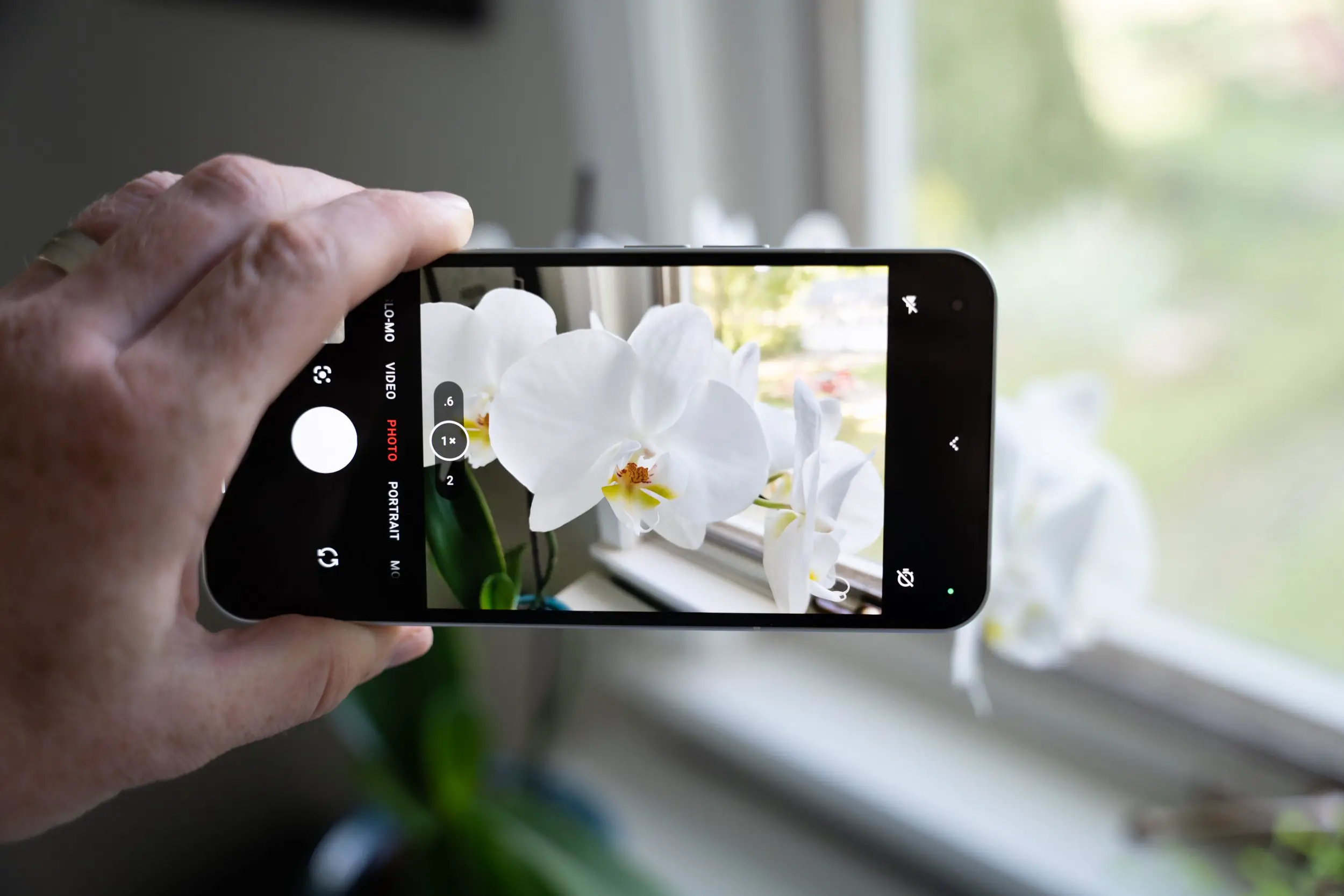
For years now, mid-range devices have typically over-promised and under-delivered when it comes to their cameras. It’s not uncommon to find a mid-range device with three or even four cameras on the back. While uneducated buyers may be impressed, the added depth and macro cameras that are used on those devices are usually pointless.
The Nothing Phone 1 takes the approach we’ve been asking other OEMs to deliver by simply using two high-quality cameras on the back and nothing more. The main camera features a 50MP, f/1.88, Sony IMX766 sensor and the ultrawide camera sports a 50MP, f/2.2 Samsung JN1 sensor and lens combination. The simple setup delivers great photos and videos.
Shots captured in well-lit conditions turn out stunning with great dynamic range and color reproduction. The ultrawide camera is also one of the best I’ve ever tested on a smartphone at this price point, matching what we typically see on much more expensive flagship smartphones. The only downside is that image processing on the device isn’t as consistent as what you find on a Samsung or a Pixel. As this is the company’s first smartphone, it shouldn’t be too surprising, but it should get better over time with additional software updates.
The weakest point for the cameras is low-light photography. You can capture some good shots if you have a steady hand or if your subject isn’t moving, but the slow shutter speed to let in additional light into the shots can also lead to blurry pictures from time to time.
The 16MP selfie camera isn’t anything to write home about, but the results are definitely commendable when compared to what Samsung has been delivering these past few years on its A-series devices. The images are sharp and vibrant and low-light performance is on point when compared to the competition. The only change I’d suggest would be to add 4k video capture to make selfie videos truly stand out.
Battery
Battery life isn’t a real strong point for the Phone 1. The 4,500 mAh cell lasted 11 hours and 30 minutes in our battery test benchmark which is slightly lower than what we’ve seen from other devices running a Snapdragon 778G. The phone can easily make it through a day on a single charge, but I did find that I needed to plug it in late in the afternoon on days I spent with more than 5 hours of screen-on time.
Fortunately, the Nothing Phone 1 does offer wireless charging, a feature we don’t see that often on devices at this price point. If you have a wireless charger at your desk, you shouldn’t have any issues with battery life. But as I mentioned already, you will need to find your own charging brick to use with the Phone 1 since there isn’t one in the box. The device supports up to 33W charging, delivering a 50% charge in about 25 minutes or a full charge in one hour.
Final Thoughts
The mid-range smartphone segment has been quite saturated lately with some impressive devices that offer great performance and very attractive prices. The downside to most of these phones is that the user experience has been compromised with bloated software or with a camera system that overpromises and then underdelivers. The Nothing Phone 1 manages to sidestep those issues without compromising on price while also delivering a fun and unique device that will be the talk of the party.
For the price, the only other device I’d consider buying is the Pixel 6a. Nothing still has a bit to prove since it’s new to the industry, but the Phone 1 is definitely a solid first smartphone and one that’s definitely worth your hard-earned cash.
Nothing Phone 1 Rating: star_fullstar_fullstar_fullstar_fullstar_25 (4.2/5)
The Good
- Unique Design
- Wireless Charging
- Software
- Cameras
The Bad
- Battery Life







Comments