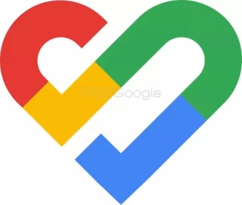
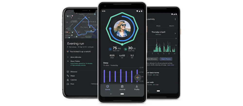
New images show Google Fit may be getting a new logo, which could indicate fresh interest in the company’s in-house health-tracking platform.
The activity monitoring app is slated to get a modest redesign, according to 9to5Google, including some color changes. The new logo has reportedly been there in Google Fit’s Wear OS update, and 9to5Google has recreated it based on what they’ve been informed.

Image Source: 9to5Google
The end of a U-shaped red piece no longer contacts the blues (or green) section, as it does in the current emblem. The yellow line is no longer perpendicular to the green line just at the bottom of a heart form. This indicates that certain colors have shifted. The hues green and blue, in particular, have shifted positions.
Google hasn’t said when or whether the new logo will appear on some of the top Android smartwatches. While it isn’t yet available on the Fit app, the new version of the company’s logo can be seen in Wear OS through the app’s metrics and workout icons.
Despite Google’s apparent ambition to deliver Fitbit as the core of its fitness & wellbeing efforts, the recent revelation implies that Google Fit is still important to the company. Google Fit’s new logo is more confirmation that the service isn’t going away anytime soon.


Comments