

Playlists are an important aspect of YouTube Music‘s discovery strategy, and Google is currently testing a major UI overhaul for them on mobile.
What’s new?
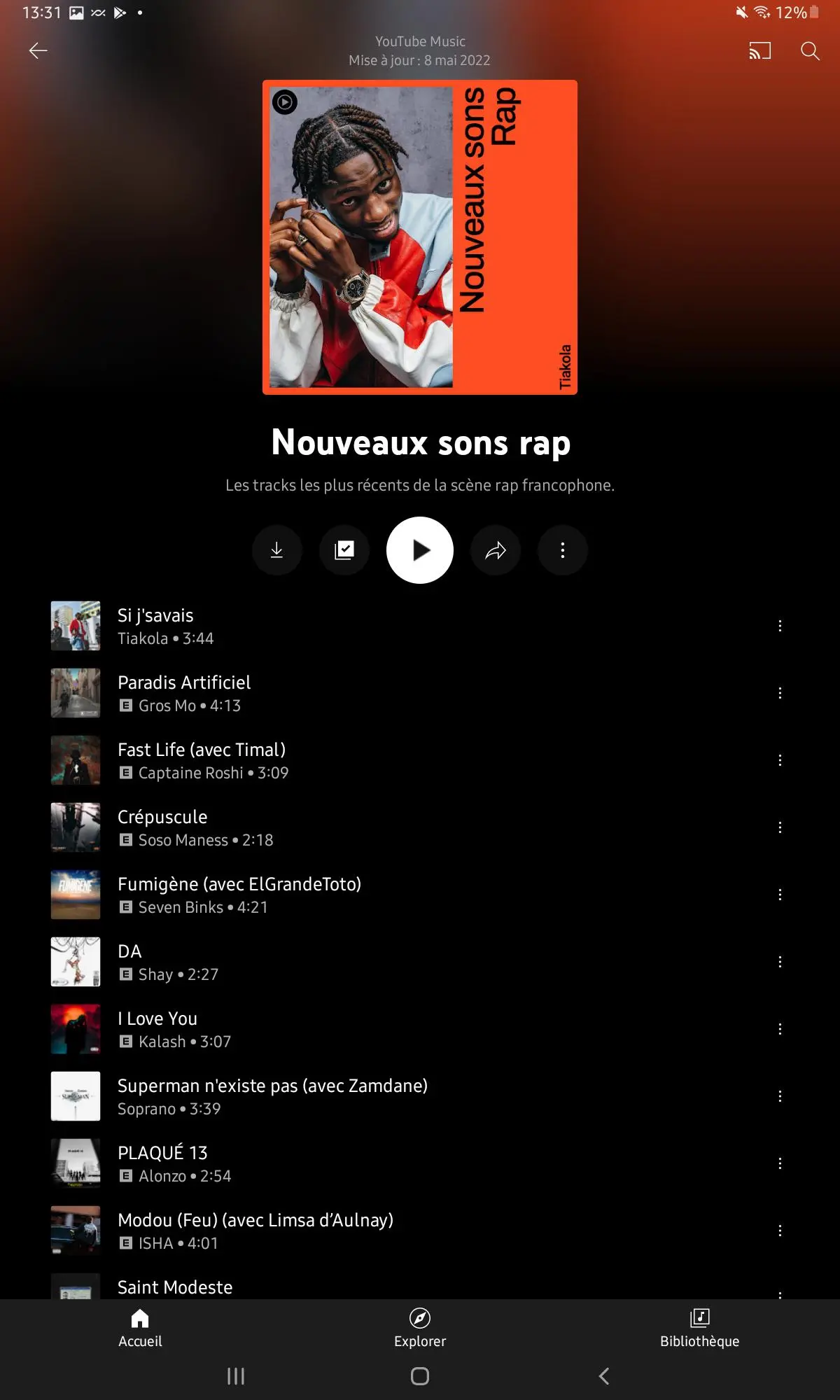
Image Source: 9to5Google
The playlist’s creator and last update date are listed in the first two lines. Following that is cover art, which features a highlighted artist image on the left and vertical text on the right, as well as YouTube Music’s circular logo in the top-left corner.
The playlist’s name and description are then shown in a higher letter size. Download, add to library, play, share, and the overflow menu all show on a single line (inside circles). Share was once located next to Cast and in the top-right corner.
There is no button for shuffle, and the song list remains but oddly does not indicate how many tracks are currently in the collection.
Where can I find it?
As reported by 9to5Google only one (French) user has got the redesigned YouTube Music playlist on a tablet so far (Galaxy Tab A7). It only displays for playlists, not albums, according to them. It’s unclear whether this is only in initial trials, or if the new appearance is intended solely for playlists. It would make sense for both perspectives to have the same graphic change, given they are currently identical. This update is likely to affect both community-generated playlists and algorithm-generated playlists tailored to specific users.


Comments