Google Chrome has finally released a new side panel interface that houses both your bookmarks and reading list. It’s included in Chrome stable release 99, and it reduces the need to show your bookmarks bar all of the time.
How does it work?
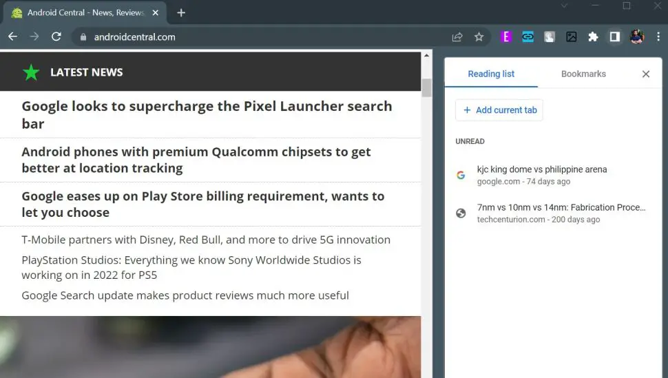
When you’re in Chrome, click the icon in the top right corner to the left of your profile avatar to open Chrome’s new side panel. This was the location of the button for your reading list.

A two-tab panel opens when you select that button, displaying your to-read list and bookmarks next to each other. The panel then resizes your current page to create a place for it. While switching between tabs, the panel remains open. You may quickly hide it by clicking on the icon or the “x” button to the right.
The reading list tab keeps all of the functionality of the previous interface, including the ability to add the current page to the list, mark articles as read, or remove a site.
The bookmarks tab is located to the right of the reading list, and it displays all of your bookmarked pages.
New Favourite Feature?
The new side panel is just one of the many useful features featured in Chrome 99. The current version of the browser also has a download shortcut at the top and a date picker, among several other useful features, so it’s worth keeping up to date with the latest updates to see which may be your new favorite feature.


Comments