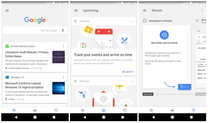
Google has been slowly rolling out a new tabbed interface for the Google app since last year. Many of you probably have it already, but not all. They have been adding features throughout the rollout and it looks like more people are finally getting the update.
The tabbed interface can be found in the main Google app and the Pixel/Google Now Launcher feed. In the main app, you’ll see three tabs across the bottom: Home, Upcoming, and Recent. Home is for articles, Upcoming is for packages, flights, etc, and Recents shows your Google searches.
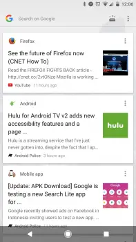
The interface looks different in the Launcher feed. Instead of tabs across the bottom, there’s a button in the upper right corner that takes you to the main app. Google also made the UI much more condensed so there’s more room for cards. Let us know if you’re seeing this new UI in your Google app.
[via Android Police]


Comments