It’s almost here everyone. Google Calendar is in the process of seeing a Material Design overhaul, bringing a much-needed refresh to the web client’s interface.
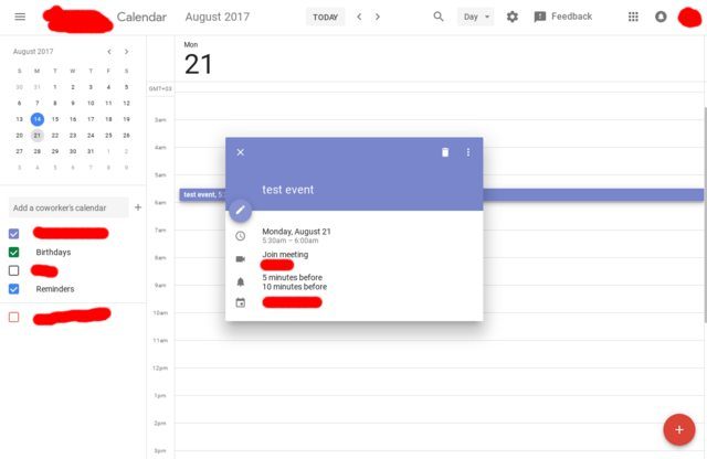
Speaking of Material Design, this design language was introduced all the way back in 2014, but there are still remnants of the “old days” lying around in Google’s arsenal of tools. Google Calendar is one of these tools which still uses the old design language, but one Reddit user has posted a few screenshots showing off what’s to come.
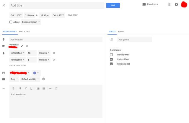
These screenshots were shared by u/xDawnut on the Google subreddit and show us the different new design elements which have already been implemented. The changes have been implemented for those who are a part of Google’s Tested Truster program, so it’s unlikely that you’ll end up seeing these changes yet.
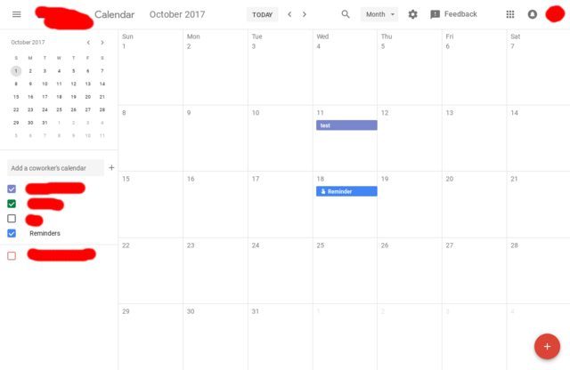
Instead, we’ll have to wait for Google to roll out the goods to the rest of us later this year. Current expectations for the update reside during Q4 2017, so we still have a couple of months before this update could start rolling out to more users.
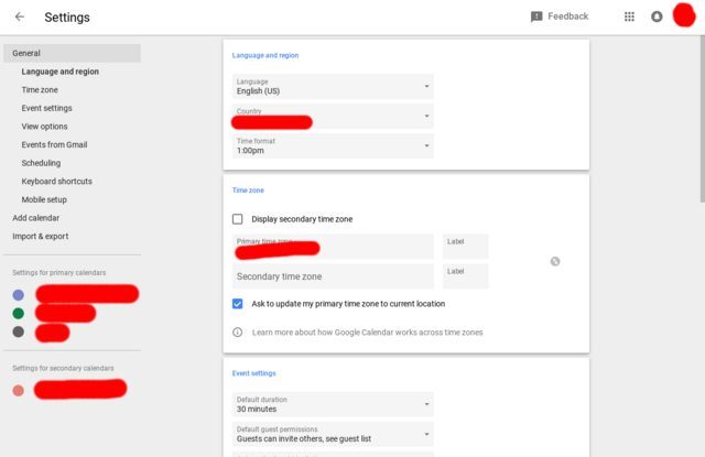
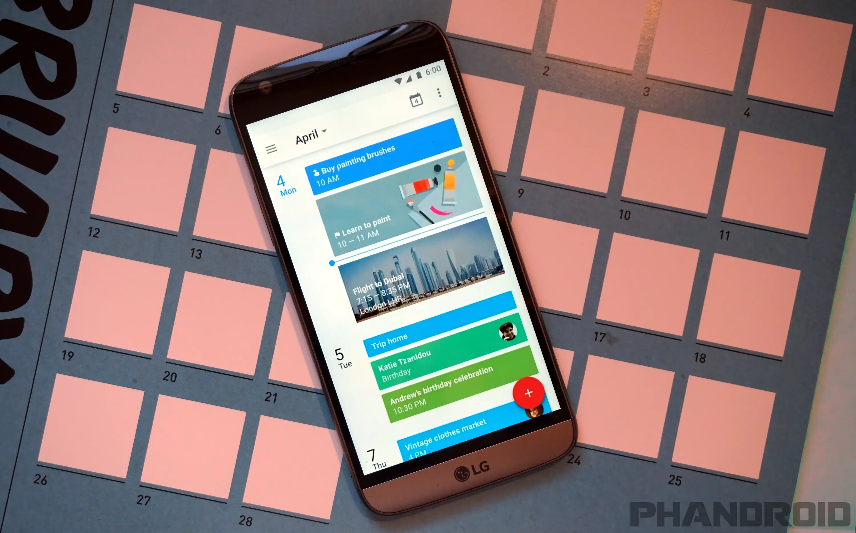
As you see in these screenshots, Google is looking to create a more unified experience for Calendar users. The color scheme and overall look ties in with the mobile Calendar app, and unification of these themes is definitely a welcome change.
I don’t know about you, but I’m super excited to see these changes, but I do understand there is some concern about Google forking things up. However, it seems these are simply design changes, and not an overhaul of how the app will actually work.
Only time will tell, but let us know what you think about this latest leak and if you’re looking forward to the new design.
Read more: 10 Tips & tricks to get the most out of Google Calendar
[Reddit]






Comments