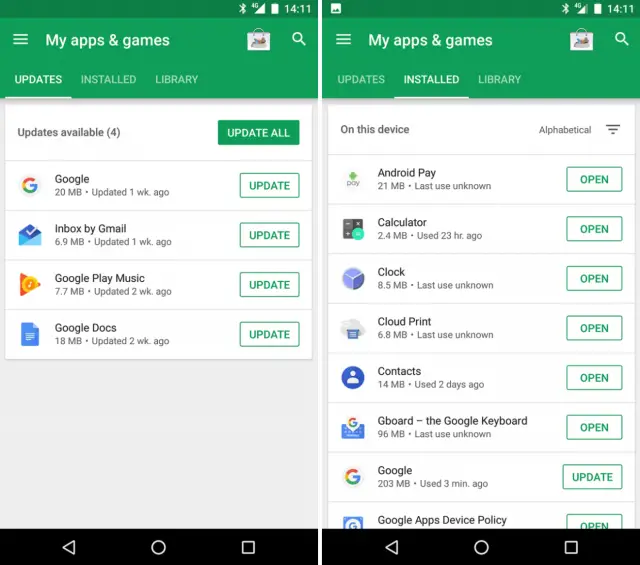
Google has been experimenting with the way it presents information in Google Play to make it easier to find apps you have installed on your device, but now it looks like the company has created a complete overhaul of how the My Apps screen works.
Android Police is reporting that the new layout has several different ways to sort through the apps installed. Right now the only tabs we have are Installed and All, so you can see installed apps on your device and all the apps you’ve ever downloaded. Now a new tab called Updates as appeared for some users, showcasing when an app needs an update and when it was published.
While the update tab itself is new, there are some changes to the way the Installed tab works, too. You can now sort all of these apps either alphabetically, by size, last update, or the last used time. You can also launch these apps directly from this page, instead of having to visit the Google Play page in order to open them.
This seems like Google is finally getting around to giving us more sorting options for apps on your devices, which is handy for those of us who have been using Android now for seven years or longer. The rollout of this new layout is apparently very limited, as one person tipped Android Police to the new update. I don’t personally have it on any of my devices, but expect to see it rollout soon.







Comments