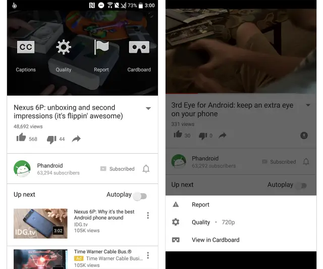
Left: Old | Right: New
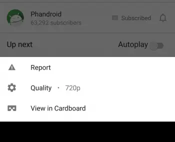
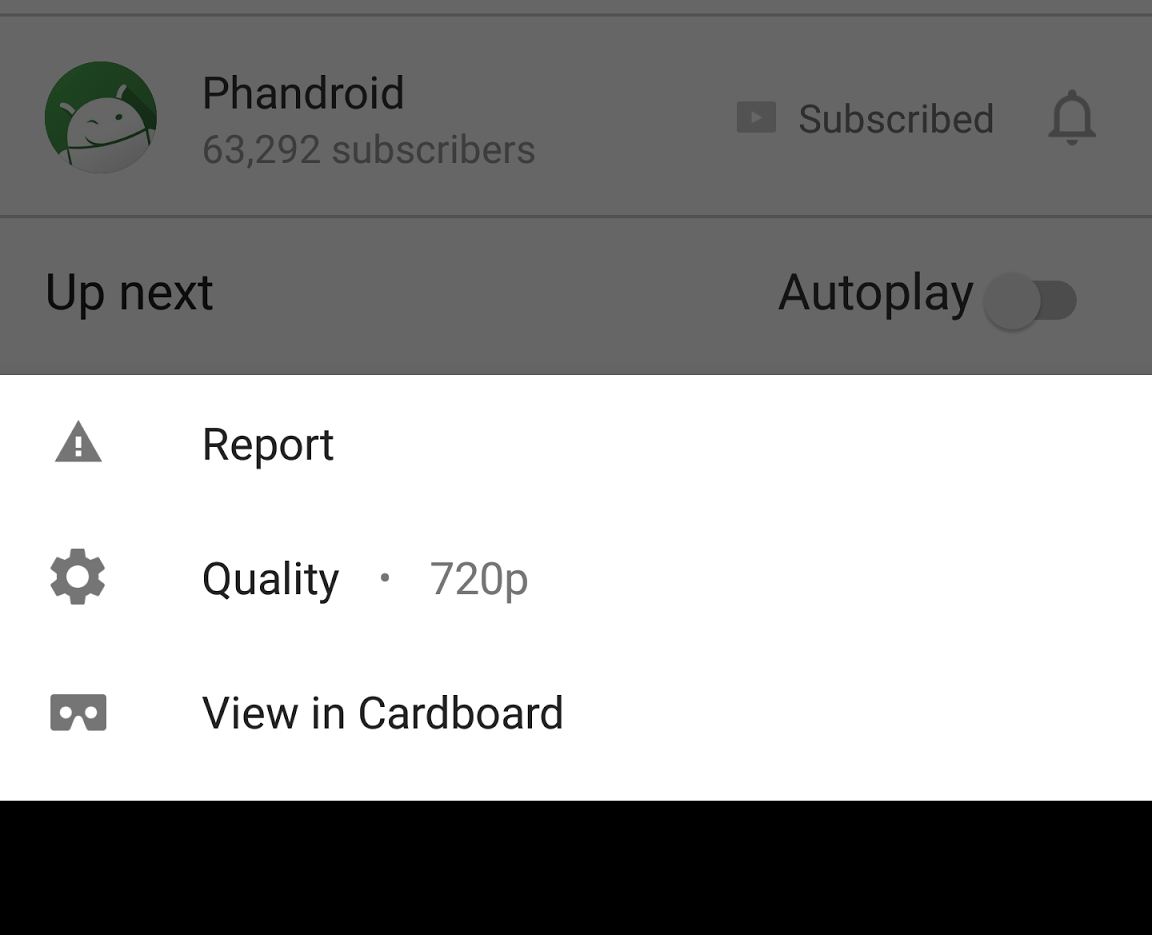
It looks like Google is enabling a new card-style options menu within the YouTube application on Android. This menu — which includes options for changing the video’s playback quality, Google Cardboard functionality, closed captions, and reporting tools — can be located by clicking on the three dots in the upper right corner of a video playing on your device. Clicking this will immediately launch the menu system.
Previously, this menu would float over the top of the video that you were currently playing. The change that is rolling out right now introduces a card-style menu setup that comes up from the bottom of the display. This new style closely resembles the material guidelines and will be more familiar to Android users trying to work with the YouTube options menu system.
If you are not already seeing the change, you should in the next several hours or days. This is a server-side switch which means that an app update is not required and will eventually make its way out to everyone. So far, we’re seeing it on our Nexus 6P, but not on our HTC 10 for whatever reason. Anyone else notice this new options style on their device?
[via Android Police]





Comments