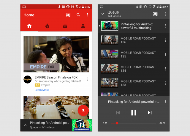
The ever-evolving YouTube app is getting another subtle change. If you use YouTube with Chromecast you’re probably familiar with the “Queue” feature. It allows users to add videos to a list, essentially creating a playlist of videos to play on the TV. It’s awesome when it works (and incredibly frustrating when it doesn’t). YouTube is rolling out a facelift for the queue right now.
At the bottom of the screen, you can now see the current video and bring up the queue at all times. Before, you could only see the queue on the page of the current video. Simply drag up the bar to see the queue and take actions on videos as you normally would. At the bottom of the new queue page are big play, previous, and skip buttons, like you would find in a music player. The new design makes the queue look more like a remote, which makes a lot of sense.
These changes are rolling out now via a server-side switch. You’ll just have to be patient to get it. How do you like the redesigned queue? Do you use YouTube with Chromecast a lot?
Thanks everyone!







Comments