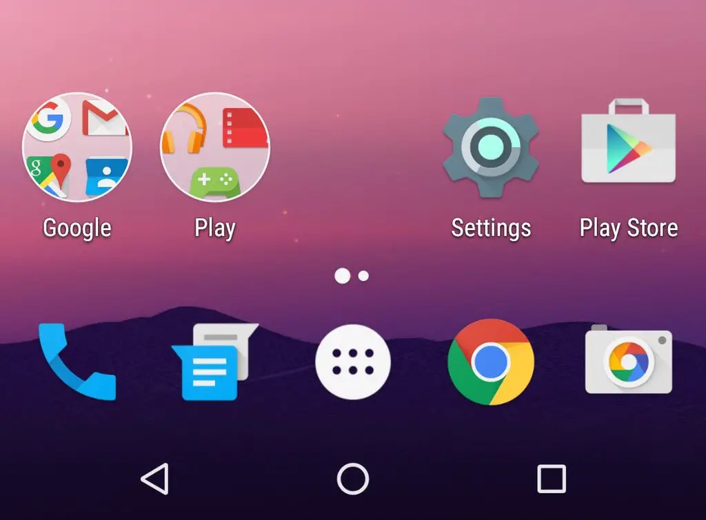
The Android N Developer Preview 2 is in full swing and there are a handful of new under-the-hood, as well as slightly more subtle user-facing, changes being discovered. One of the more interesting UI tweaks is with the updated Google Now Launcher that came bundled inside the update. The home screen replacement app now features a new look for app folders and depending on how your tastes, it might not be for the better.
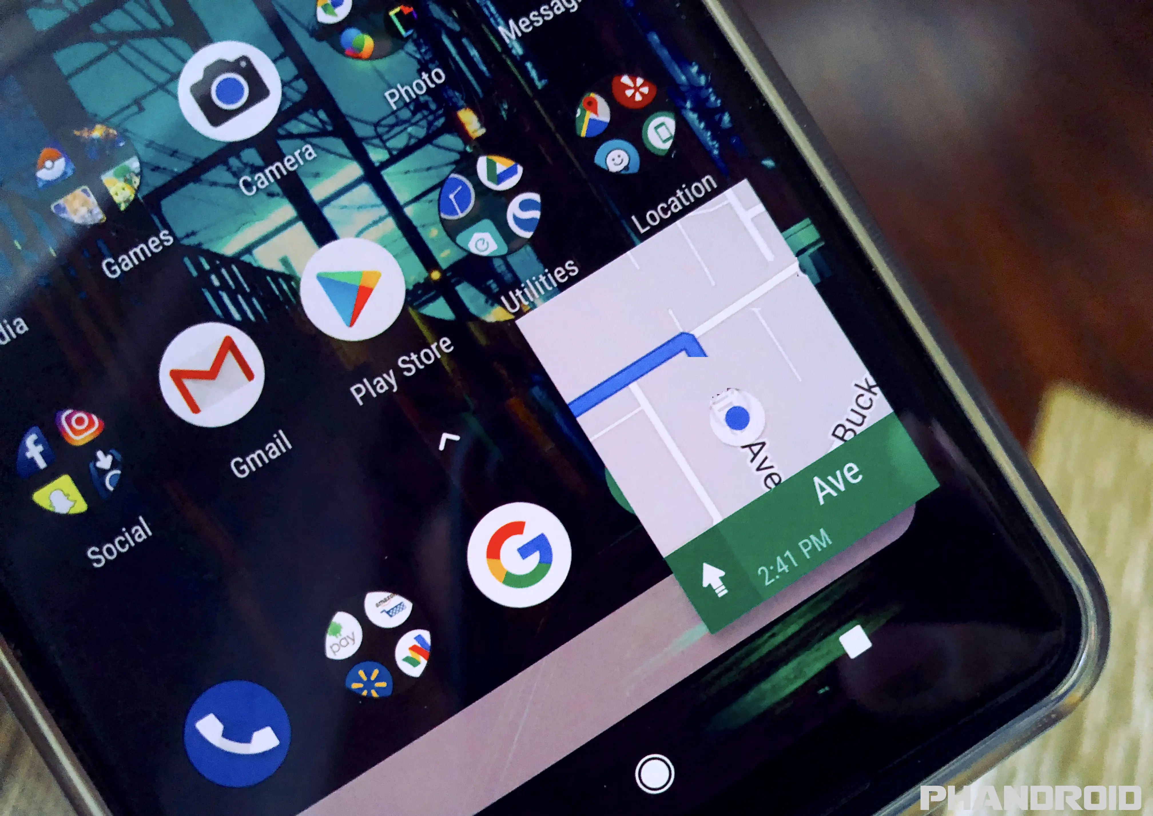
Gone are the once stacked icons sitting atop a circular background, replaced by new grid-view with 4 app icons peeking out. It’s almost like a hole in your home screen where your apps are now tucked away and everything else — like the animations and open folder view — are still the same. Our friend Tim Schofield did a great job at highlighting many of these new features — including the all new folder style — in his latest video, which you can linked down below.
So, will we see this new folder style hit the official Google Now Launcher on our non-Android N devices? It’s tough to say. The beta version of the app — which is a higher version than the one found on Android N — still has the old style folders. It’s possible Google is just toying around with the idea to see how users in the Dev Preview take to it. But if that vertical scrolling app drawer is any indication, we think there’s a good chance this will hit the official Google Now Launcher on Google Play in the very near future.


Comments