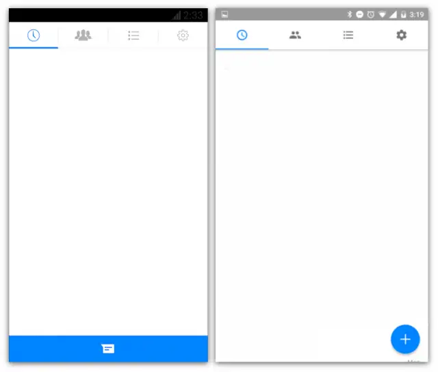
Facebook Messenger has long been Facebook’s best Android app, and one of the best messaging apps in general. It’s clean, fast, and full of features. The design has always had a bit of an iOS flair to it, but Facebook has slowly (very slowly) added more and more material design elements. The newest is a fabulous floating action button, better known as a “FAB.”
The FAB button floats in the bottom right corner of the app. It replaces the blue bar that used to display across the bottom. Tapping the FAB brings up Search, Make Call, and Write Message actions. The FAB is a much better use of space. It allows you to see more conversations when opening the app.Some users are also seeing a new grey status bar and slightly smaller icons in the tabs on the main screen.
Some users are also seeing a new grey status bar and slightly smaller icons in the tabs on the main screen. These changes are server triggered, so you might not see them right away. The new FAB is showing up in our app, but none of the other subtle design changes yet. Let us know if you’re seeing the new features in Messenger. What do you think of them?
[via r/Android]








Comments