It’s been awhile since we last saw an update to the Google Now Launcher in the Play Store (not since August 1st, according to Google). And while there still isn’t an update available quite yet, an update to the Google app is infusing even more Material design into the Google Now Launcher.
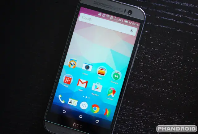
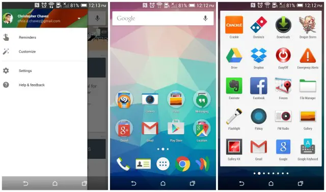
We were puzzled after our Google Now Launcher on our HTC One M8 — still running KitKat, mind you — suddenly looked identical to the version running on our stock Moto X Pure Edition. The search bar has finally been whited out, along with the app drawer button and app drawer itself. Turns out, after diving into our app settings, the actual Google Now Launcher app wasn’t updated at all (the version number stayed the same) — our newly updated Google app was the actual culprit.
You may remember that both the Google app and Google Now Launcher are closely tied together. This has something to do with the fact that Google Now is so closely integrated into the launcher (accessible by swiping to the right on the home screen). In any case, if you’re looking to update the look of the Google Now Launcher to mirror more closely our Lollipop brethren, update the Google app in the Google Play Store. Link below.







It totally screwed my home screen layout.
I don’t like how white the search bar is now. Clashes with background
I hate the solid search bar so much that I switched to Nova this morning.
I hate the solid searing white app tray just as much. Makes me miss Holo. I use Nova too for these reasons.
Agreed. I hope they add some customisation settings, even just a simple night mode would help some of the glaring whiteness disappear
I’m still favouring Nova Prime as my go-to launcher. Its Material update gives it a huge advantage over Google Now thanks to its deep level of customizability. For example, I hate the solid white background of the new app drawer, and Nova Prime lets me adjust the transparency so it still has a Material-like feel but to my own liking.
The only unique thing about GNow (IMO) is the “swipe right for instant GNow” feature, that isn’t as well-executed in some third-party launchers (which just open the app with a gesture, but closes normally)
On my LG g3 out switched to white, but I switched it back to clear, both choices have always existed as widgets for me.
Also ruined my homescreen layout. Lost widgets and folders. All this on my Nexus 7 2013 LTE which, by the way, is still rocking KitKat. Then again, I get about 18 minutes of battery life on my Nexus 5 with Lollipop so maybe it’s not a bad thing.
Same here! Ticked me off!
Wait, battery life is worse on your Nexus 5 with Lollipop than it was on KitKat?
Mine was significantly worse on 5.0, but 5.0.1 brought it back to about the same as KitKat.
Worse is an understatement. It’s a very, very common issue. 5.0.1 didn’t help mine. I did OTA and also a fresh, full install. Stock Nexus 5. Sad.
That’s terrible. No wonder Cyanogenmod has been holding off on releasing CM12. And here I thought Lollipop would improve battery life. That being said my Nexus 5 on KitKat CM doesn’t exactly have great battery life either.
Weird….if anything the battery life improved on my stock Nexus5 running lollipop
made me switch back to Nova as well.
Love it. Love it. Love it. Have xposed frameworks installed and xposed gel settings. Can customize the crap out of the gnl, and just remove the search bar (its hideous no mater what color) and love the material elements it brings
Is your app drawer solid white now? Or did the gel settings dev fix that quickly?
im waiting because white background and white text its horrible for the app drawer, it need premium for colors on he text which i dont have
He has already fixed it. It is totally worth getting premium for this app to unlock all of the options
Not even gonna try any other launcher anymore Nova is all I need. I tried a lot of launchers but switched back to Nova every time.
Tell me about it. I had my Google launcher all customized nicely with xposed and they go and make everything solid white. Screw it, back to Nova. Never leaving again.
That dev knows what he’s doing.
Sounds just like me. I can’t ever find anything else that matches the quality of Nova.
They are going to catch some s**t about that giant ugly search bar on people’s home screen.
even tho I dont find it ugly, it is counter productive in my opinion since all you have to do is swipe to the left to bring the same search bar up. Or for those like myself, just say ok google from any screen and viola !
Would like android to allow customization of notification drawer also in launchers.
Anyone else miss Launcher Pro?
ADW all day. Lol
Is it just me or does the battery suddenly drain like crazy after this update on my Note 4?
Just you, my note 4 is OK
same here
I like this new style
I’ve tried Google launchera few times but imo it doesn’t compare to Nova Launcher. Nova has so many customization options, every other launcher falls short imo.