You’d be hard pressed to find another music streaming service with a recommendation algorithm as finely tuned as Pandora, but over the years there’s no debating the app’s user interface has taken a sort of back seat. Don’t get us wrong, it looks great for a Gingerbread app, but the app is about to get a long overdue makeover that’s more than just a new coat of paint.
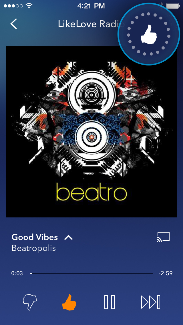
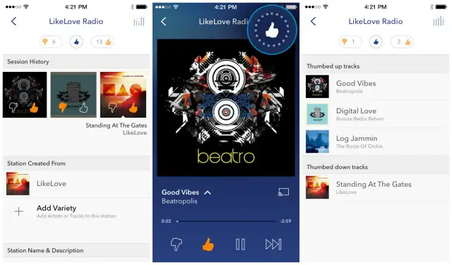
The upcoming update — available in beta for both Android and iOS — will be rolling out in the coming months and sees the Pandora completely overhauling their user interface. A mixture of iOS and Lollipop design guidelines, you’ll find the inclusion of Material-ish transition animations when moving from the Station List to the Now Playing screens.
Pandora also points out that the new design puts a greater emphasis on station personalization, allowing users to easily go back and “un-thumb” previously played tracks with their new thumb history. With music discovery being the main reason why many of us use and love Pandora, you’ll now see more artist information available with a “swipe and tap” gesture for those wanting to learn more.
You can check out the all new UI in video form (complete with gorgeous new animations) in the video for the iOS beta down below. We honestly can’t wait for the new look to go live in the near future.
https://www.youtube.com/watch?v=jG388u1UzN0





They still have ads= Not interested, Google play music is 10 times better anyway. Completely worth the money.
Spotify with a student discount isn’t bad.
I thought the paid version didn’t have ads?
It doesn’t.
Well now I see why they have that troll face for an icon. Let’s compare a free service with a paid service.
Every music streaming service has ads when you don’t pay for it.
They still haven’t fixed my biggest complaint which is bigger buttons, when driving this could literally be a life saver. Also switching menus or doing a full exit it’s a trial in steadiness, hit a pot hole and you might as well just give up, also I think there should be a speed based limit on video ads
Can you touch the pictures to control the music? Touching the album art would pause, swiping left or right moves from left or right.
I do that with Google Music, though touching the picture doesn’t pause.
Touching the album currently gives you more information, maybe this update will change that.
I use my lockscreen buttons to control Pandora and all my music playing. You can head back in later on and thumbs up if needed.
It will break Pandora patcher. No thank you.
I got a fix! Spotify!
Not a fan of Spotify’s music recommendations. Or anyone else’s for that matter. Only Rdio comes close to Pandora, but still not quite.
No Taylor Swift = Deal breaker
Ha, complete opposite for me. Her being gone is a feature.
Her music won’t show up in my radio feeds anymore? Stop making me love you so much, Spotify.
It looks more iOS than Material.
“…go back and “un-thumb” previously played tracks with their new thumb history.”
YEEESSSSSSS. Finally!
Can I just kill the app from the notification drawer? That would make me happy.
stop using pandora a while back. kept playing the same artist and song.