
Hold onto your hats — if you aren’t brave enough to be on the Chrome beta channel, then the update headed to the stable channel should bring quite a nice surprise. Google has updated the stable channel with a redesign that’s akin to the Material Design language introduced at Google I/O this past year. The app features a lot of clean lines and smart use of white space. It helps to provide an experience that doesn’t look or feel cluttered.
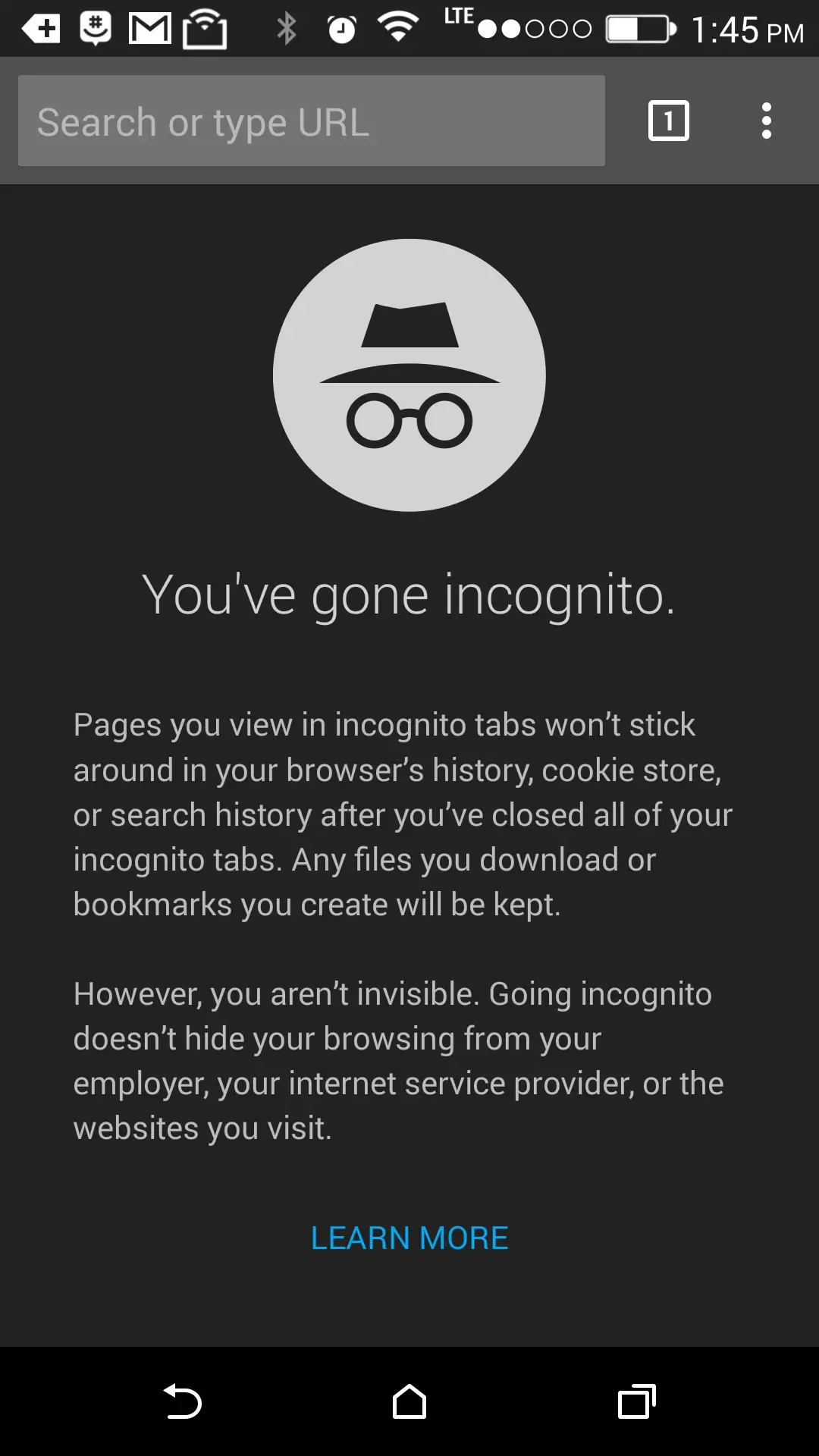
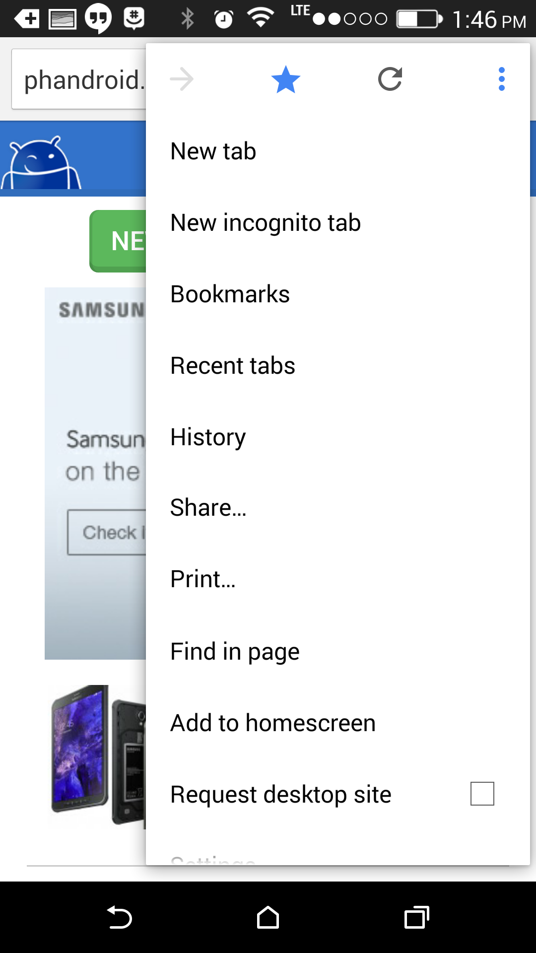
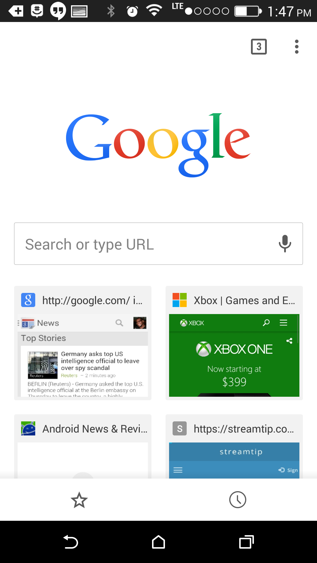
The layout is pretty familiar to anyone who has used Chrome as their browser over the past couple of years, except it all looks a lot nicer and neater. The new incognito page also received a bit of a face lift, so you can easily tell the difference between regular and incognito tabs. The app also feels 10 times more smooth when scrolling through web pages.
The rollout should be headed to everyone via Google Play, though its staggered process means not everyone will see it right away. Fret not — we’ve got the APK you seek right here. This thing is signed, sealed and delivered straight from Google so install it without any fears and let us know how it’s treating you in the comments below.


Ooo… Phandroid’s getting in on the APK download game now too? (Or have I just not noticed before?). Usually head to AP for ’em.
Sometimes they do, and sometimes not. Not sure if there is any reasoning or logic to which the offer up downloads for.
Was on the fence about this UI change, but the menu animation sold me. Now if we could only get the dark theme option….
Hmm… I still don’t understand why there is soo much hype about Material Design. Animation apart, for me, it looks like there’s too much spacing between elements. Screen real-estate is being wasted. Now you have to scroll even for a small list.
I agree with the menu here. On the Nexus 5 you get a scrollbar just because ‘Settings’ and ‘About’ are off screen. They could easily reduce the spacing between elements by about 10% to avoid this. (minor annoyance, in an otherwise nice redesign).
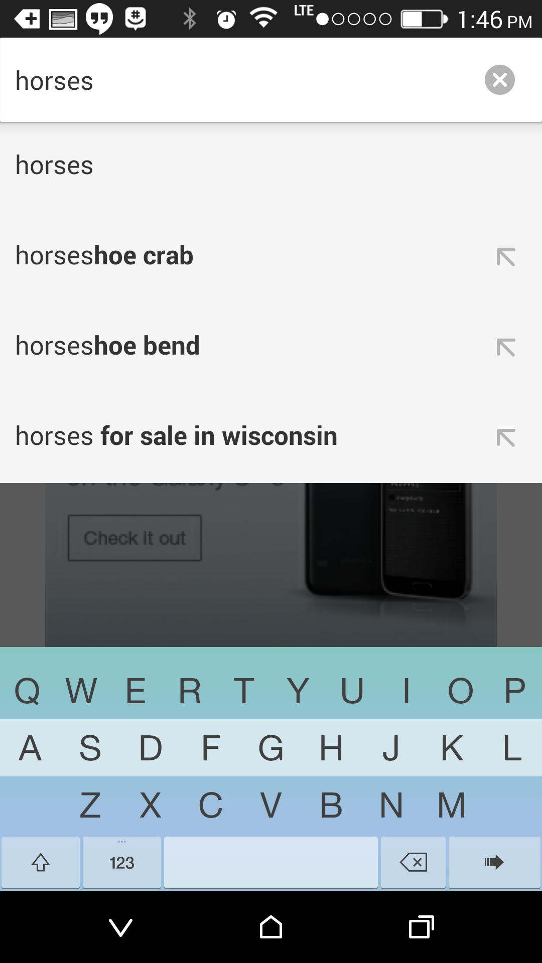
And if you used Chrome Beta for Android, you would’ve seen this already, (Not sure about the keyboard theme shown here)
That’s one of fleskey keyboard themes.
Just snagged the download… It looks nice and clean. I wish the url bar wasn’t so thick… Thankfully it hides away. But even that’s kinda jittery. I wish they would give is a true immersive experience allow the full screen to be used for the browser like in games or videos
Seriously when will they add a reading mode. I think chrome is literally the only browser without a reading mode. Also when is extensions going to come. As for the update it looks nice. Would be nice if they used immersive mode ie not hide the buttons but make it transparent like they do with the Google now page on there launcher.
New logo in the launcher too, also flatter with most of the shine removed. I wonder if this will roll out to other platforms?
Yes, it’s so much nice to have to menu for everything now that there is more whitespace!
Have you ever seen a design change you didn’t like because “OOOH NEW SHINY” There’s no clutter with actual functionality anywhere, only clear empty space!
I’d like to reload, hit the menu button. I need to stop the page load before it, oops sorry, the menu animation was pretty and you couldn’t get to the X in nearly enough time. All the form entries that we wiped out? Good luck!!