

Just a few days ago it was considered highly unlikely that Google would show off a new version of Android at I/O. Yesterday the rumors started swirling to suggest we would see Android “L” announced today. Well, here we are, and Google has just announced Android L Development preview. Check out the video below of the new design language.
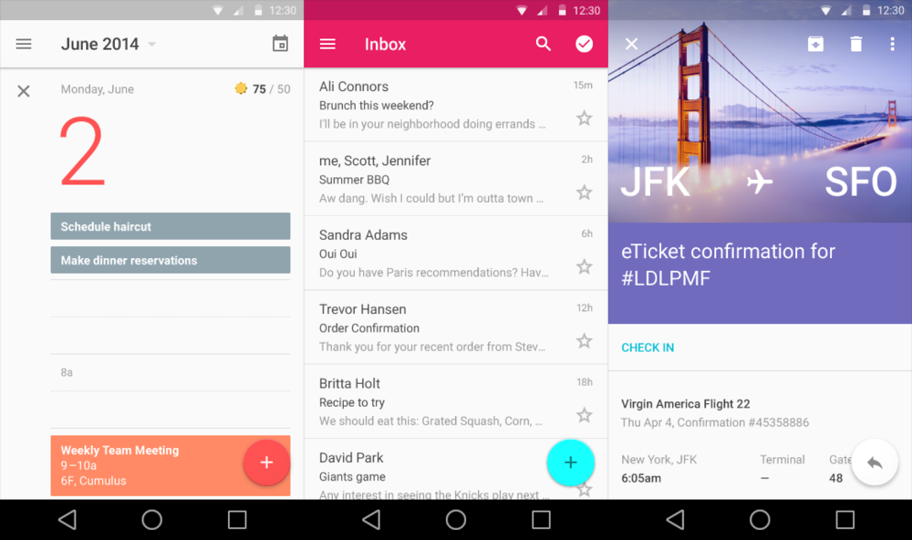
This new deisgn language is a departure from the “Holo UI.” It’s called “Material Design,” and it has more color, depth, animations, and cards. Google is releasing this design to developers today. Google didn’t talk about core features of Android L, or even tell us what the “L” stands for. This was just an early look at the new design we can expect with it. Android L will see a full release this fall. Do you like it? What do you think of the new navbar buttons?


Since I’m on Verizon, I should see these updates around the 3rd quarter of 2016?
Almost spit my soda out.. LOL good one.
Wow, there is a lot of empty space there… is that a reflection of what’s going on in their heads?
I love it.
I always wanted a pink themed inbox.
Wonder how will it affect Cyanogenmod’s new Theme Engine.
Or will Material Design be just at the apps level?
Android L feels younger and more ‘fun’.
so no more transparent nav bars?
nvm they are there
We don’t need a whole re design, just give us a damn dark theme option already!!
Android wear looking good besides 360 not till summer cue moan!
The nav bar buttons look horrible… why is the home button a circle? They’re going to get sued by apple…
Apple patented the circle now?
Also the transparent status bar looks much like the one on sense 8.. I prefer the one in kit kat that we have now :/
Aww man, that is one of my favorite features of Kit Kat. It really helps the software disappear. Not happy about the status bar having an always present background that I can see. Hopefully Nova will let me keep it going forward.
I personally don’t like the new navigation icons… but I guess it just takes time to get used to it =/
Reminds me of the HTC First a bit. But yea, not a fan so far. But your damn right i’ll be running that preview LOL
Animations look good.
Nav buttons, not so much. Easily fixed though.
I don’t for the life of me understand why we don’t have built in themers on all of the flagship phones by now. Or at least additional choices of holo, blacked out and slate.
Notice the time ;)
So Google wants to look like the new TouchWiz? Whatev, Google.
Not even close…
So this isn’t close? Looks pretty close to me: http://www.androidcentral.com/sites/androidcentral.com/files/styles/large/public/article_images/2014/04/samsung-galaxy-s5-stranslat.jpg?itok=kQ1YMUNj
And the floating circles in the lower right corner…now look in the lower right corner of the S5 lockscreen. Hmm, floating circle.
Hate the navigation buttons. They don’t even make sense. A circle for home? A triangle for back and a square for recent windows? Huh?
Almost feels like they took a Playstation controller and took similar functions from those buttons and put it on Android. Then again, on Playstation, circle would typically be back.
I see where they’re going with the Circle being home though (e.g. Google+ Circles).
There design changes and addition of animations confuggles me. Wasnt it during the Kit Kats release they had a mentality where the download marks that show up on the WIFI icon where not included Bcuz It was considered an energy hog for the phone to constanly animate those notches. Now they have only upped the animations within every phone that is going to run 5.0….Wouldnt all of that transition animation once again drain battery?…or am i totally wrong in my thinking?
I think the Material design looks great but the new buttons don’t seem very intuitive.
Did anyone else notice when Sundar said you get an extra 19 minutes of battery life?
Did the text on streets of google maps get any larger when you zoomed in or does it get smaller and harder to read? This is one thing I hate about google maps. If your eyes are older you can not read the street names when you zoom in. Or you zoom in so far you cant see enough of the road to make it useful.