
With Android 4.4 KITKAT, Google brought a ton of changes. Most of those were new features and under-the-hood goodness, but Google also brought a few significant aesthetic changes that had some people a little uneasy. For starters, they eliminated the blue and decided that white was going to be the one, and only, color for things like keyboard text, status bar text and icons, and the trace trail inside the keyboard.
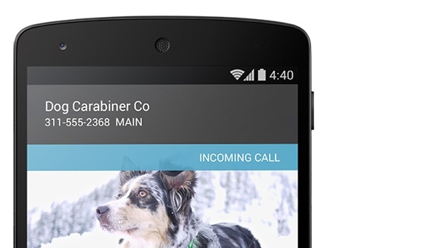
Another key change Google made was moving the network status indicators from the status bar to within the quick settings toggle menu. A lot of people might not have ever noticed it on their current phones, but the arrows on the network icon (whether you were on 4G/3G or WiFi) would light up whenever bits of data were being transferred — up is upload, and down is download, natch. Beyond that, the network icon would turn gray whenever access to the Google Cloud Messaging service was not available (that is, the protocol that handles push notifications through Google’s system).
These weren’t just random changes, though, as Google’s Dan Sandler thankfully reminds us that everything happens for a reason. In the comments thread for this Google+ post, Sandler gives a pretty in-depth explanation about it all. Long story short?
A more neutral color scheme makes it so that the OS doesn’t clash much with an app’s custom look, and the network indicators were confusing for a lot of casual users, so they tucked it into a secondary menu where the geeks can find them (if they really need them). You can find the full explanation below if you’re interested.
Seems like this is as good a place as any to explain the changes to the system status icon colors in KK.
1. Whiten ALL the status bar icons! Aesthetic concerns definitely factored into this (as has been mentioned elsewhere, a more neutral SystemUI allows apps to manage their own color palettes a bit better), but also keep in mind that with the new translucent bars feature, the color became a usability problem. Good old 33b5e5 doesn’t pop as well on top of random wallpapers, even with the background protection.
2. What about the
MCSGCM indicator? +Liam Spradlin basically called it: “Overall, network connectivity has been made strangely more opaque in KitKat, though for many average users this isn’t a huge concern.” In fact,most users find the colors confusing, if they notice them at all. Even the vanishingly small fraction of users who understood what the gray meant only really looked for it when things weren’t working right; now you and I just have to remember to actually pop into quick settings to look for things like GCM liveness (orange is the new gray) and in/out indicators. Which brings me to…3. B—BUT MY BLINKENLIGHTS?! So this (the removal of the little in/out data traffic arrows from the RSSI) was mostly a performance consideration, believe it or not. The way the data bits are bubbled up and drawn was not only causing a ton of extra rendering work, but actually forcing a layout (!) in the status bar as well. We could have more aggressively cached the bitmaps (rather than creating new BitmapDrawables from resource IDs every time, which was causing the relayout) but that would still have left all the drawing—multiple times per second in some cases—sucking away precious CPU and GPU from your game or Launcher animations or whatever. In the end it seemed like a lot of work (and battery) for what was effectively visual noise, so this too was booted to Quick Settings where it would be available for us nerds.


“The way the data bits are bubbled up and drawn was not only causing a ton of extra rendering work, but actually forcing a layout (!) in the status bar as well.”
And then there was the Sprint Spark icon lol. I wonder if it shows up on the Nexus 5, my guess would be no.
My thoughts exactly!
made me think of this for some reason
http://bensbargains.net/thecheckout/wp-content/uploads/2013/06/neutral-futurama-propaganda-poster.jpg
so, where are the settings for these in Quick Settings. I do not see them. Anyone, anyone, Bueler, Bueler?
They are not “settings” (i.e., something you turn on or off), they are just implemented in the quick settings. If you swipe down your quick settings, you will see the up/down data arrows next to your data signal. If you don’t have an active signal, the bars will be orange. This is all automatic, not a setting.
“sucking away precious CPU and GPU from your game or Launcher animations or whatever.”
Seriously? I’m not buying it. When we have phones with quad-core 1.9GHz CPUs I’m pretty sure there’s sufficient leftover horsepower for data send/receive indicators. Considering all the useless animation eye-candy that Google forces upon us that we DON’T want.
Something that causes a full layout render every time will indeed slow down performance and increase battery consumption. It may not always be noticeable but trust me, without it things will be smoother. Google has done a lot of work in letting people debug this in Chrome so it’s good to see the same techniques going into Android.
This is all part and parcel with all of Google’s new “UI vision” and I for one don’t like most of it.
If I want an Apple experience I know where to get it.
Meh. I like to know when data is being used in whatever fashion; having to go to a special “geek” menu just to see it. And camp that page the whole day which is counter-intuitive.
Just like Windows did with their network icon; no more information. It’s dumb. In the age of processing power increases, we shouldn’t always be looking for minimalist. I want to be able to take advantage of that power. What they really should be doing is increasing R&D into battery capacity.
It’s in the Quick Settings. So a 2-finger swipe will bring it up. He’s right though. I only look at it when there’s a problem.
I don’t know how this will make me feel.
I’ve always wondered why back in the day with little processing power there was tons of chrome on everything. Now that we have a lot of power everything is minimal and easy to render like the squares in Metro, etc.
Hopefully OEMs such as Samsung, HTC, etc will fix this
Theres nothing to fix.
its ko0o0o0ol :) was reading article on http://techbeasts.com/ that you can install custom 4.4 version on note 2 .. can i ?
You’d have better luck asking this in the forums.
I’m going to miss that blue, but it makes sense. Gotta say, I never missed the green.
I miss it. I go back and make my icons green every now and then.
Seriously, how significant of a resource drain could this have been? And now I have to go to the toggles, which sits atop the very app I’m trying to monitor for network activity. Annoying if you ask me… Why not just make this an option for power users to switch on or off? No, of course not. Let’s become Apple and dumb down everything for the masses.
The thing I’ll miss the most is Tablet UI. Yeah, PA confirmed it’s gone. At least for the N5.
Proof: https://plus.google.com/u/0/107979589566958860409/posts/Zg3t6YGPUDJ
So it’s just signal level indicator? Does it at least still show if you are connected to 2/3/4g???
I would imagine so. The picture above shows a phone connected to WiFi so its hard to tell.
I still will miss holo blue.
I’mall for anything that helps the battery and speeds up the phone.
I don’t know, I’m buying this explanation. I do like the change to white, but miss my little arrows.
I recently upgraded from a Galaxy Nexus to an LG G2. But for a brief time I ran a 4.4 ROM on my Galaxy Nexus, and the lack of the network traffic indicators was the most annoying thing about it. In fact, I was wondering if it was a bug with the ROM or something. If Google wants to turn off the traffic indicators, that’s fine. But at least give me an option to turn them back on.
Since upgrading to the LG G2, I’ve got to say, I’m no longer sure that the “pure Google” Android experience is the best. LG has added a lot of interesting features into the G2, and a ton of customization. Even though it’s still on 4.2, I can’t really say there’s much that I miss from either 4.3 or 4.4.
Hopefully LG will give us the option to turn back on the network traffic indicators when they upgrade the G2 to 4.4
It;superb
http://androidgalleryapkbd.blogspot.com/2013/11/memory-booster-full-version-v59-apk.html
I got used to it already, and I like the orange because it alerts me better.
Geek-think, give me a break. What else is a developer to do when they can’t add any new worthwhile wiz-bang features? They change existing minutia , simply change for the sake of change. If it ain’t broken, don’t fix it.
This is rather annoying.. “most users only looked for it when there was a problem” … WHAA?? So, when you walked into someone’s house, and connected, you didn’t watch the colour change?
I have found the 2-tone colours *SO* helpful, especially with work where the network can sometimes cut out, or at home (again wifi), or sometimes where the H (3G) signal isn’t working correctly and you’re wondering why someone isn’t responding to a chat.
At least some sort of visual aid for things “working” or “not working” would be helpful G-man (exclamation marks, a single cross-out line, etc).
… The up/down I don’t care about too much, system info does that for me.
I’m not sure what the problem is – phone or OS, but the Nexus 5 is garbage. The color of the icons is the least of my problems with it.
I just upgraded by Galaxy S4 to 4.3, and I noticed the data upload/download arrows are now significantly smaller. Now I read they’re completely gone in 4.4. I’m sorry but I don’t buy that they were “confusing” to people, it’s incredibly straightforward. I’m afraid the REAL reason they’re making these changes is to make it less obvious to us how bad our service is.
It’s to hide your phone is dl/ul something, so you spend more money without knowing. It’s a contract with providers.
It’s actually really sad how much I love the change to white status bar icons. I love the neutrality it creates and sets for the entire device UI. It’s actually one of the main reasons I love HTC Sense, it allows you to choose the way your colors will look while keeping them simple and clean.
google, why my battery icon is one pixel short related to other icons which looks ugly?
Why, when you swipe out settings screen , status background stayis visible for about quorter of second which also looks ugly?
Buuuullshit. With each update it only gets WORSE.
P.S. Shoud’ve stayed green, by the way.
Terrible update I hate having to open the little menus to see if I’m getting good data