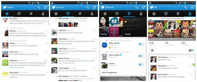
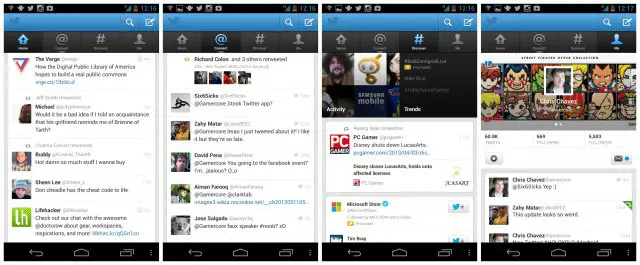
It’s been a long time coming, but it seems the developers at Twitter have finally caught onto the craze that’s sweeping the nation: Holo. Sometimes known as HOLOYOLO, Holo is a term used to describe Matias Duarte’s new look for the Android UI that was introduced back in Honeycomb. It’s a more minimal, “flat” UI styling that as of today, has finally made its way over to the official Twitter app. You can take a look at the before (below) and after (above).
Old Twitter. Ew, yuck!
But that’s not all, probably the most useful update to the UI are the new swipeable columns. This alone has kept me from using the official Twitter app for more than 2 seconds and comes as a needed, most welcomed change. It’s also easier to see your full follow list by simply typing “@” when composing or searching a tweet. Before, you’d have to type at least 1 letter after the “@” if you wanted to pull up a list of suggestions. Not helpful if you follow tweeters that constantly change their name (or if you can’t simply remember what their handle is). Oh, and the same now applies to hashtags as well. Lastly, links to the Play Store no longer direct you to your browser, and then to the Play Store — it’s all direct now. If you want to give the new Twitter a spin for yourself, the app can be download via the Play Store link below.
[Google Play link: Twitter]








I’ll just go ahead and leave this here.. https://play.google.com/store/apps/details?id=com.jv.falcon.pro&feature=nav_result#?t=W251bGwsMSwyLDNd
My favorite Twitter app is Plume. Its feature packed and even has wideget that allows you to scroll through your timeline and compose new tweets right from your homescreen. It is the most functional widget I have ever seen!
Plume is my current go-to although I was really enjoying Twidere for a good while..
Wow, this is way better. Kudos Twitter. I always hated reaching way up to hit different areas and I hated the swipe feature on the tweet. Felt like it was worthless. Much faster now as well.
What font is the new app using?
Looks like Roboto to me.
Made all the difference
Echofon is what I use. If not I wouldn’t use the dedicated twitter app, it’s just too slow.
I still don’t see the point of twitter. #unimpressed
How can I describe Twitter. It’s like Facebook but without all the sh*t. You don’t have a profile displaying every single bit of information about yourself and what’s better, you don’t “accept” friend requests. Because you follow people you’re interested in, it almost makes it like a social RSS feed.
I love Twitter (if you couldn’t tell). :p
Twitter is way better than facebook and 90% less drama. Part of it’s charm is how it limits the number of words.
is it me or are the android apps starting to look alot better than apple “?
They’re looking more… minimal which could go either way depending a person’s taste.
I’ve been hearing that Apple might (finally) try and spiff up the UI on iOS. I wonder if they’ll go the minimal route as well..
Twitter is so stupid
I like the update minus all the people who come up in the search when I’m trying to pull up one of my followers and the new ultra thin font.
It looks a lot like the now dead Boid app, an opensource Twitter client. I believe it was one of the first Holo apps. It still is the only Twitter client I have… time to go app shopping!
http://androidpure.com/boid-app-for-twitter-coming-soon-on-gingerbread/