Opera Mini is one of the most popular mobile web browsers out there and its making a valiant fight for supremacy, today launching Opera Mini 5 in beta form with a laundry list of new features.
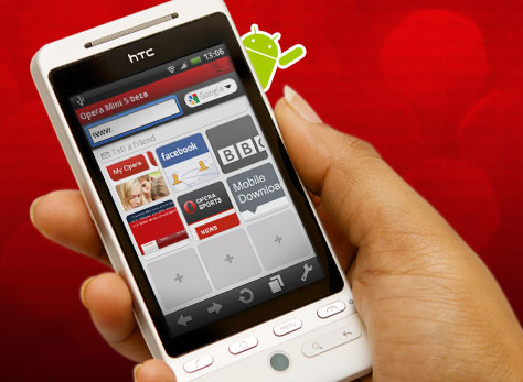
The most noteworthy additions are tabbed browsing, speed dial (quick access to favorites), password manager, opera link (sync with desktop), and download manager.
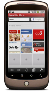 I’m really liking the direction Opera Mini is headed, but for the most part these new features aren’t anything shocking – they are just what you would expect from any browser. The trick here is that they’re implemented effectively:
“Android users should not have to compromise when it comes to surfing the Web on their phones. Opera Mini will give Android users a fast and cost-efficient access to their favorite Web sites and services,” said Dag Olav Norem, Vice President of Products, Opera Software.
I think that’s the trick and something we’ve heard Google say before in regards to the purpose of the browser (related to chrome); a browser should get out of the users way so they can focus on what’s important – the web. In my mind the real innovation here is going on behind the scenes where Opera compresses data by up to 90 percent before sending content to the phone, allowing your mobile browsing experience to be much quicker and more optimized.
One downfall to point out is that the browser doesn’t support multi-touch, an unfortunate flaw that could be a deal breaker. I’m still waiting to see some effective alternatives to pinch and zoom in the browser like the zoom-wheel that briefly leaked and then dissolved into oblivion.
Give Opera Mini 5 a download:

And then let us know how you like it.
[Via Press Release]





Frankly, I thought this was a letdown compared to xScope which feels much more solid and responsive (and also have tabbed browsing and quick access to your favorites). If you haven’t tried xScope on your Android phone, have a go at it. It’s free.
Concerning multi-touch in phone browsers: it’s not that useful. Annoying even, if you’re used to holding your phone in one hand when browsing. I was thrilled initially when I heard that HTC had enabled multi-touch browsing on the Hero, but I often wish I could switch it off.
It’s much more suited to photo galleries and the like.
It stinks, and i dont like it.
Its cool how you guys post barcode scanable links in your articles its easy to download things on my phone…when I’m viewing your site on a computer. But seeing how this is an android dedicated site with an article specifically about mobile web browsing its a safe bet that I’m on my phone right now and restricted from scanning my own phone. Using clickable links for a site like this is a little bit more logical
WTF! Where is zoom?
Multitouch should be optionally available via an setting. Can’t see any point of Opera Mini vs xScope or Dolphin right now.
Tried it for five minutes and uninstalled… First test was a failure – the Google Reader mobile site. Dolphin and stock browsers display perfectly – Opera was simply a list of bulleted links. Didn’t give it a chance beyond that. Hopefully the final version will support all page renderings and not skimp on the format. Tabbed browsing is by far the #1 requirement – multitouch, not important.
Such a waste you can’t zoom in or zoom out. I would use it if they added zoom, without that it is useless.
multitocuh?why? opera mini doesn´t show web pages normal but with converted via the server. Pages is small(data), text and images are adapted to the screen. If you zoom, tehy will be blurred. Don´t see text, enlarge font. Want see picture, click on it.
Opera mini isn´t normal browser like Opera mobile, but faster and easy utitlity for see web pages.
Doplhin and xScope is only better UI on default android browser, not separate browsers!
I had to change image quality from low to medium (looked like crap) and back to low again to get the zooming to work.
…and it’s very unattractive zooming. Hard to explain.
One question here…Why the hell is it requesting permission to make phonecalls?
I actually think its pretty solid. I won’t say its terribly faster than the other browsers I’ve tried but it is quick (for me).
Multitouch isn’t necessary so I wont go into that.
As for zoom, I hate the way they implemented that. For those that dont know, you need to rotate your trackball and then click. For devices without a trackball, I dont know. Its an overall nice feature to zoom in on specific spots on the page but the lack of traditional zoom buttons makes it feel like a chore.
I LOVE my Dolphin browser, but I’ll give this a try to compare. Seems that Dolphin already has all the features of this plus multi-touch. I’ll check out xScope too, but it will be hard to get me to switch.
It took a while to figure out you just tap to zoom in and kind of double tap to zoom out…still…WTF NO ZOOM BUTTONS!!! Overall though, very nice looking browser.
Also, very hard to scroll straight down the middle of a page.
@johnbarry3434, even the tap to zoom in/out doesn’t work at all on some pages (that are scrolling horizontally on my Milestone).
What are all these comments about “no zoom”? Just tap the screen! It doesn’t get easier than that.
The problem with Dolphin and all the other ones is that they don’t compress data, so Opera Mini is much, much faster especially on a slower connection.
@Tom Robson
What pages doesn’t zooming work on?
I see that many people here do not understand how Opera Mini works. First of all you should understand that OM has two rendering modes:
1. Mobile view
2. Normal view
Mobile view always fits pages to the screen width, so no horizontal scrolling occurs. This mode is the best for such sites like Slashdot and Phandroid. You just get straight to the text content! Why to zoom and mess around?
Normal view works almost like your Dolphin/Mobile Safari today. So you need to zoom to see text, bla-bla-bla. You may know that Mobile Safari allows a web-developer to lock zoom level, so pages will work without zoom. Safari does that through proprietary META tags. Opera Mini also can do this, but using open standards – HTML and CSS. So when you visit proper standards compliant and mobile phone ready page in Normal view, this page will work just like in Mobile view – without zooming and horizontal scrolling. This is NOT A BUG! This is the way SITE OWNERS INTENDED!
So leave your complaints to web-devs. But better – complain to WebKit devs not properly supporting mobile rendering modes specified by W3C.
And one more thing about multi-touch. Opera Mini is just a thin client for a rendering servers out there. Zooming is done there too. When your recieve a page you get it at some zoom level calculated at the servers specially for your device. So dynamic zoom is not very possible. At least not very likely to be made.
If you use your mobile browser to get data from internet, read news and so on, and you use mobile browser a lot, then you already know that multi-touch is a pain in the ass. But if you are a kid bragging in school then go and buy iPhone. It’s that simple.
By the way, Opera Mini is really the best mobile browser out there – I’ve tried most of them since this is a part of my job.
Yeah, I was just messing around with it on my GF’s Cliq and discovered how to zoom correctly. Given that, its now my favorite browser. After using it for a while it does feel faster than the others (I havent tried xscope). As my default PC browser, its now nice to have it as my primary mobile one too. Go Opera!
1. Wow. This thing is awesomely fast
2. I can’t open youtube vids. wtf?
3. Google mobile doesn’t recognize it as droid and gives you the simple HTML view. Seriously?
Opera Speed > Android Browser
Opera functionality < Android Browser
The end.
I really like it so far, seems pretty decent, and I’m not having any problems with page rendering :)
they called it “mini 5” as in the same name for dells device? what the what?
@Brett Lewis
No, they called it “Opera Mini 5” because it’s version 5 of Opera Mini. The previous version was 4. The one before that was 3. And so on. Get it?
The interface is very nice, and I liked the fast page loads. I liked the bookmark page, and the edit bar.
HOWEVER, the page rendering is absolutely horrible. Rather than looking like a tiny version of the real websites, opera attempts to reformat some page elements, trying unsuccessfully to fit the screen.
Zoom is also terrible. Yes, you can tap the screen to zoom, but it just goes from zoomed all the way out, to all the way in. That’s two zoom levels, compared to lots offered by the default browser.
Finally, you can’t set Opera as the default browser, meaning that you actually have to open the program before using it. I never use the browser that way, frequently visited sites are viewed through RSS, so I typically use the browser for searching, via the built in search tools.
I concede that this is a beta, but it’s deeply flawed, and it appears that the flaws are by design, rather than accident. I will continue using Dolphin.
havent tried it with 5 beta yet but one nice thing about opera mini on android is that it permits uploading files, which his disabled on the native browser and anything that uses that
Opera Mini 5 beta for android does support uploading. so it’s good to have at least for those rare occasions you need to upload a file from your mobile
The lack of multi-touch was a dealbreaker. And I also liked the comment about how you guys post barcodes for scanning but not links. I also view your website from my mobile device!
Do I always have to launch OM-5 on my mobile every time?