It may be called the CLIQ here, but over in Russia where Mobile-Review does its thing, its called the DEXT. No matter though, because the hardware and software are exactly the same, so Mobile-Review’s extraordinarily thorough pictures give us a pretty good idea of what to expect.
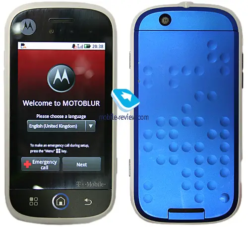
So, what do they have to say about it?
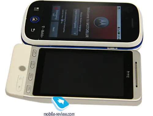
Mostly good, which means nice build, good screen, good design, nice slide mechanism and decent keyboard. However, there are some interesting points made in regards to the overall hardware:
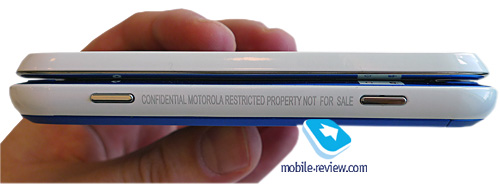
The battery cover slides down effortlessly, it’s made out of plastic and doesn’t look particularly durable. Noticed the pattern? Pretty offbeat, if you ask me. By and large, the DEXT’s design isn’t what are used to see from Motorola – too much color, for one, and then a variety of materials, such as white glossy inserts.
In other words, it doesn’t really feel like a Motorola. Those of you who remember the days of the RAZR no what this guy means. Even though Moto’s UI sucked big time, its hardware was hard to beat, with nice textures, solid feel and beautiful materials. Just take a look at the Aura for proof of what Motorola can do with hardware.
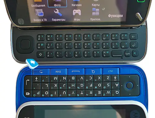
However, even if the hardware is a little disappointing, you can’t really fault Moto for this decision. The CLIQ is, afterall, obviously aimed at the youth market. That’s the market that cares more about the keyboard and touch-screen than how much metal is used or how glossy and cheap the plastic is. In addition, cheaping out a little on the hardware means this can be marketed at a truly accessible price point for the target consumer, and with the power of Android on its side, it could do something very good for Moto.
Click the link below to see all of the pictures and full write-up.
[Via Mobile-Review]




“In addition, cheaping out a little on the hardware means this can be marketed at a truly accessible price point for the target consumer, and with the power of Android on its side, it could do something very good for Moto.”
Umm, isn’t this being sold for $199 AFTER subsidy? That’s hardly a “truly accessible price point” for the youth market. That’s about what the “professional” level phones go for.
That’s a prototype – what’s the point of the review?
Valid points, but considering this thing comes with a touchscreen, QWERTY keyboard, and 5MP camera, $199 initially isn’t bad. Cheapo-youth it is not, but iPhone range (spec-wise and price-wise) it is. Plus, count on that falling pretty quickly.
As for the review allen, that is part of the reason we didn’t call it a review.
I think it’s incredibly ugly, everything about it. I don’t know why, but I do. The colored circle round the HOME button, the Motorola logo in the top left corner and the black material round the screen (especially at the top). The flatness at the back.
And the UI, omg, HORRIBLE! The bar at the top (the one with battery, wi-fi, signal status ecc) has ugly icons, and the red cross in the Emergency Call button moves the text right, and looks stupid.
Maybe the final product will be better, and I really hope so!
I’m sorry, that’s just what I think. The ONLY positive aspect I can see in this product would be the price, but then… it’s still very expensive ($199!).
Goodbye Moto.
@david_94
I agree, I don’t really like the look of it at all, i’m wondering if they are aiming towards a more younger audience but I don’t think you could really have this phone and be taken seriously. Don’t know if its just the prototype but the white, blue and black i’m not a fan of.
@david_94
I agree, I don’t really like the look of it at all, i’m wondering if they are aiming towards a younger audience but I don’t think you could really have this phone and be taken seriously. Don’t know if its just the prototype but the white, blue and black i’m not a fan of.
Unfortunately, I’ll never consider a phone that still rocks the SAME QUALCOMM 528 and internal 512Mb user-storage as spec-wise near the iPhone. I do love the form factor and keyboard, but until they put some actual storage (microsd is great, but seriously you can’t put a couple gigs of storage onboard?) and get an updated processor/graphics core (iPhone 3gs, pre, etc all use the ARM Cortex-A8 which is lightyears ahead of this Qualcomm package) most people will pass right on to the iPhone, unfortunately for T-mobile.
stupid review of a prototype
I was excited about this phone because i thought they would be able to get it down to Free with contract.
At this price i can’t see any reason not to just go with the iphone.
Hey guys!, as far as I remember from the videos posted elsewhere, most of the materials on this phone were different. If you watch any random youtube video you can clearly see that the keyboard is different. Let’s just wait until it comes here.
Also what motorola is trying to sell with this phone its not the hardware at all, but the software: motoblur powered by android.
After being hyped for the Cliq for about 2 months now, I’ve been reading up on all Android phone news to keep myself sane. After the announced $199 AR w/contract price point, I’m leaning more towards the Samsung InstinctQ. Sprint voice + data plans work better for my needs, and the Samsung doesn’t look like a sidekick.
Wait people its a proto device. This should not be posted. This Eldar guy is a joke, steals devices and reviews them yet some idiots consider him a ‘respected’ reviewer.
Its only a prototype but Android fans will whine as usual. Pessimists the lot of you !!
ithink that features are really unique and to me its better than the iphone and im gettin it even if it cost a thousand dollars
@cameron mulder
If you’re concerned about the price, T-Mobile is giving away a Cliq a day for the new few weeks (as well as a handful of all-inclusive vacations). You can visit http://t-mobile/cliq to enter and get more information. I’m working with T-Mobile so feel free to ask me any questions as well. Hopefully you won’t rule out the Cliq altogether!
hey derek, do you think tmobile is going to makes us pay for a different data plan to get the cliq with motoblur?
attaphone!
r u all retrded?
this phone is soo much better than the stupid iphone. nd ppl who thought this phone should come out free are all fcking idiots.. this phone is so worth 200 dollars. i remember when g1 first came out it was 180.. this is only 20 more and MUCH better phone with motorola and BETTER LOOKING… to those ppl who thought this phone were ugly and expensive.. u guys clearly dont know anything about cellphones.. why dont u all sign a 2 year contract and get a crappy free phone instead of complaining at the new phones tht u will never get.. cuz u know u dont have enough money to.. srsly.. fuck off
Here is a REAL REVIEW of the DEXT:
http://asia.cnet.com/reviews/mobilephones/0,39051200,45022297p,00.htm
@john
Not sure how your individual price and plans would be affected by the new phone / motoblur service — you can pre-register for more info (different from pre-ordering) or wait until the phone comes out and find out more at that time.