
Google is making more tweaks to the Google Play Store’s layout. The company has been toying around with a change that shows one big search result card for the app you’re most likely looking for, followed by more results and other suggestions.
That style is still present, but it seems Google is flavoring things up a bit by adding screenshots to the header listing. You can thumb through them and click to embiggen just as you would on the full app listing. This gives you a nice and quick way to see what an app looks like without having to dive into multiple pages of an app, especially useful for those of us who like judging books by their covers.

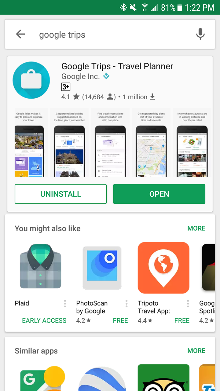
Beyond that, it seems Google is also now tinkering with the way suggestion cards appear, with some folks noticing one large white card of results as opposed to a carousel of individual cards. The former style seems to be a much more desirable use of white space, though if Google finds that mushing all the results together causes some confusion then we could see it reverted.
In any case, it seems whether you see these changes or different variations of them is still left up to chance as Google quietly undergoes server-side A/B testing.
[via Android Police]


Comments