
Google today posted the winners of their annual Material Design awards. These awards aim to showcase the apps which not only follow Google’s no-nonsense approach to app and web design, but also do it in a way that’s unique, refreshing, and engaging.
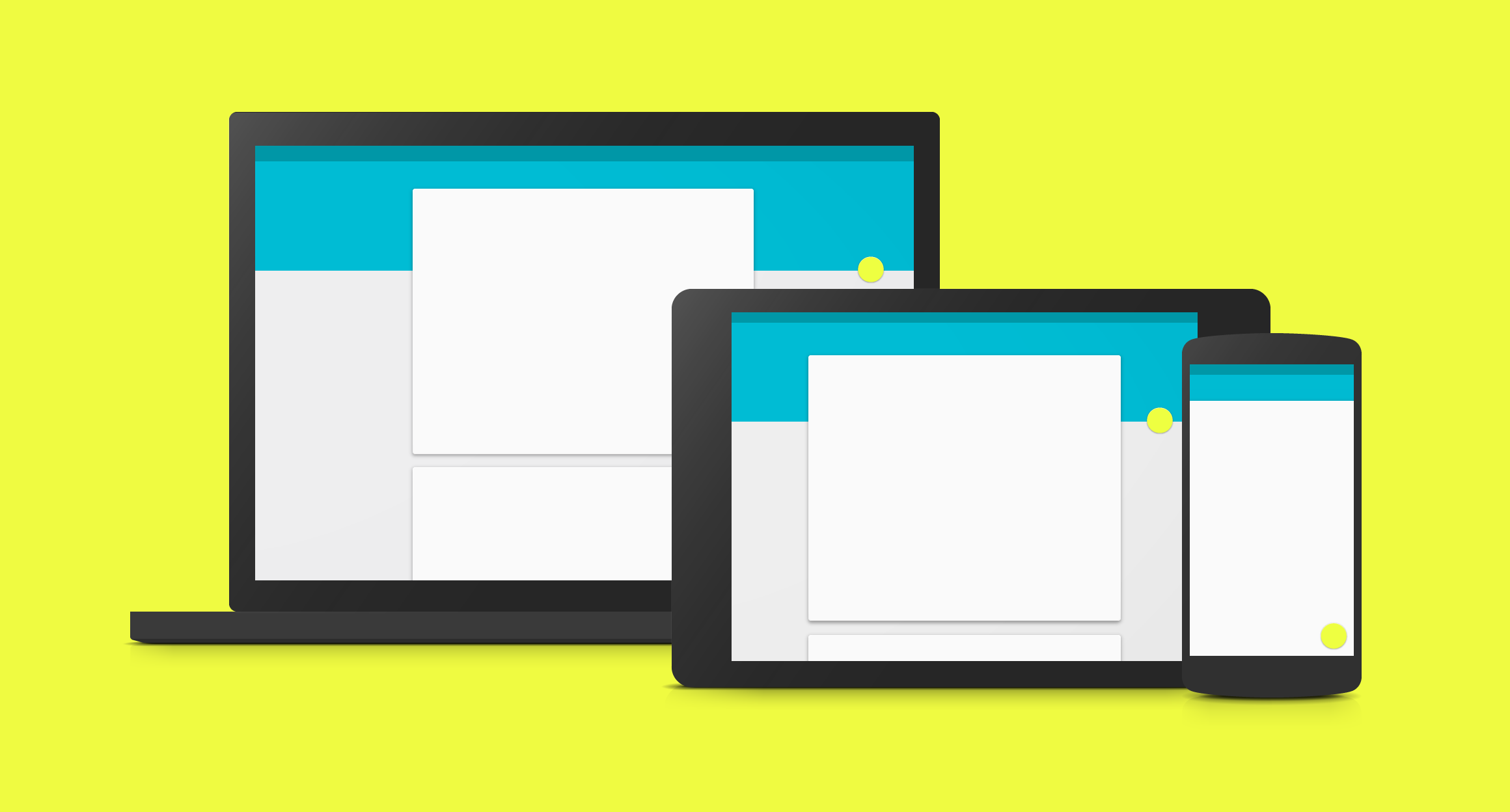
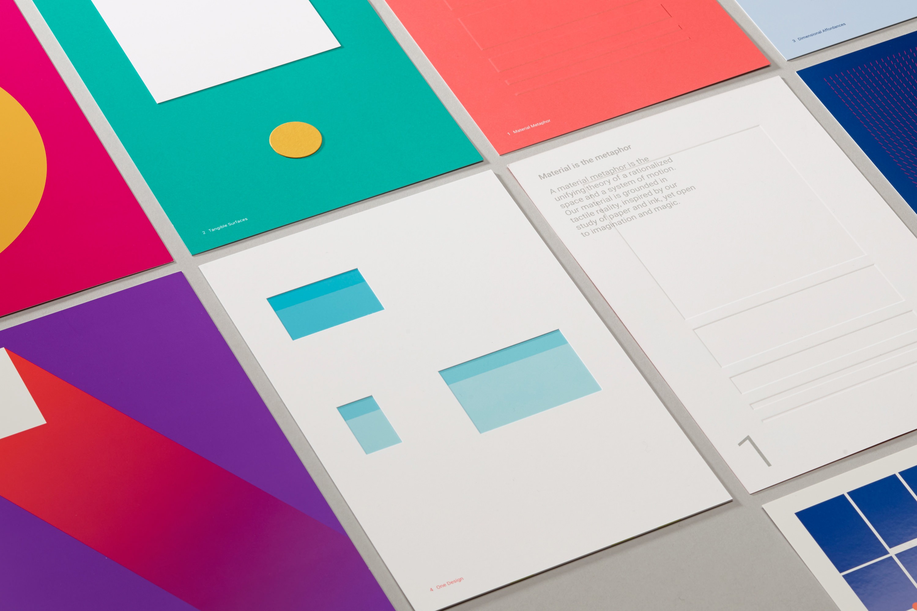
Before diving in, it’s important to remember that Material Design isn’t all about floating action buttons and drop shadows — there’s functional meaning to the way some of these elements work and look, and they all meld to make for the best user experience possible. With that said, Google sorted winners into 5 different categories:
- Brand Infusion: The ability for an app to cleanly and effectively communicate information and offer controls while seamlessly blending a company’s unique branding into the UI.
- Charming Engagement: This category focuses on an app’s ability to offer an eye-popping design which uses lush animations, vibrant colors, and energetic features to get the user excited about using the app.
- Creative Navigation: Navigation is one of the most important elements of any app, so Google recognizes apps which uses elements like tabs and drawers to make it easy for users to whisk through the app.
- Expressive Layouts: An app’s layout is important in making sure the flow of information remains consistent, uniform, and easily identifiable throughout.
- Focused Efficiency: This category is all about speed and an app’s ability to offer up a deep amount of information, controls, and features without burdening the user with an overwhelming operation process.
Asana – Brand Infusion
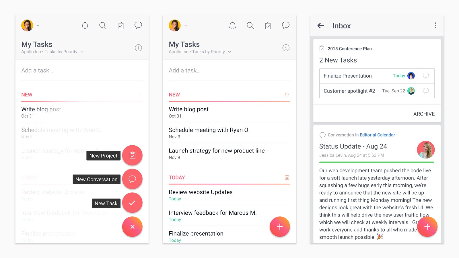
An app built on making teams more productive and collaborative needs to be visually focused and clear to keep users concentrated on getting work done. Asana achieves this by polishing short, frequently repeated interactions to make efficiency feel rewarding. Content is never overwhelmed by the wide range of available actions because they are organized intelligently and are easy to trigger.
With so much functionality built into the app, it would be easy for Asana’s visual identity to become diluted. But Asana’s design team thought through the brand experience at every turn. Subtle gradients are applied to the floating action button as well as in moments of more casually paced user communication. The product logo is echoed in the circular outlines around icons while editing a task.
Fabulous – Charming Engagement
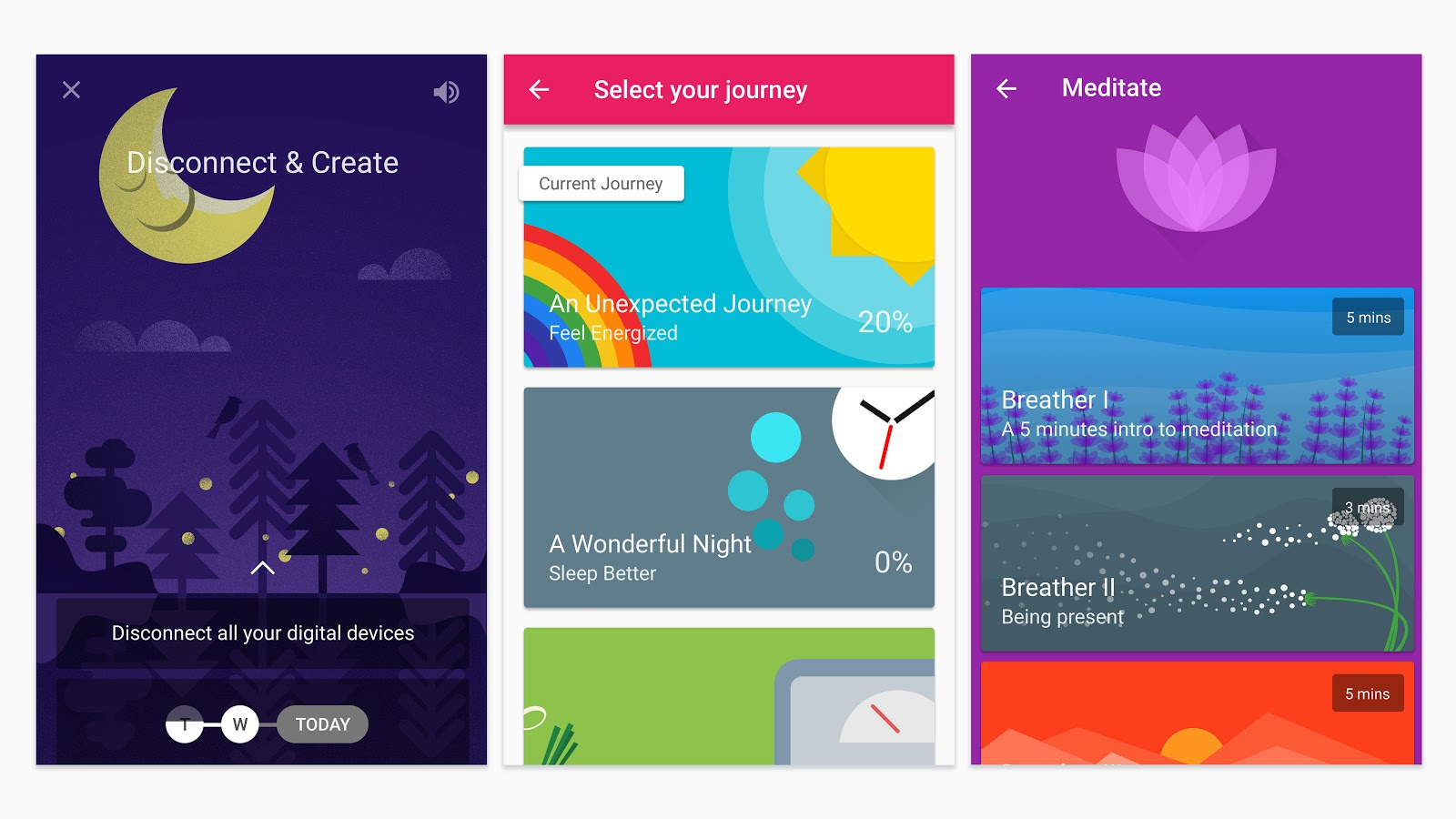
It’s hard to rewire your brain and adopt a new routine, but it can be made easier with an attentive coach by your side, encouraging you to achieve your goals through positive reinforcement. The Fabulous app is such a mentor, a self-described “happiness trainer” that makes positive choices habit-forming.
The app’s charming illustration style makes an immediate impression, inviting users into their first experience of goal-setting. The crisp state transitions and pleasing goal completion animations keep up motivation—even experiences beyond the in-app functionality are carefully considered, with bold notification styles, a well-developed soundscape, and email reminders that feel personal and direct.
Download at Google Play
C Channel – Creative Navigation
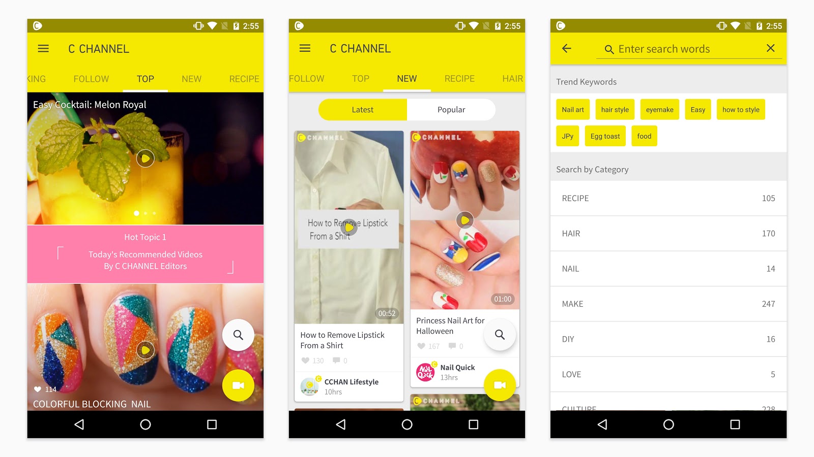
When it comes to designing an app’s navigation, more content usually means more problems. Search often becomes a primary mode of exploration, reducing the user’s exposure to items they might otherwise be interested in, if they’d only known they existed. The C Channel app neatly balances a blend of studio-created and user-submitted videos covering fashion, food and more.
C Channel organizes content into a series of tabs that can be traversed easily with a simple swipe. This engaging, gestural journey through the product continues even when videos are playing, allowing users to advance seamlessly between clips with a vertical fling. The overall positive vibe of the app—there’s only a like button and no down voting—celebrates the ideas and trends within the community.
Download at Google Play
Kitchen Stories – Expressive Layouts
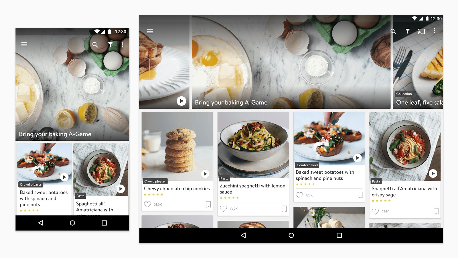
Determining the layout of an experience isn’t a solitary decision—it’s the result of a series of small decisions, that combine to create a harmonious whole. When it works well, users may not even consciously notice it, but they certainly feel it when things go awry.
Kitchen Stories excels at creating effective, easy-to-scan layouts for recipes across a variety of screens and sizes. Home cooks will be happy to have their tablets in the kitchen: content is organized smartly, minimizing the number of times you’ll need to touch messy fingers to the screen. The attention to craft shines through at other moments in the app experience as well, from the precise positioning of type, to the playful use of the logo as a textural element on background surfaces.
Download at Google Play
AirBnb – Focused Efficiency
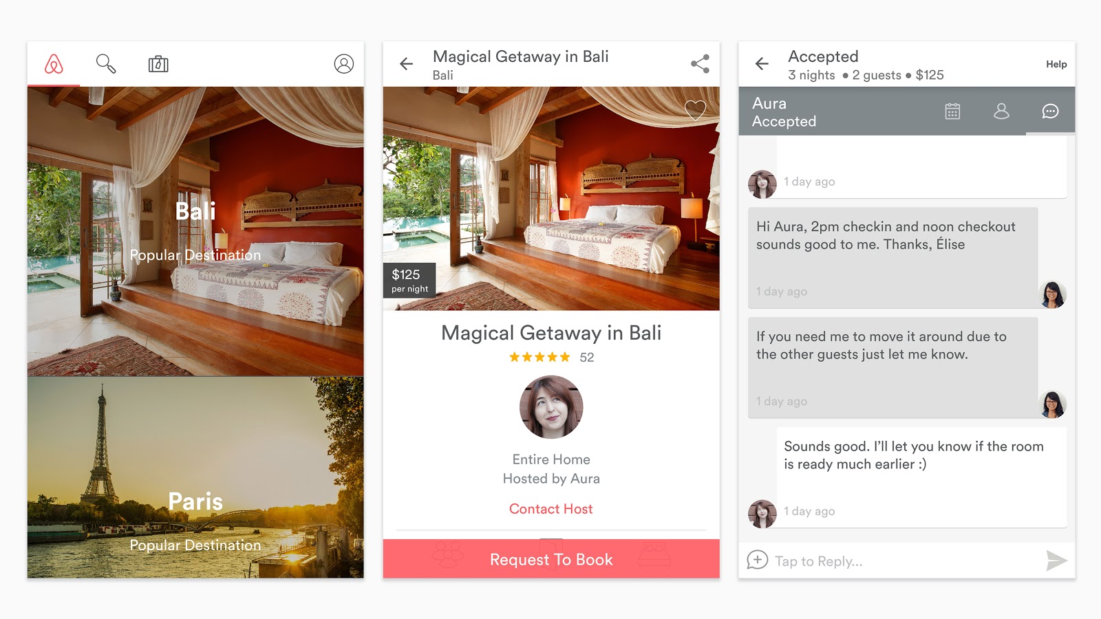
One of Google’s Ten things we know to be true is “Fast is better than slow.” Airbnb clearly relates to this philosophy, and acts on it by showing respect for their users’ time. Essential tasks are satisfied through precise design, routing users clearly and briskly from sign in, to browsing, to booking a reservation. By neatly segmenting larger goals into smaller steps, Airbnb is able to sidestep the appearance of complexity, making the overall experience feel comfortable.
Happily, none of this efficiency comes at the cost of Airbnb’s visual appeal. Photography is a clear focus and communicates a sense of opportunity in each new destination. The considered typography and consistent but unobtrusive branding are equally successful for both the Android and iOS versions of the app.
Download at Google Play
My Personal Favorite
All the apps mentioned above have great designs, but I want to give a shout-out to one of my own personal favorites — GameFly. It doesn’t do anything out of the ordinary in its design, but the use of Material Design allows the app to deliver information in a way that’s important to me.
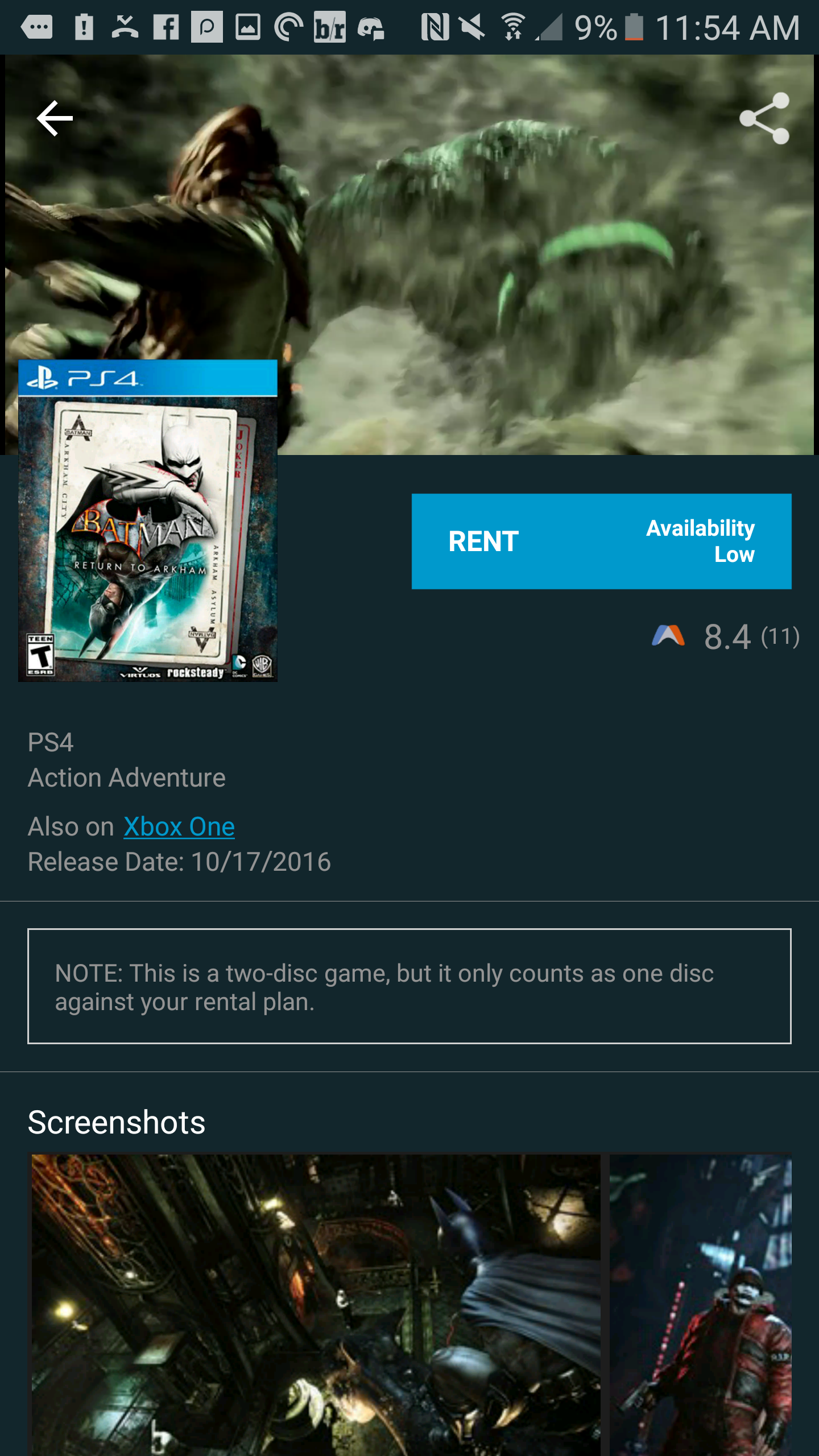
This shines through best when clicking on individual game listings to get more information about the games I’m trying to rent, including a trailer which plays as the header before scrolling down to jump into the details (there’s something about that trailer fading away as you scroll down the page that gets me every time). It’s not the best, most elegant, or even most pleasing design out there, but I love it for what it is.
What’s your favorite example of Material Design?
Have your own personal favorite app that makes use of Material Design? Even if it’s just one element of the app or the entirety of it, we want to hear about your favorite use of Material Design and why it enhances that app’s functionality for your unique needs and tastes. Hit us up below to share!


Comments