
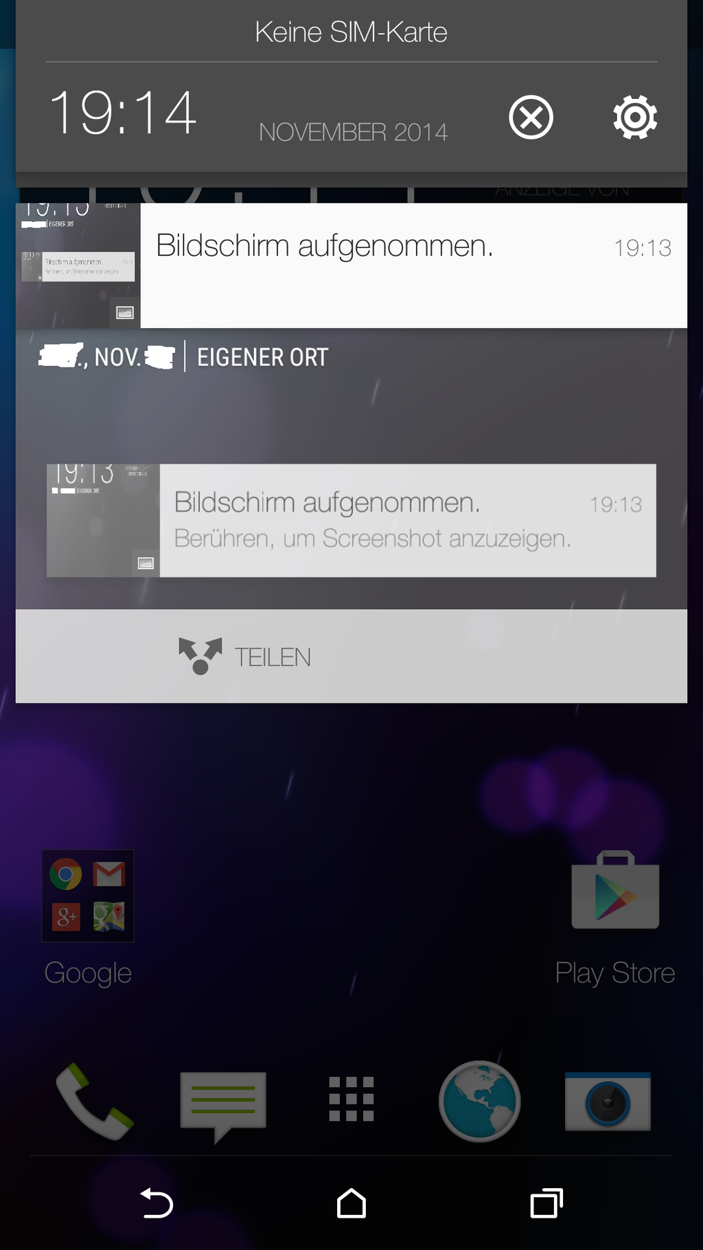

We already got a few good looks at what Samsung’s vision for Android 5.0 Lollipop running on Galaxy devices, but now it’s HTC’s turn. A few screenshots taken from a leaked Sense 6.0 build have surfaced thanks to the infamous Android developer/hacker LlabTooFeR. The screenshots — taken from the HTC One M8 running Android 5.0 Lollipop — paint a clearer picture of what HTC has in store for their version of the update.
Really, it doesn’t seem to venture off too far from what we’ve already seen in Lollipop, with the most noticeable difference swapping out Android 5.0’s teal color scheme in favor of more muted greys. This gives Sense it’s usual distinguished look and should help compliment whatever icon/wallpaper theme you choose for your device.

You’ll also notice the same HTC style nav buttons and of course, their current set of icons are still present for a clean, minimal look. We have to admit, we are a bit disappointed to see HTC using Lollipop’s incredibly unintuitive Rolodex-styled recent apps menu (the tab colors have also been removed in favor of a more uniform grey).
We know a good many of you are still scratching your heads, wondering why OEMs skin Android in the first place. We don’t have as much a problem with it anymore. It’s a way of adding personality, features, and brand recognition to a hardware vendor’s devices and as long as its done right and doesn’t hinder the update process — like we saw with Sense 5.0 — we aren’t complaining.


Looking good… Just glad they incorporated the new recent apps menu. I can only imagine what they have in store for the M9
That’s probably my least favorite part. The new recents, while it looks pretty, is a pain to use. Scrolling through apps and selecting takes way more time then having it all laid out in front of you (like in Sense 5.0).
Exactly my thoughts on it. I much prefer recents as it is now in Sense and was hoping they would keep them the same in the update. Maybe they’ll give you the option to change it, but I doubt it. But that’s what root (and Sense tools) are for!
As always, nothing is perfect………………….. until you root it.
i like it. it’s a light layer. nothing to drastic and it should serve well when it comes to updates.
For once, stock looks better than sense.
I’m probably alone in this, but not a fan Lollipop’s new teal theme. I don’t get how they went from no color (KitKat), to green (Lollipop). -_-
Somebody is always going to question someone else’s color choice, be it teal or whatever. That’s why they were going with the whole no color thing for a while but the problem with going that route is it’s bland and boring. I got tired of it and went looking to OEM skins like LG and Sony, but I’m glad they threw that out the window and went bold. Stock android is once again the best looking android version. Also you don’t need to change the look to add features, Motorola is a perfect example. I think it’s 100% about differentiating themselves. Which is fine, but they just plain don’t do it as well as Google.
Yea some color shades are a bit off. Overall, I like lollipop a lot more than anything else.
I don’t understand why Google (knowing teal would be out of the question for some) would not do like windows does when you boot up for the first time. Ask what color scheme you want. At least give a few choices. I like lollipop but that would have made it just that much better.
Arrrrgh… That would have been perfect. At least “light or dark” like they do with the keyboard. :/
I have to disagree. Stock android has looked better and better with each release, couldn’t stand the Jelly bean/ICS holo theme and gingerbread was worse. But KitKat and Lollipop are really good. Still sense is better looking IMO
I really like this. I’m probably in the minority here, but I’m not a huge fan of the new UI in Lollipop and was a little worried about how it was going to work out. Glad to see HTC have stuck with what worked in KitKat and just added a few little changes.
IM STOKED