
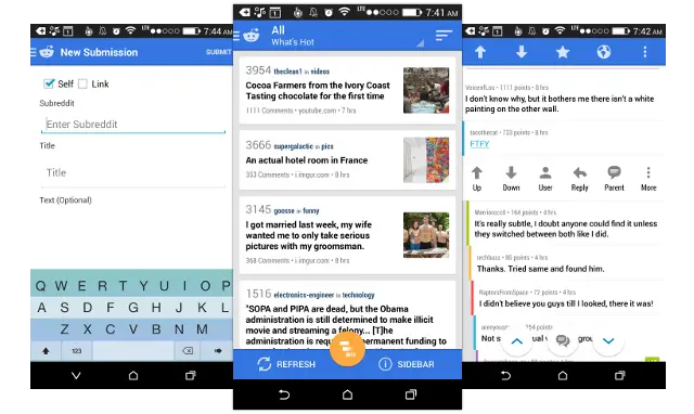
 It’s remarkable how many developers seem to miss the mark when it comes to following Google’s design guidelines with each passing version of Android. Reddit News doesn’t fit that category of developers, and they’re showing that again with the latest update to the beta version of their application. Version 7.0 brings us a Material Design-like upgrade that gives us a hint of what to expect once Material Design becomes prominent in many applications.
White space is used to its absolute best, rich and lush advanced animations are present throughout every corner of the app, and those buttons for navigating through cheeky Reddit comments and marking posts as favorites can be moved around to fit your style and needs.
Being a beta, the app isn’t without its rough edges — that’s just a circumstance of early access to these things. Don’t fret if something isn’t working quite the way it should: simply post a note in the beta community here and make sure the developer knows about it so they can knock out all the kinks ahead of a stable launch. That’s what these things are for, after all.
Want to give it a spin yourself? Join the community and have a look at the About Community section on the right hand side. You’ll see handy links to opt into the Reddit News beta on either the free or paid version. The update might not make it to your phone immediately if you weren’t previously opted into the beta, so give it a few hours and it should be on its way shortly. Watch the quick video preview above to get a taste of what you’re in store for.


If only their mobile team would work on the improving the UI/UX of the reddit website
I hopped on bacon reader after y’all posted a list of reddit apps. It’s a cool site to visit when I’m bored, but even with this updated design for this reddit app, I just don’t seem to care enough. It’s all about functionality for me, not beauty.
can we just call it googles UI, you say “material design” like everybody follows this website daily, I would guess 9 out of 10 android users have no idea what that is.
So you’re saying we need a “What is Material Design?” article? I think that’s a good idea too. Many apps and users themselves are confused as to what Material Design is. Just because an app, such as this, implements a few Material Design elements doesn’t mean it’s full blow Material Design. For example, this app includes animations and transitions from Material Design as well as a floating action button. However, the rest of the app is still using the Holo design language.
Also, this app is still in beta stages, I’m sure it will eventually become Material Design in full blown glory. Until then, it’s just like the new Chrome Beta that includes a few Material Design elements while the rest of the UI is transitioned.
Sorry, but just adding crazy meaningless animations and some floating buttons doesn’t mean this is using anything of Material Design. The animations on this app are completely gratuitous and don’t help provide meaning or context to what is being displayed. That’s basically the opposite of what Material Design is about. As for the FAB, read my other comment, it’s also completely misused.
Maybe the site could use a What is Material Design article, hopefully written or advised by an actual UX designer that understand how these visual tools must be used, because just adding animations everywhere is not it. As someone that does that for a living, seeing articles promoting bad design like this as a “hint of what to expect once Material Design becomes prominent” is very depressing. If this is what the future holds for Android, I will stick with the present.
Lol, so since a majority might not know who material design is, we should just not continue to use the term or educate anyone and let them continue up to fall further behind in technological ignorance? You’re a special person
I understand what it is, however most I would bet do not. Soon it will be google’s standard for the look and feel of the UI and wont be referred to as “material design”. People that come up with a new acronym for something that isnt new, really just a different look, should be fired as they aren’t really doing anything but fighting for relevance in their job. Much like Captain Meetings
Captain Meetings
You need to distinguish from the old holo ui and the new material design. that’s why it needs it’s own name. Those are both google ui’s.
This isn’t material design, it does a lot if things that the guidelines says not to do, like multiple floating action buttons, and destructive action in those bubble. Phandroid please read the guidelines for material design so you know when something is actually material design, heck even the developer say it isn’t material design :/
Ew , what’s up with that keyboard? And that bright orange on bright blue? Have people lost all sense of color?
Did the developers behind this app even bothered to read the Material Design Guidelines, or did they just saw a couple of videos, thought it was cool and decided “yeah, we can totally do that”?
Because had they read the guidelines they would have seen that when using the so called Floating Action Button, you should have it be for ONE PRIMARY ACTION for that entire screen, usually something like Create New Post or similar actions. So aside from very extreme cases, there should only be ONE FAB per screen.
Rating individual posts/replies isn’t a primary action, it’s a contextual one, and a post counter is not even an action. Not only this app doesn’t even make full use of Material Design (most of its layout is classic Holo), but what it does use it’s used incorrectly.
So, app developers and designers out there, please check this app, and see how to NOT design Material Design apps.
Just about to post this!
Meanwhile, actual Material Design:
http://www.polymer-project.org/#apps