


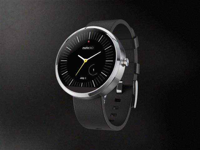
The Moto 360 is shaping up to be one beautiful smart watch and Motorola is sure to want beautiful watch faces to go along with them. In case you weren’t aware Motorola recently started a contest for people to submit custom watch face designs for a chance to win prize money and / or a Moto 360 smart watch.
Well, they’ve revealed the 10 finalist designs that will square off for first place. Many of these designs might be featured in the final roster for the smart watch’s launch, though only the winning design is guaranteed a spot. Let’s take a look at the full roster of finalists.
Watch #1 – Tyler Allicock

Another last minute one
Watch #2 – Paul Stringer
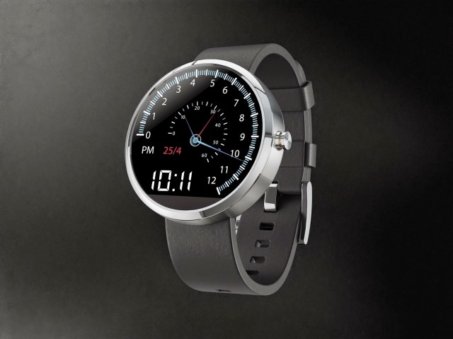
A car speedometer style watch face with the Hours on the outside and Minutes and Seconds on the inside. When the Second hand gets to the end it flys back to the beginning (very much like a tachometer). The Minute and Hour hands also do this when reach the end of their respective gauges. It also includes the AM/PM Indicator, Time in a digital format and then date.
Watch #3 – Jason Wang
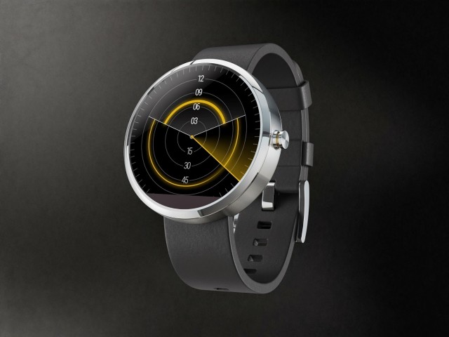
A last minute revision of my previous submission, because it’s just so much fun brainstorming! Same ideas as before: themed, but only subtlety so; analog fun, but still purely digital. Again, the face bears a passing resemblance to an old radar, but only in aesthetic, as functionally it’s very distinct. The smaller arc on top represents the hour, and the larger arc below represents the minute. As arcs, they can be read easily at a glance from any angle. A second hand sweeps over them.
Watch #4 – Jose Azua

ANGLES | 360 #Moto360 – (Compass & Timer app addition) – sorry guys added last minute compass face
Watch #5 – Pawel Hanusowski
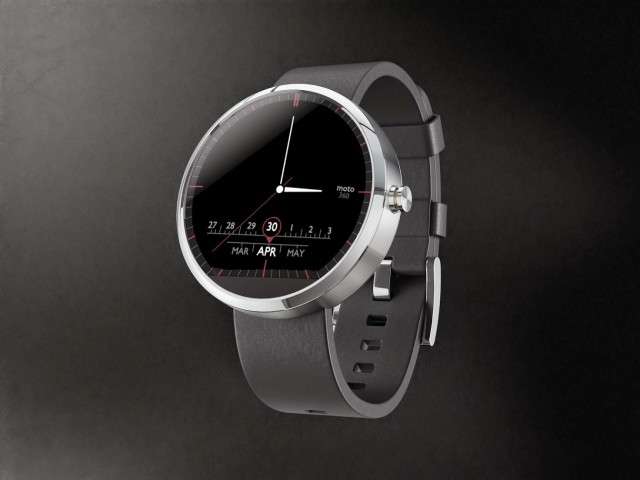
Radio like readout for the Month and Date accompanied by some red accents. #moto360 #moto #motorola #design #moto360designface-off
Watch #6 – Will Rodriguez
This disc design concept takes a modern approach to showing the time. Minutes are shown through the larger disc in the background (which can be color customized) and the hour is shown through the foreground disc. It also displays notification icons for sms, email and health alerts as well as a basic weather widget. #moto360
Watch #7 – Dave McCarthy
A scarcity nowdays, very few manufacturers have seemed to get the smart-watch design quite right. With the Moto360, Motorola decided to take a very classy, and minimalistic approach, so I decided to do the same. Keeping it feeling truly like a watch, the only things on it are the time, date, and a battery indicator. Hope you all like it! #Moto360
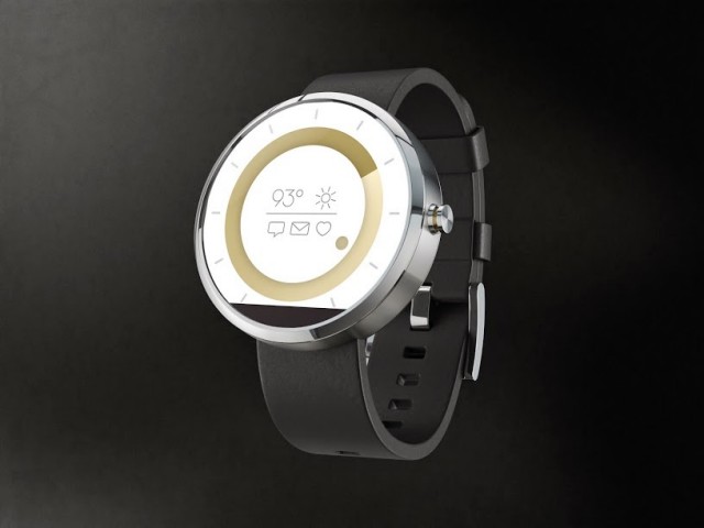
Watch #8 – David Pascual
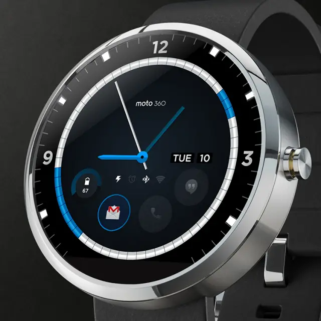
Displays calendar events, allows for user defined notification widgets, and provides status information for basic watch functions (charging, alarm, bluetooth, and wifi connection.)
Watch #9 – Aramis Negron
Simple, new and easy to read. Strongly believe that each widget should have the entire canvas to portray its information.
Watch #10 – Layton Diament
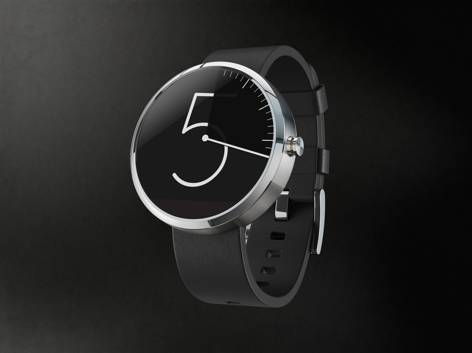
My “Vanishing Hour” watch face concept. As the minute hand makes its way around, the hour is dimmed while revealing the minute marks.
Want to vote on any of them yourself? Head to Google+ here and simply +1 the one you like the most. Don’t forget to circle back here and let us know which one caught your fancy by leaving a comment below.

This will replace mechanical watches one day. I mean basically all you would ever need is one smartwatch and you can easily just change the bands or the especially the face by downloading new faces if you ever find yourself bored or just want to switch things up everyday. I cant wait. I have never even thought twice about those ugly square bricks Samsung, Sony and LG are throwing out. This actually looks like a watch and nothing else. If you didnt tell people it was a smart watch nobody would think it was. Thats what Ive been waiting on for me to make that leap into the wearables arena.
People buy mechanical watches because they like mechanical watches. They are different breed of people. Or else everyone would be wearing one with a quartz movement or a digital.
Budget smartwatches or what? I think I see a market opening.
Why am I the only one that is extremely dissapointed they added that black bottom bezel essentially ruining the look of round watch faced designs? I cannot be the only one that is like, wtf, you do plan on having round designs on a round faced watch but oh ya, not really???
I highly doubt it was a design decision, likely a technical limitation. Smart watch tech is still in it’s infancy, it’ll be years before manufacturers can pull of crazy designs with high-end specs like we see in phones now.
I read somewhere there are 1 or 2 sensors there, so a technical decision I guess. That said, it doesn’t really bother me that much. I’d prefer the symmetry of a completely round screen, but I don’t think it ruins the overall look of the device.
I’m right there with you. I don’t remember seeing that in the original reveal, and I think that it ruins that beautiful round display.
The bezel has always been there from day one, including the promo pics on their website and the Android Wear YouTube videos. The bezel blends very well with a black background and can be easily missed but if you zoom in and look closely at any of the black face promo pics, they do indeed show the bezel. And yes, because they did not include any bezel around the circumference of the screen they had to sacrifice that little bit of screen for all of the sensors. I agree that the bezel doesn’t look good with any lighter faces but it looks fine with darker faces. I’m not sure how other companies will work out the round design limitations if they do go down that route, but if they find another discrete place to put all the sensors needed, then kudos to them.
I hear you guys, makes sense. I don’t remember ever seeing this early on so to my dismay, seeing it now kinda sux. Seems like they need to solve this issue oossible with to small round sensors some to the left and right of center (or somewhere less conspicuous), the round design and round watch faces are simply breathtaking BUT the sensor bar does ruin the symmetry imo
I only see two.
“Head to Google+ here… ”
https://plus.google.com/u/0/photos/+Motorola/albums/6025927350868561553
I added the rest for you :)
I find the top 10 designs a bit too traditional…
I much prefer these designs:
https://moto360mockup.appspot.com/pop.html?explode=1
https://moto360mockup.appspot.com/
https://moto360mockup.appspot.com/tron.html
:)
those are pretty nifty
Thanks :)
I’d go with the first link. I it took me a moment to realize that the ball drops weren’t random, but the spaces that weren’t being used anymore.
I like it.
Heck, if you could download watch faces, I’d pay for that.
Very cool mockups. The Moto360 is gonna be awesome.
The one at the top of this article really is the best, especially if it’s an OLED screen so you wouldn’t even notice the bottom sensor.
I went with the Pascual design (shown at the top of this article), as did most folks. Great look plus flexibility of adding my own widget choices.
This was my choice as well, the only thing that bothers me is it looks a little like a BMW logo.
All of them look good. However, it would be nice to have a Pilot watch (B-uhr) face.
I was hoping for something more imaginative than just making it tell the time and adding a few ‘widgets’
It’s a watchface contest, what do you want?
If I knew what I wanted, I’d have entered the competition.
The device is capable of so much more that just telling the time, its only really called a watch face competition because no-ones coined a phrase to describe it in another way yet.
How about the wrist disk face competition? Second thought, scratch that.
Yeah, I felt like #6 was the only one that really attempted to do something a little unique rather than a standard watch face.
The last one is a cool idea, but i feel like sometimes I would look at my watch and have no clue which hour it was.
That number 2 is my favorite love the speedo look
Would be nice if you could download different faces and switch whenever you want a different look.
You mean you can’t? I assumed switching faces would be a basic feature.
I was under that impression as well.
Information I like to always see at any glance is:
Time (XX:XX not military time)
Day of the Week (Day)
Date (Mon/DD/YYYY)
Weather (Today, Low // High Fahrenheit)
If I can see that all at once, then any design is good for me.
Right now, I’m at
Number:
8
2
5
The rest I don’t really care for. I like the fancy designs, but I don’t like to have to think about the hand positioning to tell what time it is. Yes, it’s true. I have become lazy due to technology and my own will. =.P
4 6 and 9
Watch #2 & #10
6 n 8 my choice nice looking.
For me the #8 design is clearly superior. Tried going to the Google site to vote and didn’t see how.
Agree. #8 is superior.
It provides the most information, well organized. It does not waste space with redundant information.
The time and date are in the traditional familiar format.
Beyond the four widgets at the bottom, I could see those widgets continuing clockwise around toward the top of the day/date. Having widgets that display indications of information available, as well as then providing direct access to that information seems useful compared to a design where you would first have to access a screen showing the status of what information is available.
With all of those functional advantages, which is always my top criteria (function more important than form) the face manages to be beautifully attractive.
2, 4, and 8.
Also, what is the resolution for this watch…these renders will need a high resolution to make the icons visible…right?
Great designs, I’d be rocking #7 or 8.
Hi Everyone my submission made it to top 10 finalist here’s my animated version:
Vote for it here https://plus.google.com/u/0/photos/+Motorola/albums/6025927350868561553
I just need a couple more votes!
My submission made it to top 10 finalist here’s my animated version:
Vote for it here https://plus.google.com/u/0/photos/+Motorola/albums/6025927350868561553
I just need a couple more votes!