
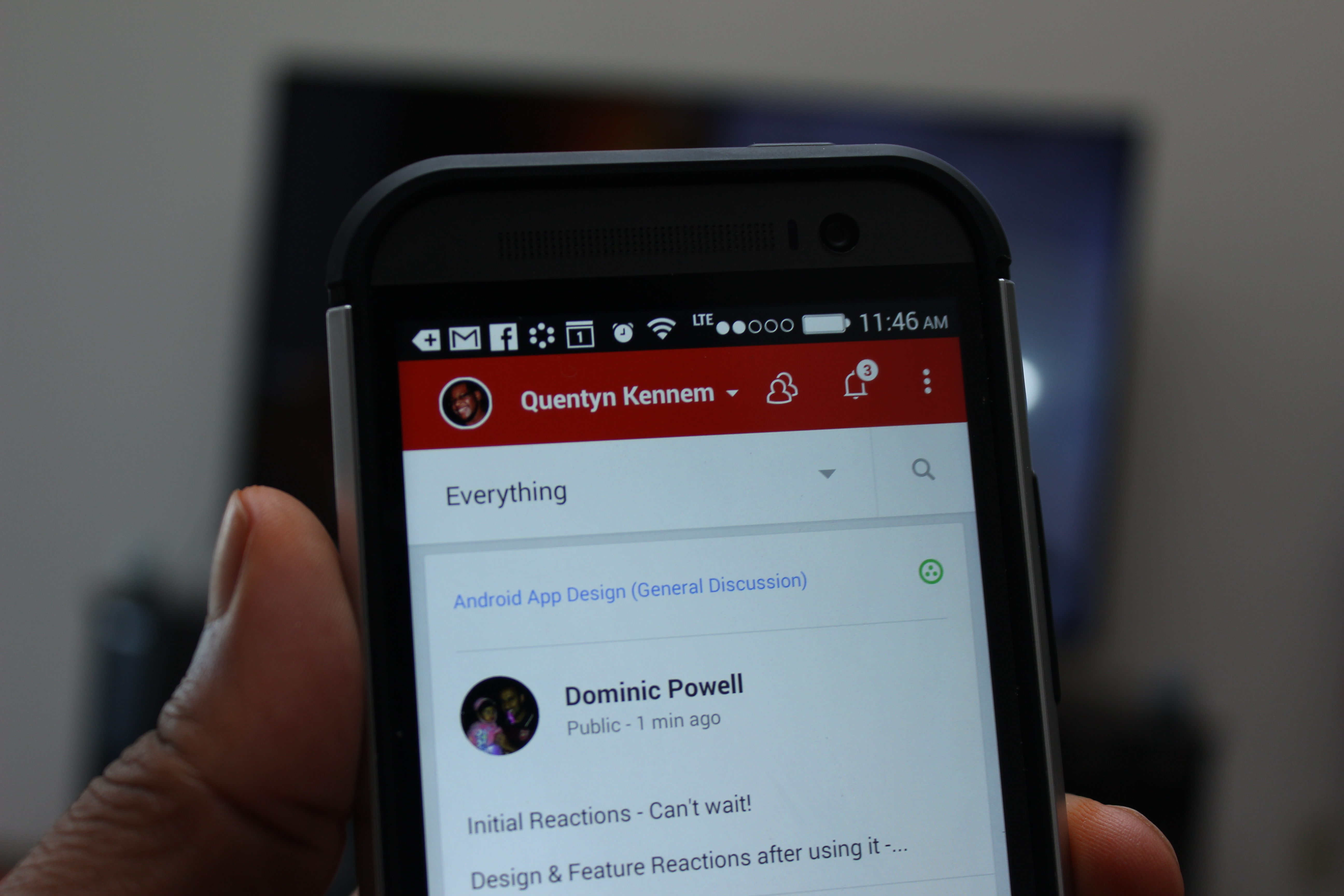

Google has just announced a huge new upgrade for the Google+ for Android app. The biggest change you’ll see right out of the dugout is a brand new user interface. The app features a lot more red on profile pages, and tightens things up around nearly every other corner.
Said UI tweaks include an updated interface for posting new status messages, a new photo browser that lets you quickly view your entire catalog (said to be a big change for those with big photo libraries) and navigate the photos by date, and new navigation and app menus to make it easy to zip around the various sections of the app.
On the more functional side of things, Auto Awesome Stories and Auto Awesome Movies arrive, with the former taking all your photos, video and public check-ins into a travelogue of sorts, while the latter allows you to automatically string together photos and videos to make quick and fun highlights. Finally, you can now create animated GIFs and photobooth-style images right from the Android app using the new “Motion” and “Mix” options in the Photos section of the app.
As with most Google app updates, this one is rolling out to user at a gradual pace. That said, we’ve already gotten our paws on the APK for you to check out, so be sure to give that a download using the link below (if you can’t find it in Google Play) and take the new app for a spin.


have it. Brilliant!
I… don’t like this. After all barely adding the slide out nav bar in all their apps, Google’s now getting rid of it and reintroducing the 3-dot menu/overflow button? It’s so weird.
Also, now instead of easy access to Photos and Locations, they’re hiding inside the “everything” section where NOBODY would think to look. It doesn’t even make sense.
Couple this weird new design with Vic Gudontra leaving and it makes you wonder. Just what is Google planning?
It’s a gorgeous UI…it just doesn’t feel very HOLO as we’re used to seeing and using. I’ll assume this is part of the upcoming design language changes that we’ll see in the future. It’s also kind of odd that Photos didn’t receive the new UI, making it seem very separate down there on it’s own. Anyways, the new G+ is definitely odd. I like it though.
Yeah, what is Google doing? As you said, they literally just cut their apps over to the Navigation Drawer while also removing the overflow menu (three dots) — and now, the overflow menu is back and there’s a new spinner-style navigation drawer. Totally bizarre.
It’s neat in its own way, but the design message to the Android development community is COMPLETELY confusing.
I’ll re-enable it and try it out. I would only use it for photos to replace my aging Gallery application, but only if they’ve made significant changes (which you alluded to in your article).
So no one is getting “There is a problem parsing the package” error? I cant seem to get it installed.
Try uninstalling your current Google+ app first.
I read in another article that this is for 4.4+ Jelly Bean. I am on 4.3.
4.4 is not Jelly Bean, hahaha.
Did it fix the glitch that deleted photos out of your gallery when you have Sync Google+ Photos turned on? Anyone else have that problem?
That has never happened to me, and I leave the sync on at all times. It’s the perfect backup/social sharing because it eliminates a whole bunch of steps and downloading/uploading
I like it alright. It looks really nice to me. Even though I like the slide menu of the old UI and that’s still in other apps, maybe it was too confusing for a lot of users who aren’t very tech savvy. I know some people who didn’t realize they could do that until I showed them. The three dots for the menu items really stand out, and I think they should always be there in every app, even if the phone has a dedicated menu button. That way, people can get accustomed to it. It helps a lot when I’m trying to assist someone with their phone and I forget or don’t know they have a menu button. It’s frustrating when I tell the person to tap the three dots and they tell me there aren’t any.
If Google didn’t change the slide menu because of confusion, maybe it’s because they have other plans for the edges of the screen in the next version of Android or the Google Now Launcher. It would be great if I could swipe from the left edge and bring up the app drawer while in any app.
Whatever Google is doing though, they need to pick something and stick to it. It will help the app creators as well as the end users if they have a uniform user experience that isn’t continuously overhauled every few months.